Enterprise Rebranding Meets Design System Architecture: Building Cigna's Quantum UI
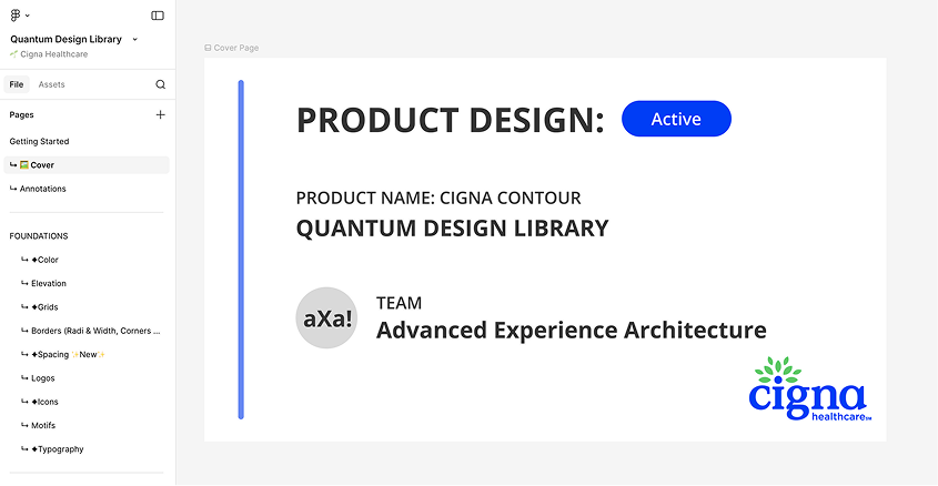
Built, refactored and scaled Cigna’s Quantum UI Design System components inside Figma libraries and establishing a cohesive relationship and operating cadence with engineering and design teams. In addition, we teamed with branding and marketing teams fully modernize digital assets.
Rebranding Initiative Team
Design Systems:
Senior Product Designer (Me)
Senior Application Development Advisor
5 UI Designers (offshore team)
Branding:
Design Operations Manager
VP Brand & Creative
4 Brand Designers (onshore team)
Design Process
Rebranding Cigna’s digital presence in the healthcare space.
Audit the current state of Cigna’s fragmented digital ecosystem.
Design the brand foundation for a more modern, visual identity for both digital assets and UI components.
Build a UI design system using Atomic Design Principles.
Validate with real designers on adjacent teams.
Implement at scale with new, updated brand identity and design system components.
Impact: Key Metrics
⬇︎ 40% reduction in development time ⬆︎ 90% increase in design consistency ⬇︎75% decrease in accessibility bugs
The Transformation
Old Cigna UI Design – COVID 2020
Updated UI Cigna Design – Post-COVID
Where to Start?
Audit Stage
Prior to this team forming, Cigna had no official UI Design System: Components were designed manually in Figma by siloed design teams within the organization.
After running an audit on a handful of categories, some key notable observations were:
Foundations and general maintenance – colors, typography, states, grids and the basics
Figma architecture – are the screens laid out intuitively? Are they matching developer semantics?
Components – which components are the most needed and most used?
Considerations
Working on a small team as the lead for design systems meant that I had some limited time developing the Figma side of the design system. I couldn’t spend months of developing the perfect strategy, so I had to take an iterative (very iterative) approach. Thankfully, Engineering had standardized many of the foundations such as color, scale, grid and icons so I had a solid base to work off of.
Partnering with engineering and design leadership stakeholders, we strived towards just getting the information in one centralized area for designers and just getting the information out there.
Setting Up the Rebranding Foundation
The Context
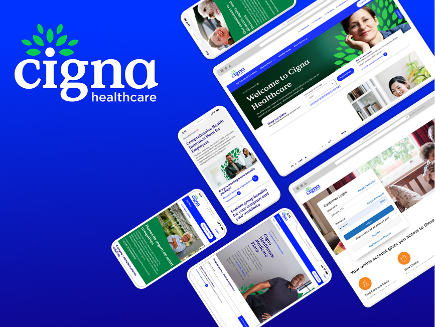
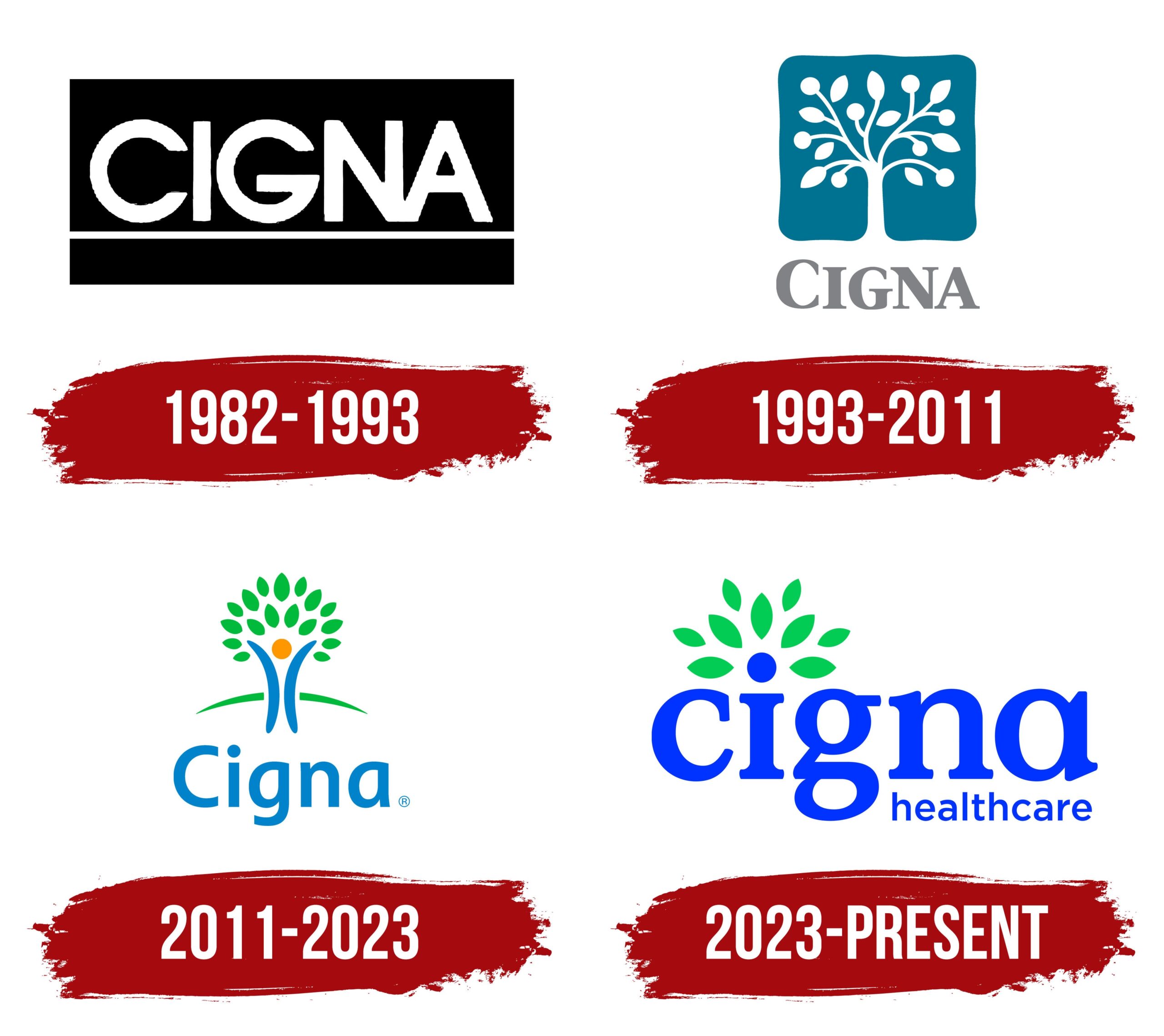
Cigna was undergoing a complete rebranding overhaul to modernize its visual identity. The old logo was outdated; their visual language didn’t represent a forward-thinking, growth-oriented healthcare company.
What we built
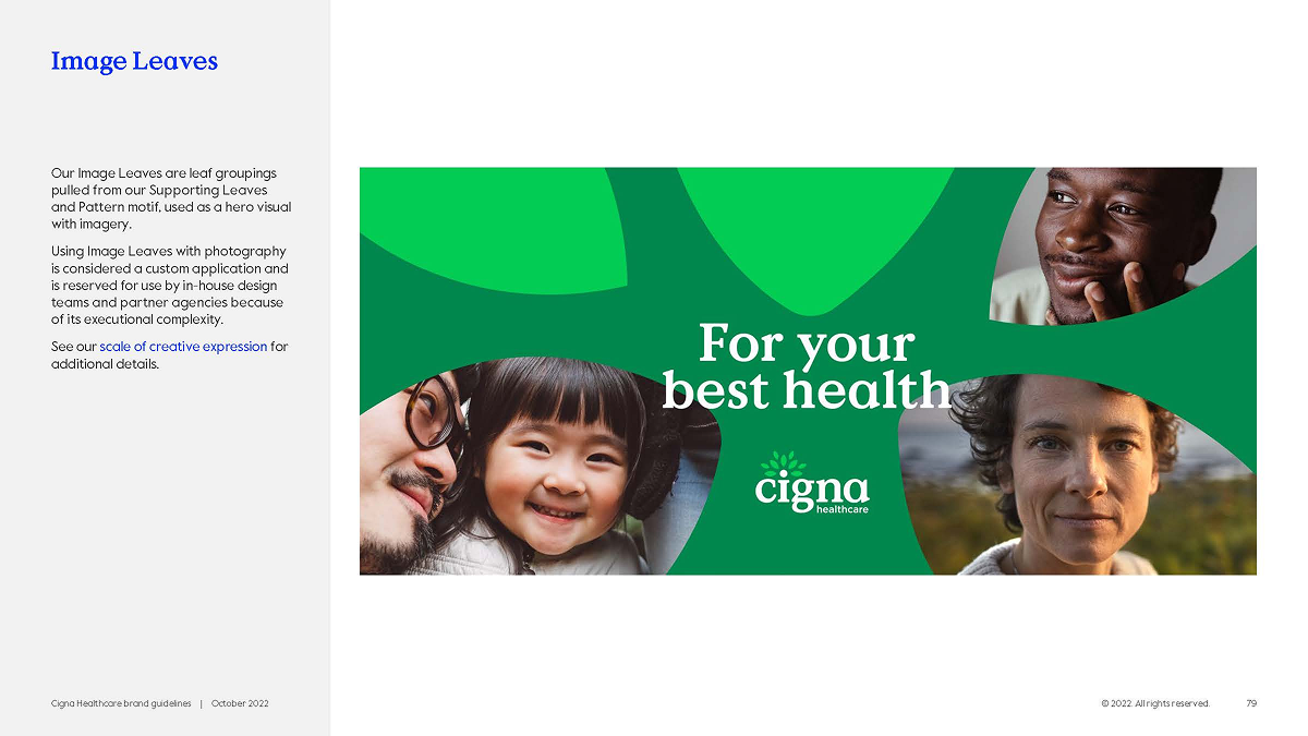
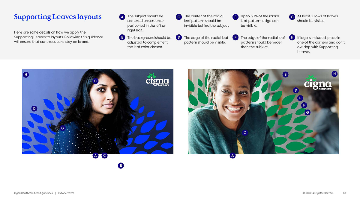
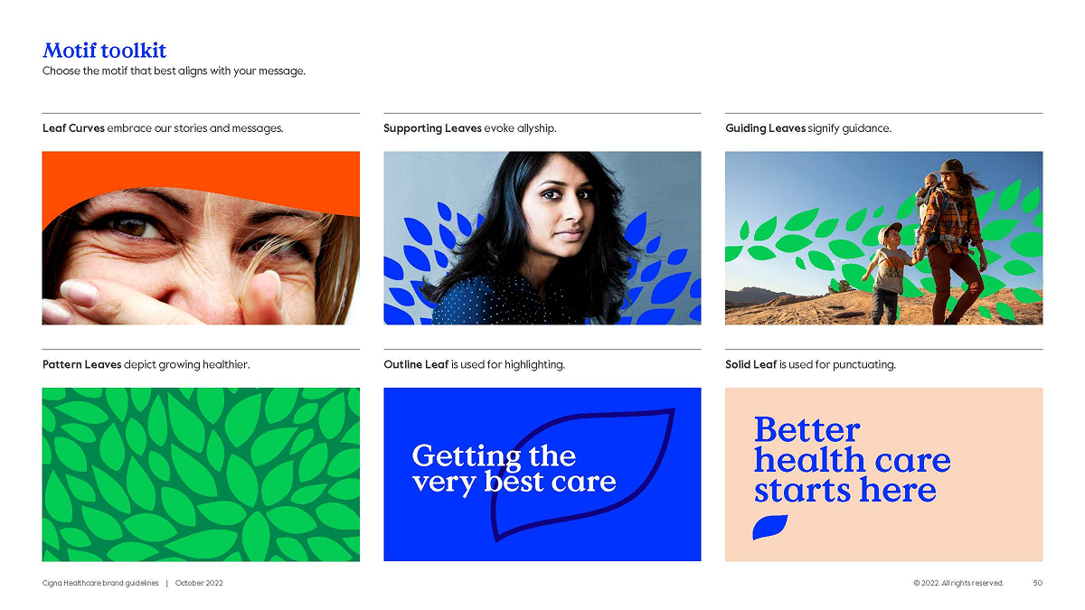
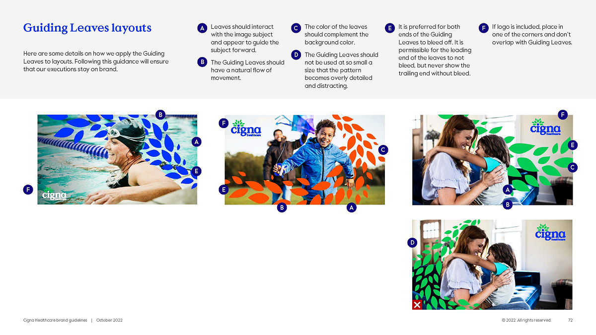
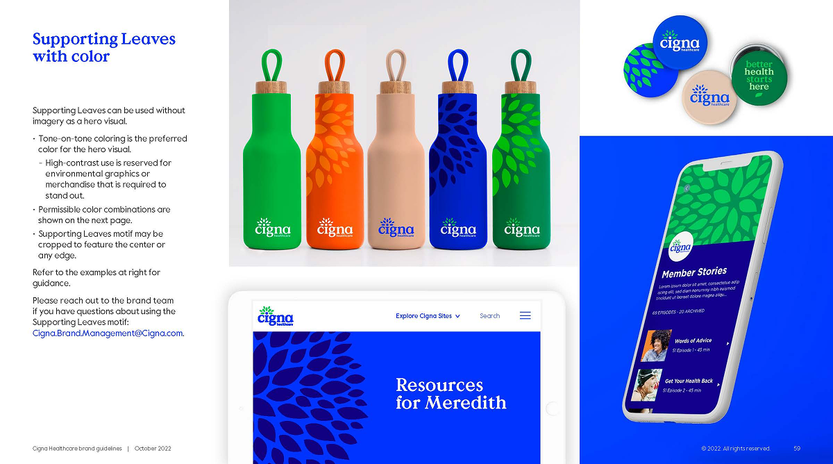
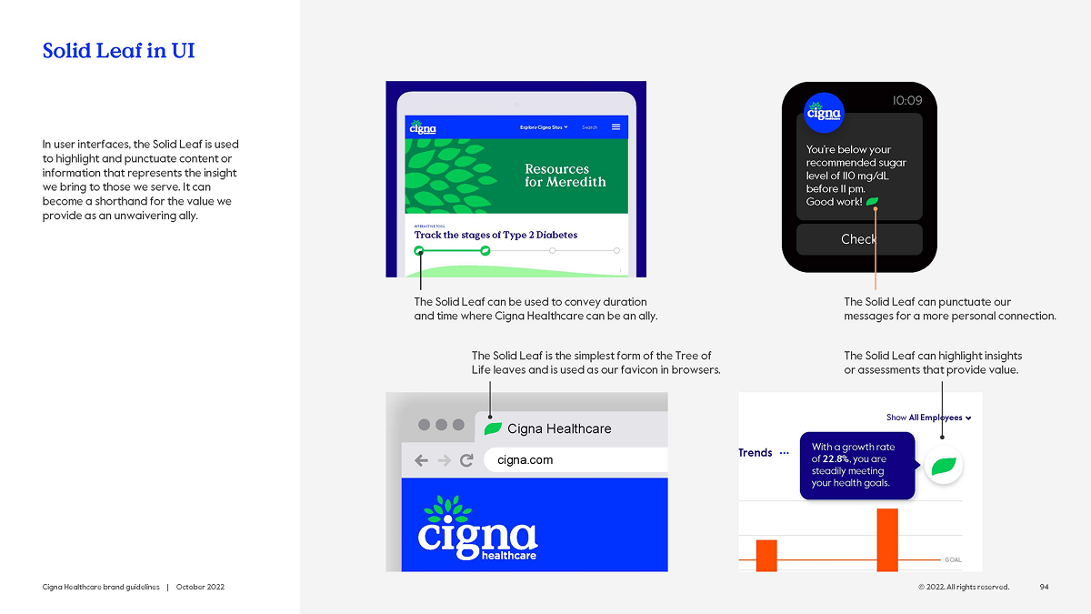
A modern visual identity where every element served double duty—working as both brand asset and UI component. The leaf motif became a functional design system piece. The logo symbolized patient-centricity (“i” for individual) and growth (encircling leaves forming a tree).
Cigna Healthcare Guidelines p.79
Cigna Healthcare Guidelines p.63
Cigna Healthcare Guidelines p.50
Cigna Healthcare Guidelines p. 64
Cross-functional Collaboration
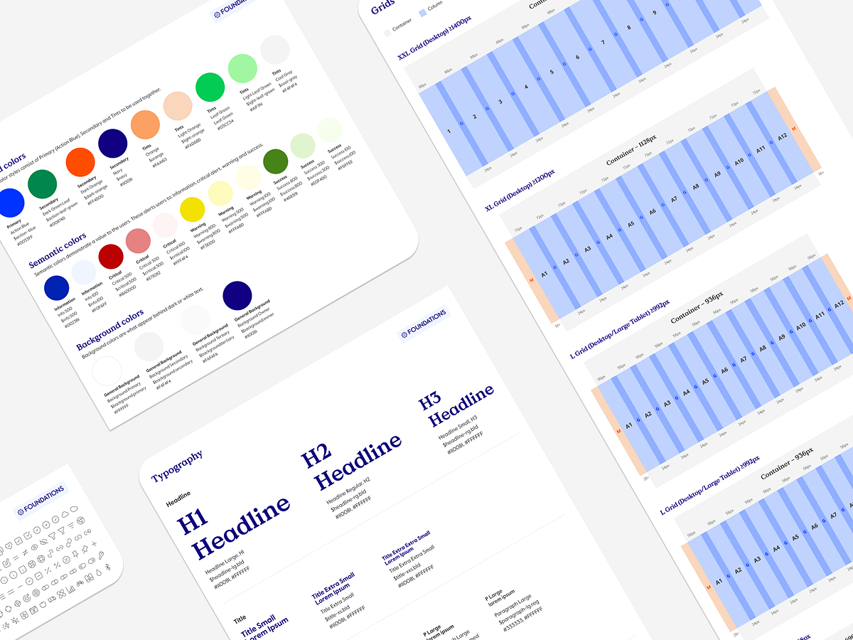
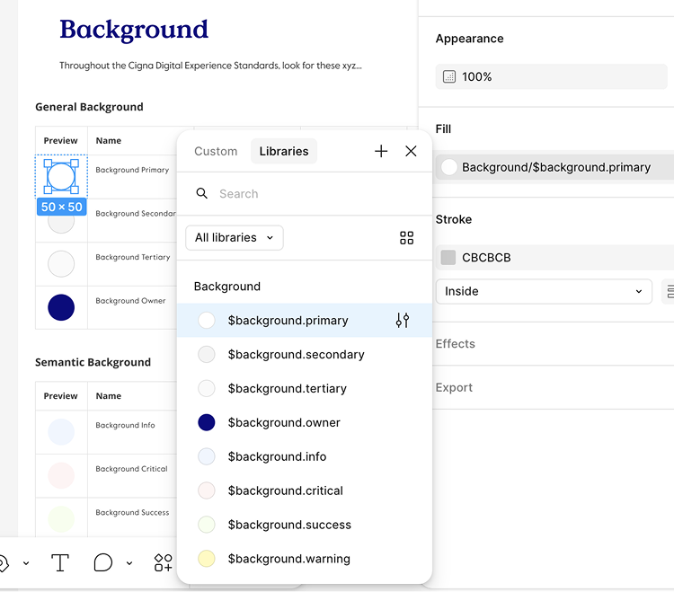
We involved the brand and marketing teams from day one, taking their brand research, color explorations, and typography hierarchy—including leaf motif work originally developed for print—and converted them into scalable system components validated against WCAG 2.1.
This collaborative translation turned marketing’s one-way brand assets into bidirectional design system components that worked across digital products, email, landing pages, and physical touchpoints.
Cigna Healthcare Guidelines p. 59
The Strategy
Rather than design brand separately then hand off to product, we grew brand and design system together. Every color, icon, and typographic choice was accessibility-compliant from the start—no retrofitting later.
Building the Component System
What we shipped
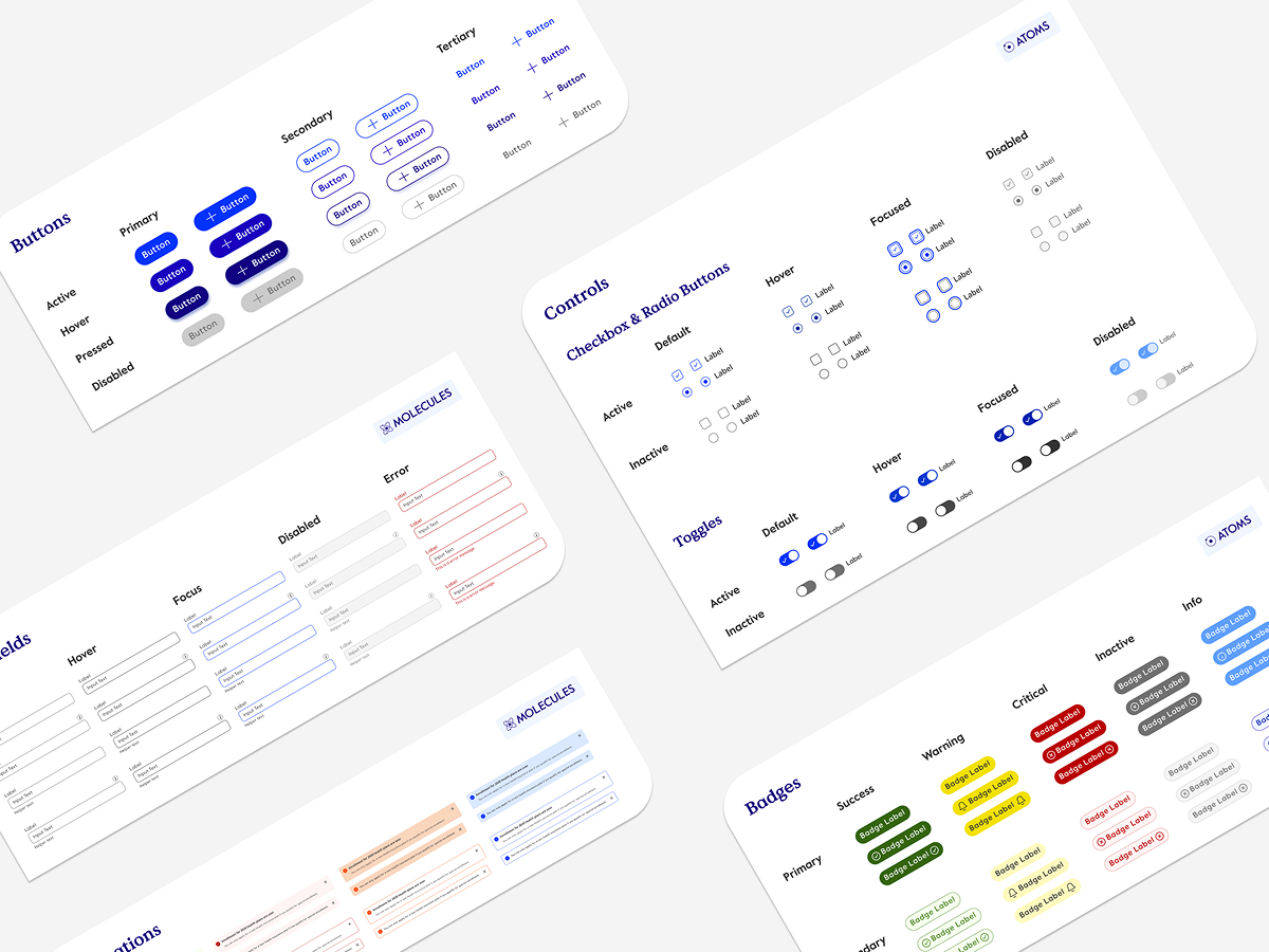
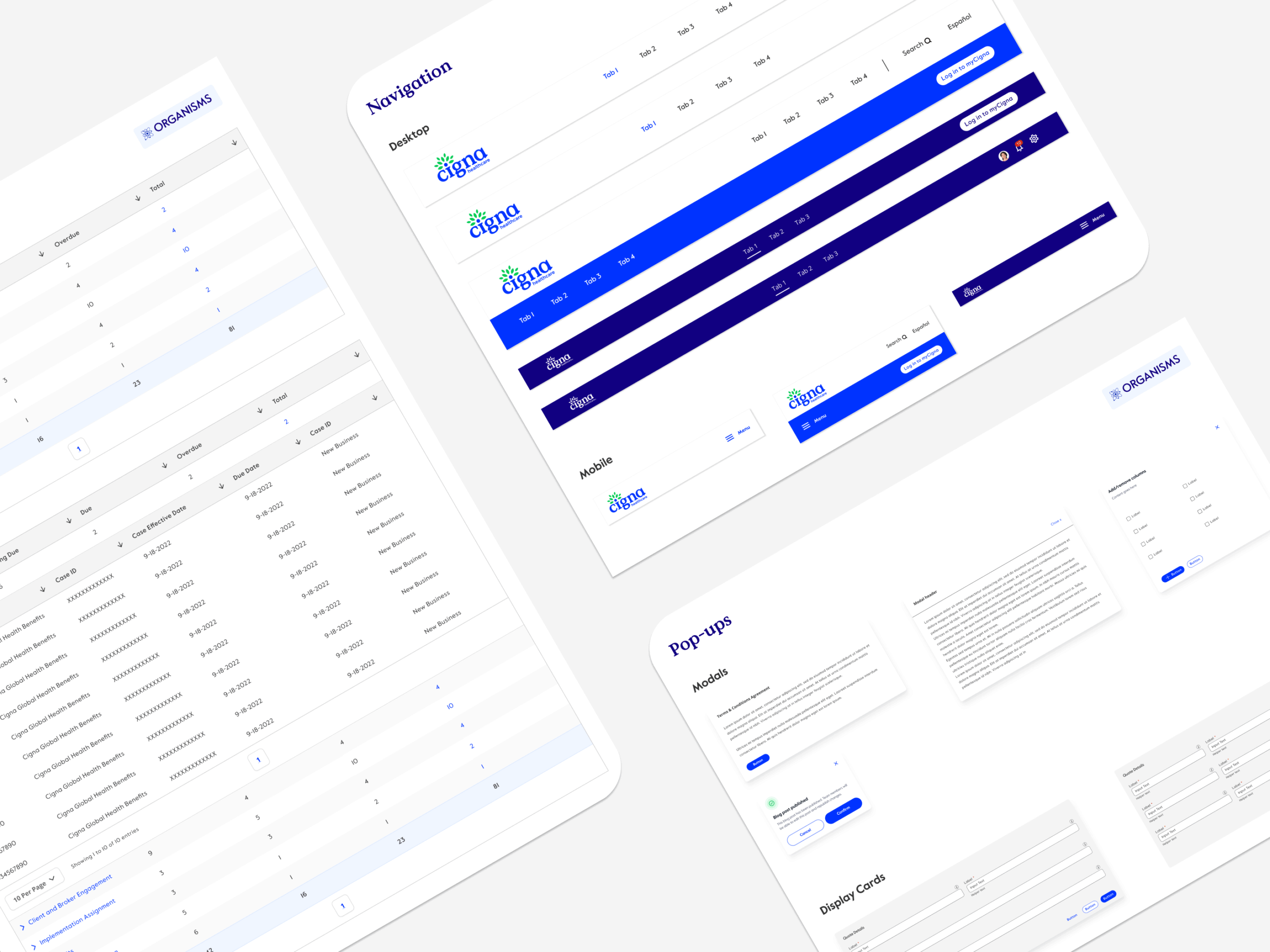
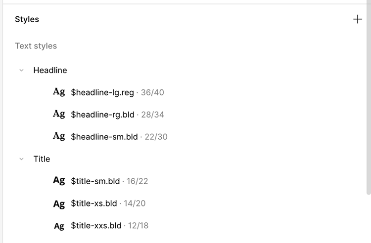
200+ components organized using Atomic Design principles. We consolidated scattered Figma files into one source of truth. Each component came with interactive states, accessibility attributes, and usage documentation. Semantic naming between Figma and code meant designers and engineers spoke the same language.
Cigna UI Design System - Foundations
Cigna UI Design System - Components
Cigna UI Design System - Patterns
Cigna Healthcare Guidelines: 94
Design-to-Development Handoff
Figma component names matched React component names matched BEM class structures—eliminating translation errors and reducing back-and-forth between design and engineering. Designers documented component variants using the same language engineers used to build them.
BEM-labeled color tokenization in Figma
BEM-labeled text tokenization in Figma
The Multiplier
Product teams across D2C, B2B, and SaaS could immediately access consistent, pre-built components instead of creating bespoke solutions. Design and engineering spoke the same language, eliminating implementation surprises.
Pilot with a Real Product Team
What we did
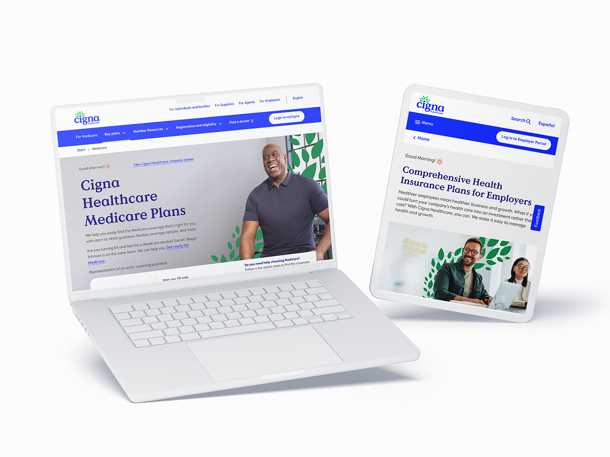
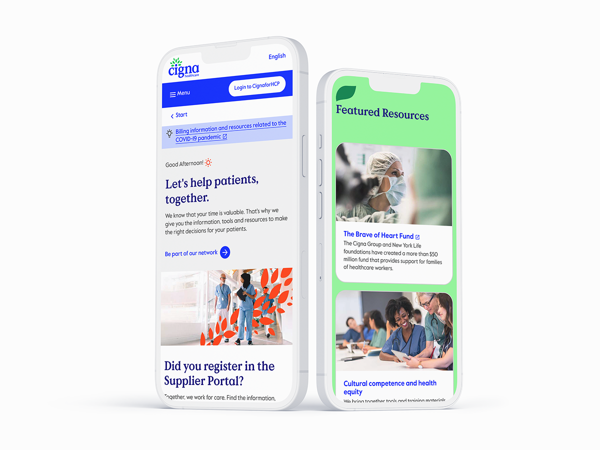
Rather than force adoption across all teams, we selected the D2C product team (highest design velocity) as our pilot. They redesigned 3 screens using only Quantum UI components with zero custom work allowed.
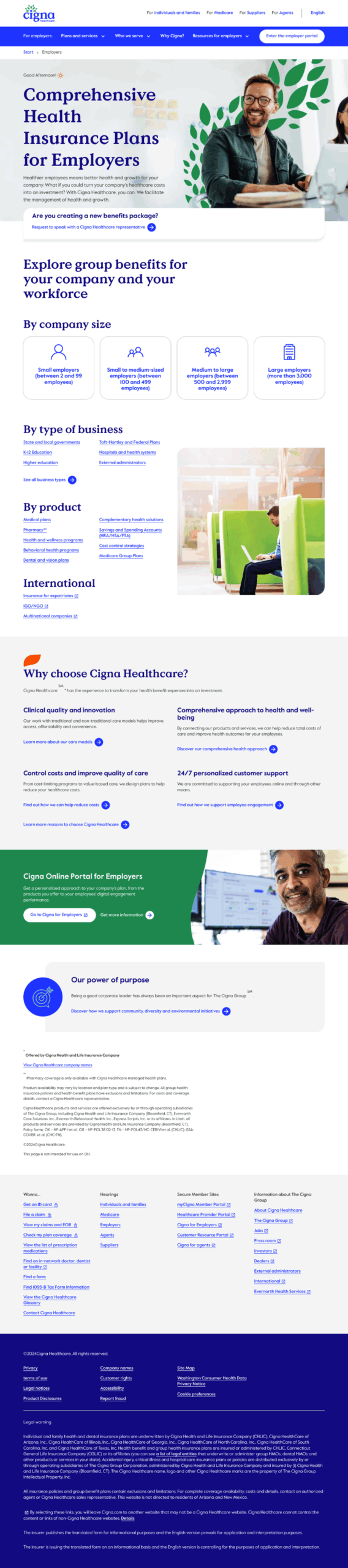
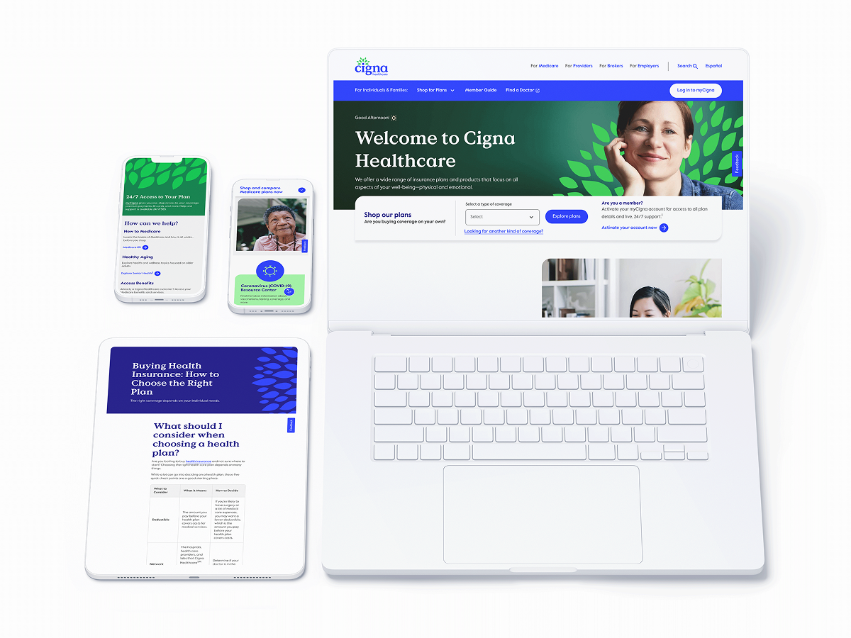
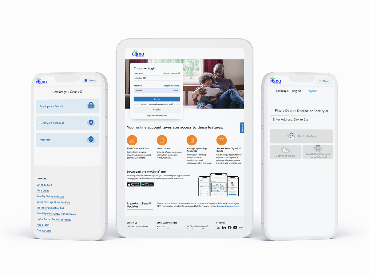
Pilot #1: Cigna Healthcare Homepage
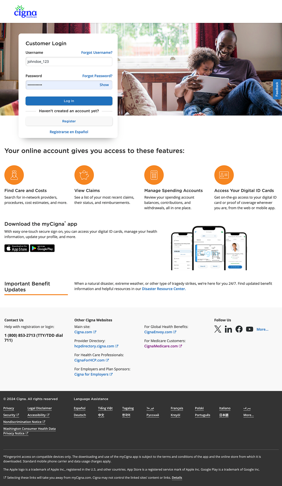
Pilot #2: Patient Login
Pilot #3: Employer Insurance Plans
The Validation
This wasn’t theoretical testing—it was production reality. Component discovery dropped from 47 minutes to 17 minutes (63% faster). Design reviews went from 2.4 iterations to 1 (60% fewer rounds). Designer CSAT scores jumped from 6.2/10 to 8.7/10.
The Proof
The pilot proved the system worked in real conditions. Bugs surfaced and got fixed before wider rollout. Team champions emerged who could evangelize adoption to peers. When the D2C team showed results, adoption became pull, not push.
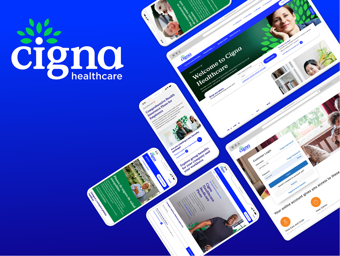
Implement at Scale
The Proof
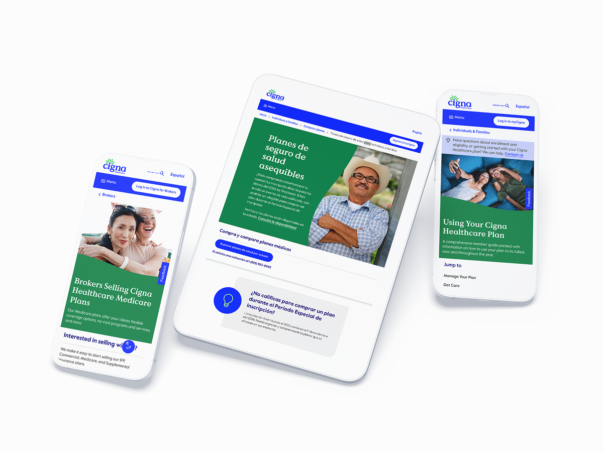
With pilot learnings baked in, we rolled out phased: foundations → components → patterns → legacy migration. 5 product teams adopted the system by month 6.
What we shipped
50+ landing pages, 80+ app screens, 40+ email templates. 500+ total assets updated with new brand identity and design system components.
Why This Process Worked
This wasn’t a typical “rebrand then build system” flow. We recognized that brand and design system are inseparable. By designing them in parallel, we ensured the brand was systematizable—every element had a function, not just a feeling. Accessibility wasn’t an afterthought; it was architecture. And the team (designers and engineers) validated the approach before we scaled it to the entire organization.
The Results
⬇︎ 40%
Reduction in Development Time
⬆︎ 90%
Increase in Design Consistency
⬇︎ 75%
Decrease in Accessibility Bugs
The system wasn’t just adopted – it was defended by teams who’d seen it work.
The process took 8 months. The impact has lasted years.
Wanna see more? let's get in touch
For a deeper-dive Figma presentation that showcases my research, methodology, and outcomes. This includes journey mapping, userflows, data-driven metrics that drive design-thinking and more UX-artifacts.
Enterprise Rebranding Meets Design System Architecture: Building Cigna's Quantum UI
Built, refactored and scaled Cigna’s Quantum UI Design System components inside Figma libraries and establishing a cohesive relationship and operating cadence with engineering and design teams. In addition, we teamed with branding and marketing teams fully modernize digital assets.
Rebranding Initiative Team
Design Systems:
Senior Product Designer (Me)
Senior Application Development Advisor
5 UI Designers (offshore team)
Branding:
Design Operations Manager
VP Brand & Creative
4 Brand Designers (onshore team)
Design Process
Rebranding Cigna’s digital presence in the healthcare space.
Audit the current state of Cigna’s fragmented digital ecosystem.
Design the brand foundation for a more modern, visual identity for both digital assets and UI components.
Build a UI design system using Atomic Design Principles.
Validate with real designers on adjacent teams.
Implement at scale with new, updated brand identity and design system components.
Impact: Key Metrics
⬇︎ 40% reduction in development time
⬆︎ 90% increase in design consistency
⬇︎ 75% decrease in accessibility bugs
The Transformation
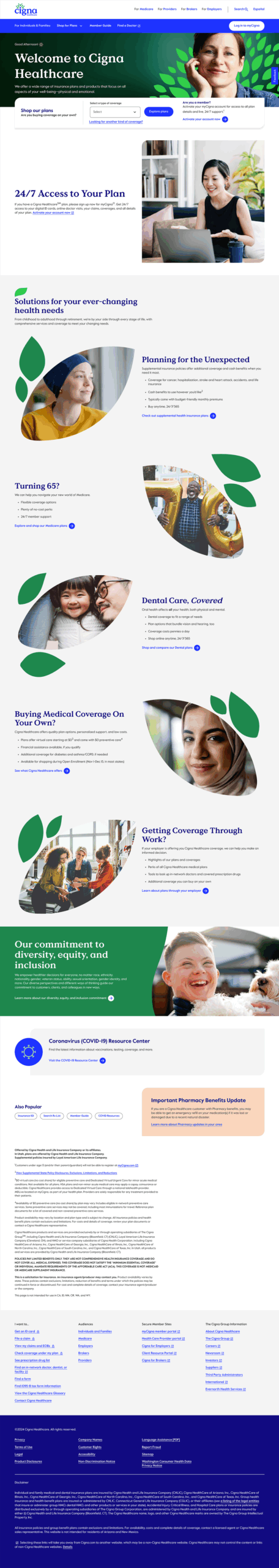
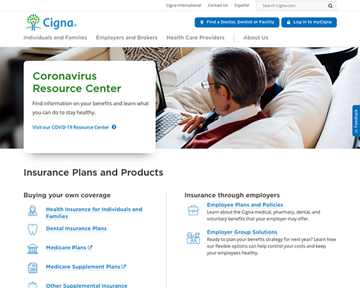
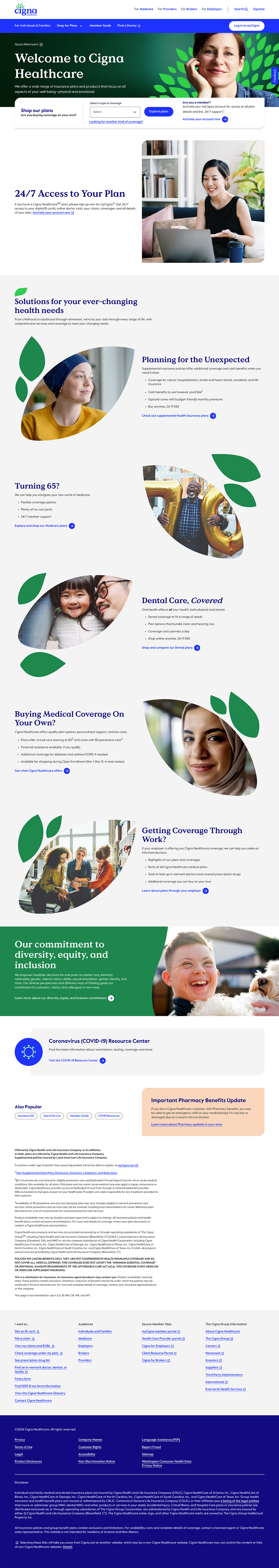
Old Cigna UI Design – COVID 2020
Updated UI Cigna Design – Post-COVID
Where to Start?
Audit Stage
Prior to this team forming, Cigna had no official UI Design System: Components were designed manually in Figma by siloed design teams within the organization.
After running an audit on a handful of categories, some key notable observations were:
Foundations and general maintenance – colors, typography, states, grids and the basics
Figma architecture – are the screens laid out intuitively? Are they matching developer semantics?
Components – which components are the most needed and most used?
Considerations
Working on a small team as the lead for design systems meant that I had some limited time developing the Figma side of the design system. I couldn’t spend months of developing the perfect strategy, so I had to take an iterative (very iterative) approach. Thankfully, Engineering had standardized many of the foundations such as color, scale, grid and icons so I had a solid base to work off of.
Partnering with engineering and design leadership stakeholders, we strived towards just getting the information in one centralized area for designers and just getting the information out there.
Setting Up the Rebranding Foundation
The Context
Cigna was undergoing a complete rebranding overhaul to modernize its visual identity. The old logo was outdated; their visual language didn’t represent a forward-thinking, growth-oriented healthcare company.
What we built
A modern visual identity where every element served double duty—working as both brand asset and UI component. The leaf motif became a functional design system piece. The logo symbolized patient-centricity (“i” for individual) and growth (encircling leaves forming a tree).
Cigna Healthcare Guidelines p.79
Cigna Healthcare Guidelines p.63
Cigna Healthcare Guidelines p.72
Cigna Healthcare Guidelines : 50
Cross-functional Collaboration
We involved the brand and marketing teams from day one, taking their brand research, color explorations, and typography hierarchy—including leaf motif work originally developed for print—and converted them into scalable system components validated against WCAG 2.1.
This collaborative translation turned marketing’s one-way brand assets into bidirectional design system components that worked across digital products, email, landing pages, and physical touchpoints.
Cigna Healthcare Guidelines p.59
Cigna Healthcare Guidelines p.94
The Strategy
Rather than design brand separately then hand off to product, we grew brand and design system together. Every color, icon, and typographic choice was accessibility-compliant from the start—no retrofitting later.
Building the Component System
What we shipped
200+ components organized using Atomic Design principles. We consolidated scattered. Figma files into one source of truth. Each component came with interactive states, accessibility attributes, and usage documentation. Semantic naming between Figma and code meant designers and engineers spoke the same language.
Cigna UI Components - Foundations
Cigna UI Design System - Components
Cigna UI Design System - Patterns
Design-to-Development Handoff
Figma component names matched React component names matched BEM class structures—eliminating translation errors and reducing back-and-forth between design and engineering. Designers documented component variants using the same language engineers used to build them.
BEM-labeled color tokenization in Figma
BEM-labeled text tokenization in Figma
The Multiplier
Product teams across D2C, B2B, and SaaS could immediately access consistent, pre-built components instead of creating bespoke solutions. Design and engineering spoke the same language, eliminating implementation surprises.
Pilot with a Real Product Team
What we did
Rather than force adoption across all teams, we selected the D2C product team (highest design velocity) as our pilot. They redesigned 3 screens using only Quantum UI components with zero custom work allowed.
Pilot #1: Cigna Homepage
Pilot #2: Patient Login
Pilot #3: Employer Insurance
The Validation
This wasn’t theoretical testing—it was production reality. Component discovery dropped from 47 minutes to 17 minutes (63% faster). Design reviews went from 2.4 iterations to 1 (60% fewer rounds). Designer CSAT scores jumped from 6.2/10 to 8.7/10.
The Proof
The pilot proved the system worked in real conditions. Bugs surfaced and got fixed before wider rollout. Team champions emerged who could evangelize adoption to peers. When the D2C team showed results, adoption became pull, not push.
Implement at Scale
The Proof
With pilot learnings baked in, we rolled out phased: foundations → components → patterns → legacy migration. 5 product teams adopted the system by month 6.
What we shipped
50+ landing pages, 80+ app screens, 40+ email templates. 500+ total assets updated with new brand identity and design system components.
Why This Process Worked
This wasn’t a typical “rebrand then build system” flow. We recognized that brand and design system are inseparable. By designing them in parallel, we ensured the brand was systematizable—every element had a function, not just a feeling. Accessibility wasn’t an afterthought; it was architecture. And the team (designers and engineers) validated the approach before we scaled it to the entire organization.
The Results
⬇︎ 40%
Reduction in Development Time
⬆︎ 90%
Increase in Design Consistency
⬇︎ 75%
Decrease in Accessibility Bugs
The system wasn’t just adopted – it was defended by teams who’d seen it work.
The process took 8 months. The impact has lasted years.
Wanna see more? let's get in touch
For a deeper-dive Figma presentation that showcases my research, methodology, and outcomes. This includes journey mapping, userflows, data-driven metrics that drive design-thinking and more UX-artifacts.
Enterprise Rebranding Meets Design System Architecture: Building Cigna's Quantum UI
Built, refactored and scaled Cigna’s Quantum UI Design System components inside Figma libraries and establishing a cohesive relationship and operating cadence with engineering and design teams. In addition, we teamed with branding and marketing teams fully modernize digital assets.
Rebranding Initiative Team
Design Systems:
Senior Product Designer (Me)
Senior Application Development Advisor
5 UI Designers (offshore team)
Branding:
Design Operations Manager
VP Brand & Creative
4 Brand Designers (onshore team)
Design Process
Rebranding Cigna’s digital presence in the healthcare space.
Audit the current state of Cigna’s fragmented digital ecosystem.
Design the brand foundation for a more modern, visual identity for both digital assets and UI components.
Build a UI design system using Atomic Design Principles.
Validate with real designers on adjacent teams.
Implement at scale with new, updated brand identity and design system components.
Impact: Key Metrics
⬇︎ 40% reduction in development time
⬆︎ 90% increase in design consistency
⬇︎ 75% decrease in accessibility bugs
The Transformation
Old Cigna UI Design – COVID 2020
Updated UI Cigna Design – Post-COVID
Where to Start?
Audit Stage
Prior to this team forming, Cigna had no official UI Design System: Components were designed manually in Figma by siloed design teams within the organization.
After running an audit on a handful of categories, some key notable observations were:
Foundations and general maintenance – colors, typography, states, grids and the basics
Figma architecture – are the screens laid out intuitively? Are they matching developer semantics?
Components – which components are the most needed and most used?
Considerations
Working on a small team as the lead for design systems meant that I had some limited time developing the Figma side of the design system. I couldn’t spend months of developing the perfect strategy, so I had to take an iterative (very iterative) approach. Thankfully, Engineering had standardized many of the foundations such as color, scale, grid and icons so I had a solid base to work off of.
Partnering with engineering and design leadership stakeholders, we strived towards just getting the information in one centralized area for designers and just getting the information out there.
Setting Up the Rebranding Foundation
The Context
Cigna was undergoing a complete rebranding overhaul to modernize its visual identity. The old logo was outdated; their visual language didn’t represent a forward-thinking, growth-oriented healthcare company.
What we built
A modern visual identity where every element served double duty—working as both brand asset and UI component. The leaf motif became a functional design system piece. The logo symbolized patient-centricity (“i” for individual) and growth (encircling leaves forming a tree).
Cigna Healthcare Guidelines p.79
Cigna Healthcare Guidelines p.63
Cigna Healthcare Guidelines p.50
Cigna Healthcare Guidelines p.72
Cross-functional Collaboration
We involved the brand and marketing teams from day one, taking their brand research, color explorations, and typography hierarchy—including leaf motif work originally developed for print—and converted them into scalable system components validated against WCAG 2.1.
This collaborative translation turned marketing’s one-way brand assets into bidirectional design system components that worked across digital products, email, landing pages, and physical touchpoints.
Cigna Healthcare Guidelines p.59
Cigna Healthcare Guidelines p.94
The Strategy
Rather than design brand separately then hand off to product, we grew brand and design system together. Every color, icon, and typographic choice was accessibility-compliant from the start—no retrofitting later.
Building the Component System
What we shipped
200+ components organized using Atomic Design principles. We consolidated scattered. Figma files into one source of truth. Each component came with interactive states, accessibility attributes, and usage documentation. Semantic naming between Figma and code meant designers and engineers spoke the same language.
Cigna UI Components - Foundations
Cigna UI Design System - Components
Cigna UI Design System - Patterns
Design-to-Development Handoff
Figma component names matched React component names matched BEM class structures—eliminating translation errors and reducing back-and-forth between design and engineering. Designers documented component variants using the same language engineers used to build them.
BEM-labeled color tokenization in Figma
BEM-labeled text tokenization in Figma
The Multiplier
Product teams across D2C, B2B, and SaaS could immediately access consistent, pre-built components instead of creating bespoke solutions. Design and engineering spoke the same language, eliminating implementation surprises.
Pilot with a Real Product Team
What we did
Rather than force adoption across all teams, we selected the D2C product team (highest design velocity) as our pilot. They redesigned 3 screens using only Quantum UI components with zero custom work allowed.
Pilot #1: Cigna Healthcare Homepage
Pilot #2: Patient Portal Login
Pilot #3: Employer Insurance Plans
The Validation
This wasn’t theoretical testing—it was production reality. Component discovery dropped from 47 minutes to 17 minutes (63% faster). Design reviews went from 2.4 iterations to 1 (60% fewer rounds). Designer CSAT scores jumped from 6.2/10 to 8.7/10.
The Proof
This wasn’t theoretical testing—it was production reality. Component discovery dropped from 47 minutes to 17 minutes (63% faster). Design reviews went from 2.4 iterations to 1 (60% fewer rounds). Designer CSAT scores jumped from 6.2/10 to 8.7/10.
Implement at Scale
The Proof
With pilot learnings baked in, we rolled out phased: foundations → components → patterns → legacy migration. 5 product teams adopted the system by month 6.
What we shipped
50+ landing pages, 80+ app screens, 40+ email templates. 500+ total assets updated with new brand identity and design system components.
Why This Process Worked
This wasn’t a typical “rebrand then build system” flow. We recognized that brand and design system are inseparable. By designing them in parallel, we ensured the brand was systematizable—every element had a function, not just a feeling. Accessibility wasn’t an afterthought; it was architecture. And the team (designers and engineers) validated the approach before we scaled it to the entire organization.
Results
⬇︎ 40%
Reduction in Development Time
⬆︎ 90%
Increase in Design Consistency
⬇︎ 75%
Decrease in Accessibility Design
The system wasn't just adopted - it was defended by teams who'd seen it work
The process took 8 months. The impact has lasted years.
Wanna see more?let's get in touch
For a deeper-dive Figma presentation that showcases my research, methodology, and outcomes.