
Gotta have the password 😉
Incorrect password. Please try again.
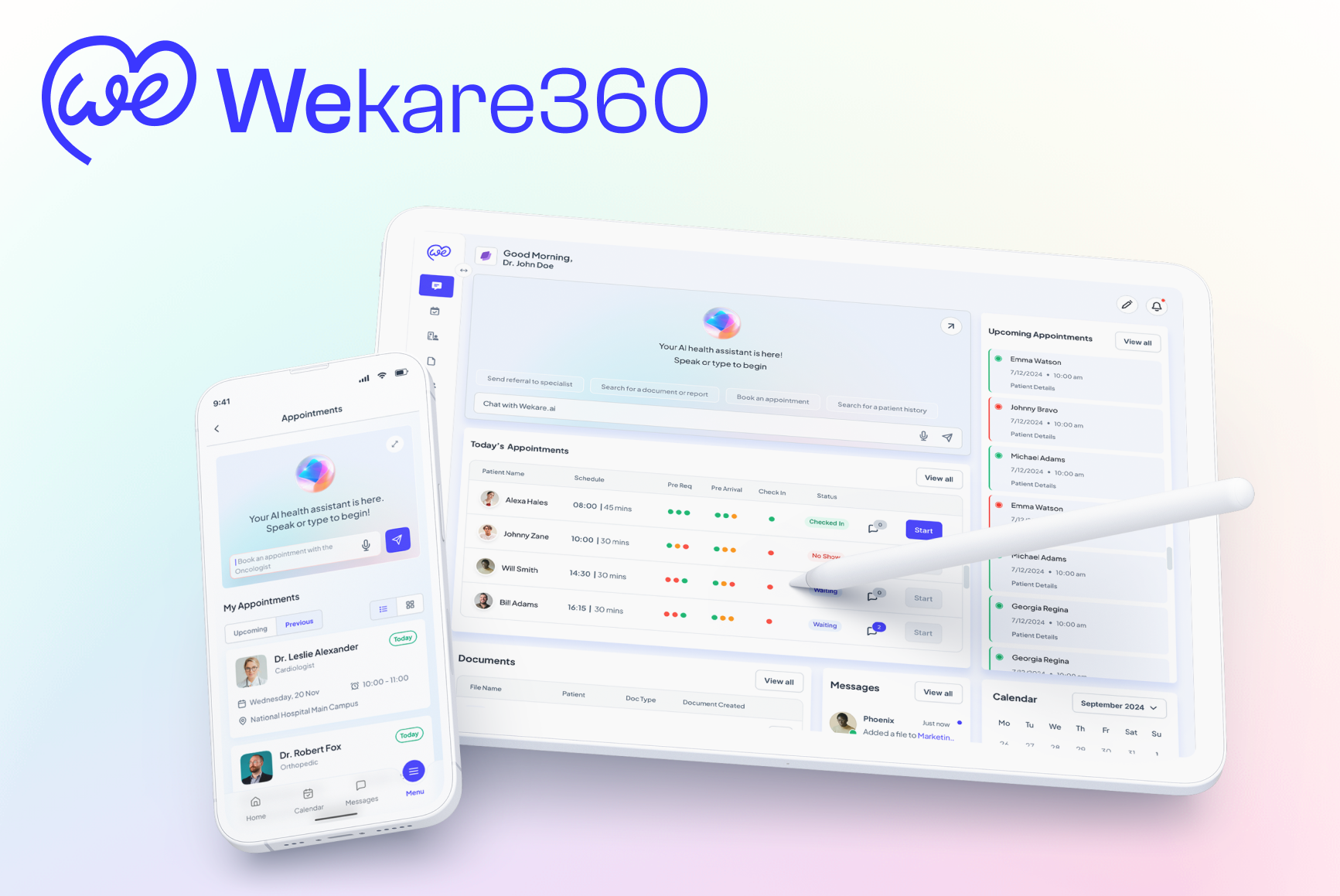


Designing a unified AI-assisted referral workflow for physicians, specialists, and patients
Wekare360 is a 0→1 healthcare AI platform focused on fixing one of the most fragmented parts of the care journey: referrals. Existing workflows force physicians and staff to move across multiple portals, repeat information manually, chase insurance approvals, coordinate records, and manage scheduling with little visibility for themselves or for patients.
As the Founding Designer, I led the design of a unified experience intended to reduce referral friction across providers and patients while making AI-driven workflow support feel usable, trustworthy, and actionable.
This work involved translating an ambitious product vision into an MVP experience across multiple actors: primary care physicians, specialists, staff, and patients. The design challenge was not just making the product “look good,” but turning a high-friction, multi-step, multi-system process into a coherent workflow that could support AI-generated summaries, referral recommendations, messaging, and patient navigation. The aim was to reduce manual work by 80% and referral processing time by 72%.
Snapshot
- Role: Founding Designer
- Stage: 0→1 MVP
- Team: Founder/CEO, AI Lead & Architect, Product/Healthcare Architect, Product Manager & Architect, Me
- Users: Primary Care Physicians, Specialists, Patients
- Market context: U.S. referral management market framed at $4B growing to $11B by 2030
- Goal: Reduce referral processing time by 72% and manual tasks by 80%
My approach: AI-driven Lean UX process


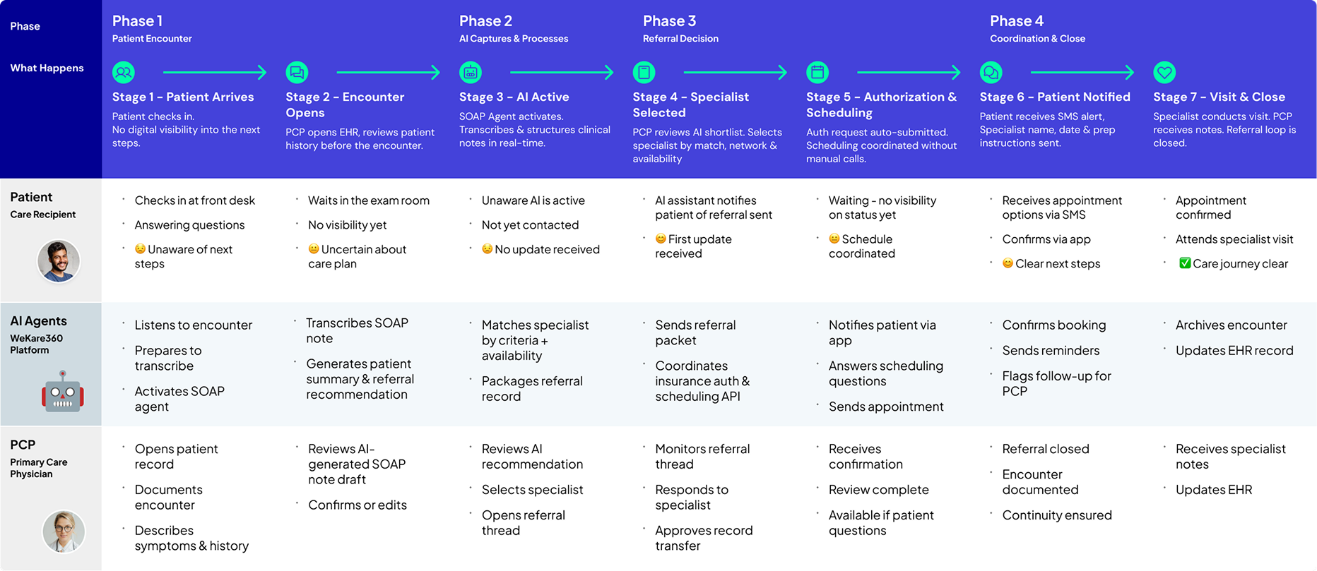
Claude personas + Problem statement + Service Blueprint

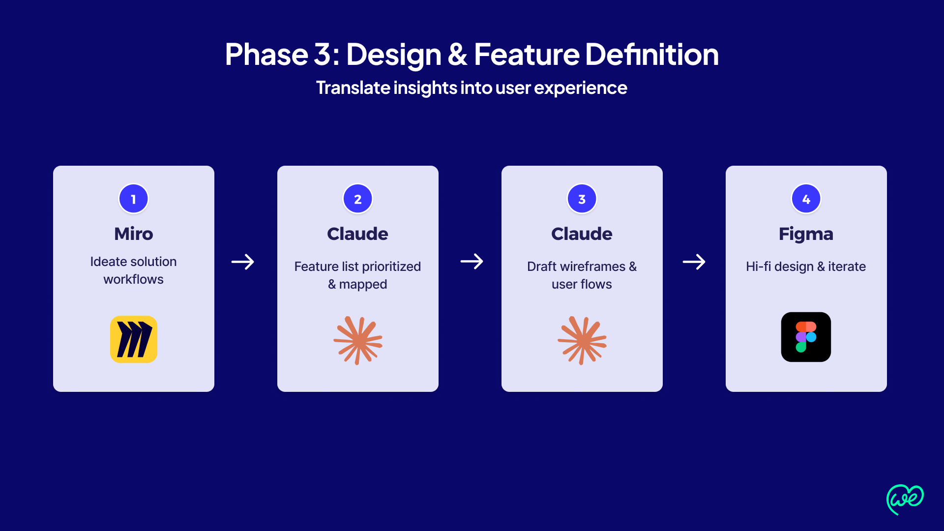
Miro ideation + Claude features +
Claude userflows + Figma Hi-Fi


4-5 day sprints + Real feedback + 3-4 cycles/month

Synthesis App Store & Launch
HIPAA compliance + Testflight + Apple Review + Live
Why this mattered
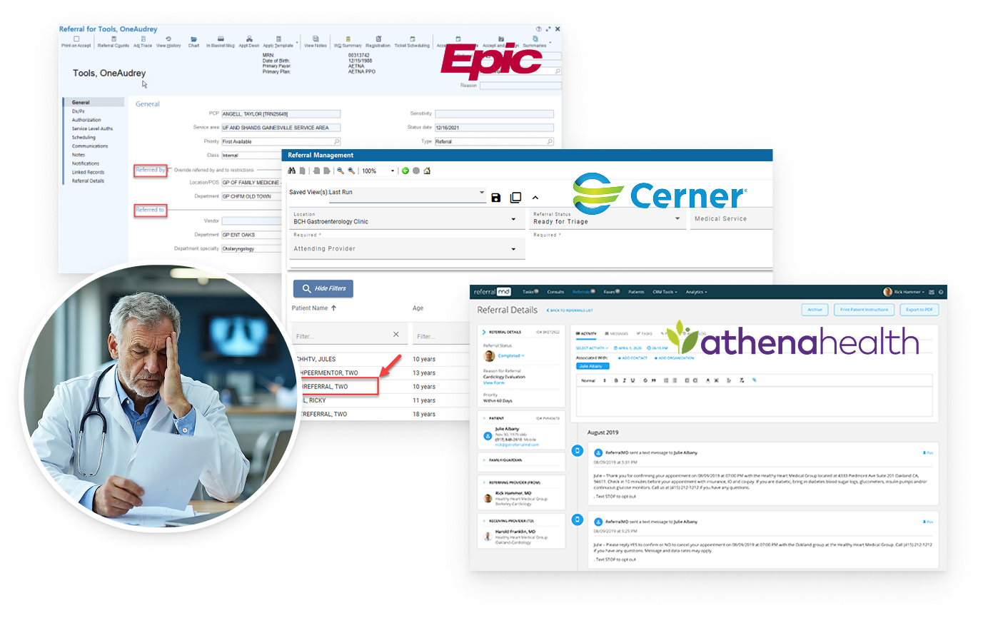
50% of referrals go uncompleted
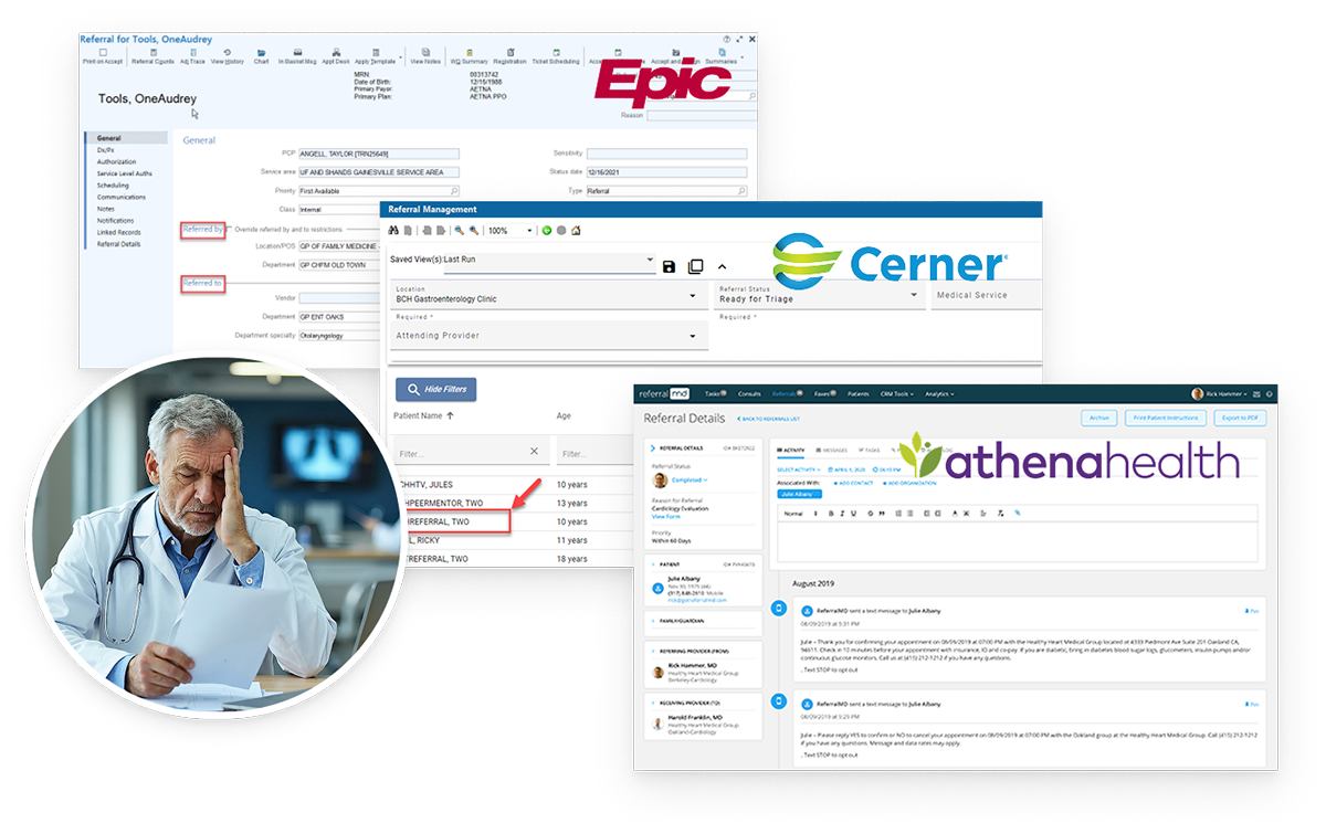
Day-to-day consequences existed with the current EHR systems: system fragmentation, time spent on paperwork instead of care, incomplete referrals, denied claims, no-shows, and confusion across patient journeys.
Platform fragmentation
Physicians and staff were expected to navigate 3-5 separate systems, re-enter information manually, coordinate records, manage insurance steps, and keep patients informed along the way. Each referral involved 10-15 manual steps and consuming up to 2 hours of staff time, with poor transparency across PCPs, specialists, and patients. These inefficiencies contributed to delays in specialist care, confusion for patients, and financial leakage for providers.
Financial Impact
Practices lose $200M-$500M annually to incomplete referrals, denials, and no-shows. Physicians spend up to 30% of their time on administrative tasks, fueling burnout.
The UX perspective
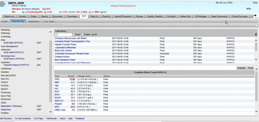
The challenge was significant: users were not just navigating one bad interface. They were being forced through a fragmented EHR ecosystem with too many different touchpoints and too little clarity navigating between them.
My role
As Founding Designer, I led the design of the product experience from early concept into MVP-level workflows. My work focused on shaping the interaction model for physicians and patients, defining how referral orchestration would appear in the interface, and translating product and AI ambition into flows that people could realistically understand and use.
I was also working in a highly cross-functional, early-stage environment where the product vision, AI architecture, and implementation details were still evolving. A large part of my role was helping make that complexity visible and usable.
This included designing:
- Physician-side referral workflows
- Encounter recording and SOAP-note related flows
- Patient summary and recommendation flows
- Patient-side appointment and information flows
- Messaging and coordination touchpoints
- The overall structure of the MVP experience across mobile and desktop patterns shown in the deck
As the Founding UX/UI Designer, it was my task to translate a complex AI vision into a coherent 0 ➝ 1 MPV by conducting user research, mapping a service blueprint and designing a user experience for physicians, specialists and patients that made AI feel useful and not opaque
🎯 Design challenge
The design challenge was bigger than creating a physician dashboard or a patient app.
The real challenge was to design one coherent experience across multiple users, each with different user needs, responsibilities, and mental models, while also integrating AI into a sensitive healthcare workflow.
⏱️ Time & resource constraints
One designer supporting a full cross-functional team with no design backup
Moving Goalposts
Requirements and architecture were still evolving throughout the design process
MVP Complexity at High-Stakes Domain
Had to simplify a multi-system, AI-driven healthcare workflow fast – without cutting corners that matter
⚖️ How I advocated for users & balanced priorities
Designed for people, not portals
Every decision traced back to reducing real friction, not modernizing UI
Three user groups, One product
Balanced conflicting needs through shared logic rather than three separate experiences
Kept humans in the loop
Embedded AI where it reduced the burden without removing physician control or trust
How WeKare360 AI helps its users

For primary care physicians (PCPs)
- Cuts administrative costs
- Faster insurance approvals = Faster payments
- Keep more patients in-network
Needs: Faster referral processing, reduced administrative burden
Pain Points: Incomplete referrals, slow insurance approvals and payments
Goals: Focus on patient care, not paperwork

For specialists
- More completed referrals = more revenue
- Reduce revenue loss from no shows
- Fewer fuplicate tests = lower costs
Needs: Complete patient context, efficient scheduling
Pain Points: Incomplete referrals, duplicate tests, no-shows
Goals: Maximize revenue, improve patient outcomes

For patients
- Consolidates multi-clinic records, appointments and messaging
- 24/7 intelligent health assistant
- Real-time status tracking of referrals and appointments
My design approach
#1 – Held user research sessions at various clinics in the Corpus Christi area
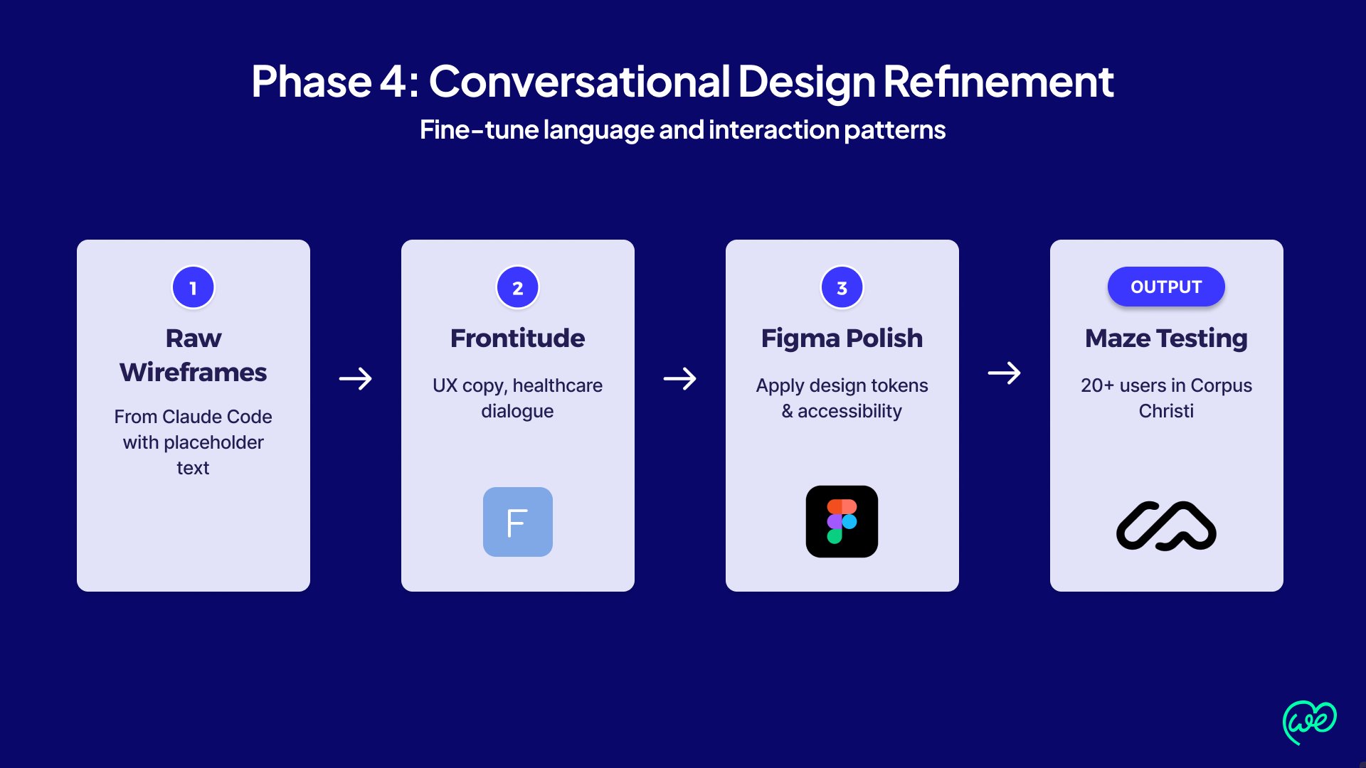
#2 – Synthesized research findings into visual artifacts
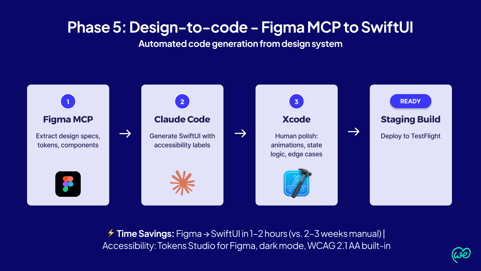
#3 – Used Claude Code and Figma MCP to create mid-fidelity vibe-coded prototypes
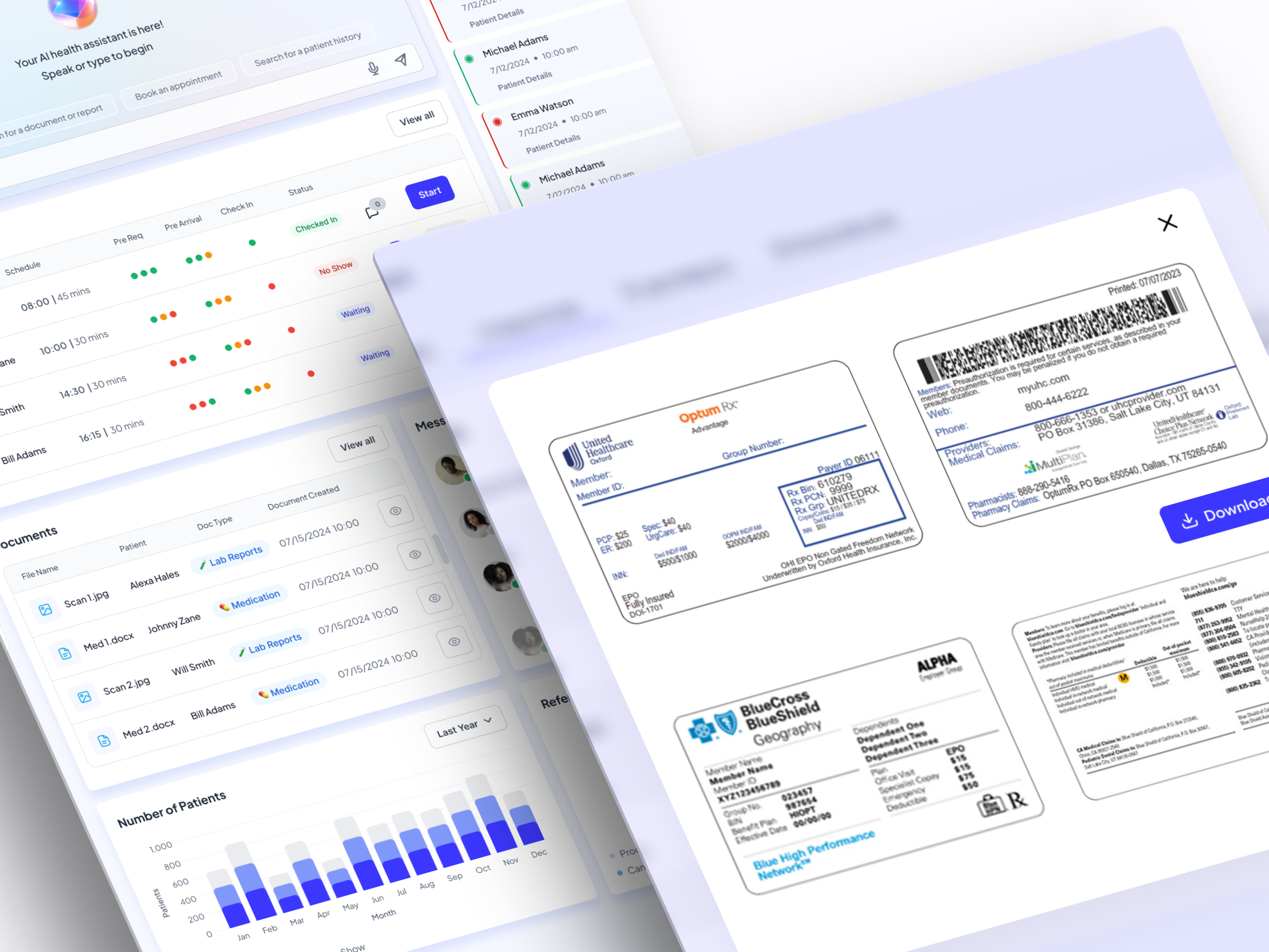
#4 – Used my human designer’s eye to fine-tune those prototypes
🔍 User Research Finding:
After interviewing PCPs, Specialists and Patients locally at a local hospital in Corpus Christi, Texas – the following user types and their needs were mapped out to give us a starting point.
👩⚕️ Primary Care Physician
Need: Speed + Context
Design approach
Unified encounter → AI-summary → Referral flow Every AI step reduces admin. work without removing clinical judgement.
→ AI-generated referral recommendation
→ Single referral discussion thread
👨⚕️ Specialist
Need: Speed + Context
Design approach
Richer referral context on intake. Consolidated communication thread with PCP. Clearer scheduling and record access.
→ Direct messaging thread with PCP
→ Structured appointment + record view
👨🏽 Patient
Need: Speed + Context
Design approach
Consolidated appointment view, AI assistant for next-step questions, previous encounter summaries accessible on demand.
→ AI assistant answers scheduling questions
Synthesized research findings ito visual artifacts

Claude Prompt:
Summarize the key findings from this clinical user research session. Focus on the user’s role (e.g. PCP, specialist, or medical scheduler), main goals, unmet needs, and critical pain points.
Use this for a high-level overview of a 1-on-1 interview or usability session.
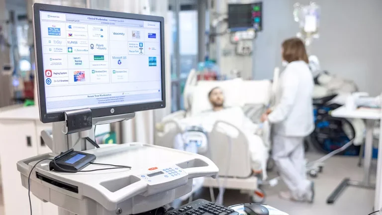

AI Agent reduces friction. The physician stays in control. Patients receive more seamless care.
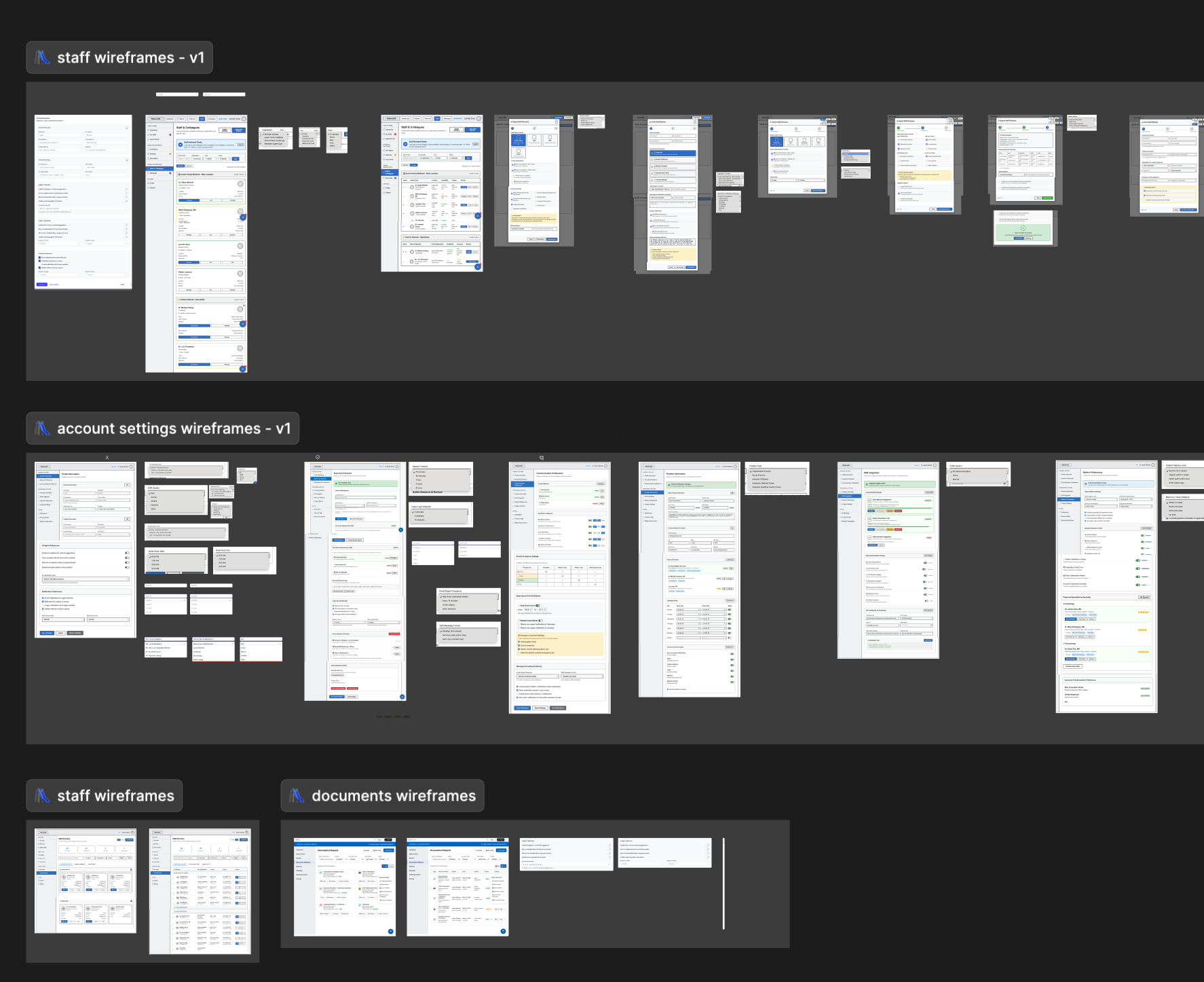
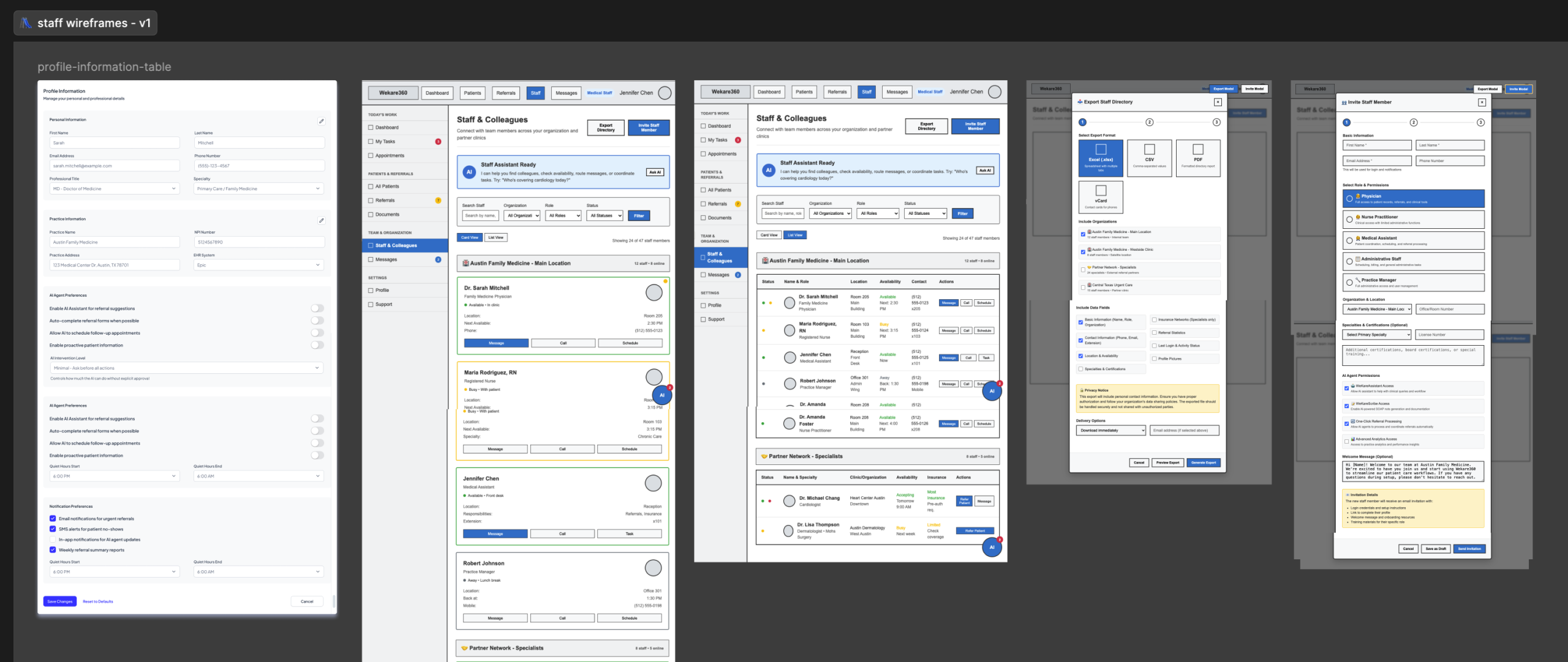
Used Claude Code and Figma MCP to create mid-fidelity vibe-coded prototypes

Claude Code Prompt:
Based on the transcription and meeting notes, take these mockups in prototype mode and create a detailed prototype for the Document Screen that addresses:
- All required display elements mentioned in the meeting
- Integration with the referral workflow (especially with the chat function mentioned).
- Design patterns for differentiating between external documents and internal reports
- Information architecture recommendations
- A wireframe showing both grid and list view options
This is for WeKare360’s physician portal where doctors need to manage patient documents efficiently while coordinating referrals
Used my human designer’s eye to fine-tune those prototypes
Main use cases
#1 – PCP sends referral to a specialist
#2 – PCPs and specialists share patient charts seamlessly
#3 – Patients get quick notifications on their appointments, clinic records, and prescriptions

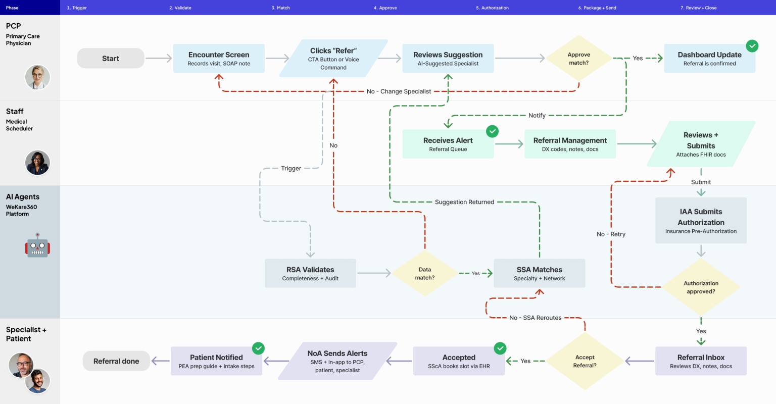
Primary care physician (PCP) creates an AI-assisted referral
PCP transcribes SOAP notes
Primary care physician (PCP) records the patient encounter and SOAP notes are automatically transcribed
SOAP notes generate referrals
Once the Encounter Summary picks up on the patient’s needs, referrals are automatically generated
PCP transcribes, refers, and connects - automatically
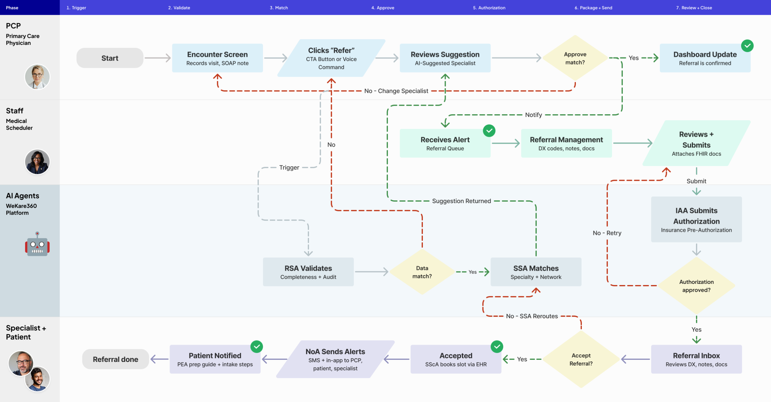
The PCP records the patient encounter, and SOAP notes are automatically transcribed. Once the Encounter Summary picks up on the patient’s needs, referrals are automatically generated. The PCP then selects a referral specialist, opening a chat window that connects the PCP, specialist, and patient in one conversation.
User stories
Primary Care Physician (PCP)
As a primary care physician (PCP), I want to initiate a referral with a single click during or after an encounter so that I can reduce the time I spend on administrative tasks and focus on patient care.
As a specialist, I want to receive a complete referral packing including demographics, insurance info, DX codes, and clinical notes so that I can make an informed accept or reject decision without requesting additional information
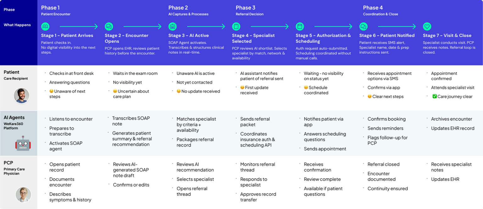
The physician encounter-to-referral flow became especially important because it tied together documentation, summarization, recommendation, specialist selection, and communication.

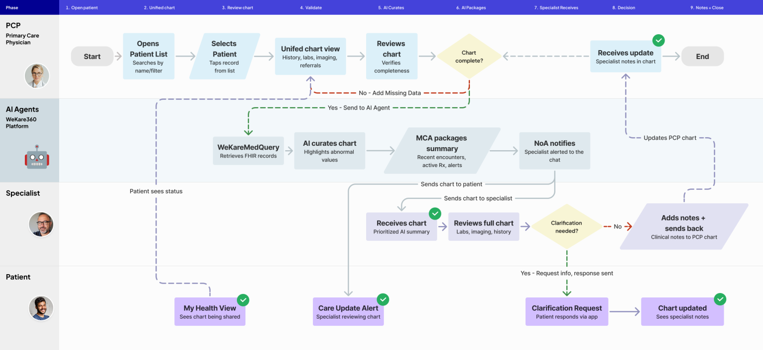
Patient Management Portal for PCPs and specialists to share patient charts seamlessly
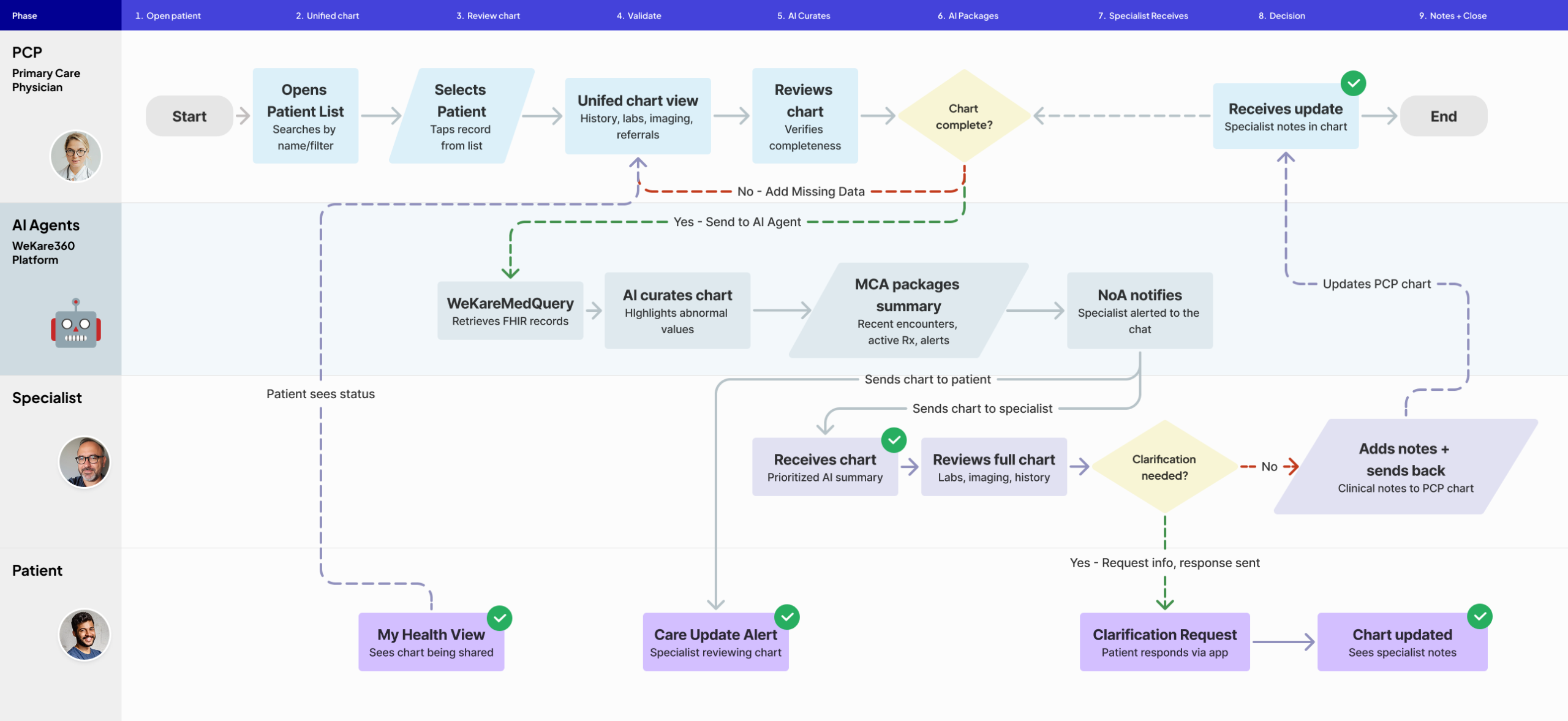
PCP opens unified patient chart
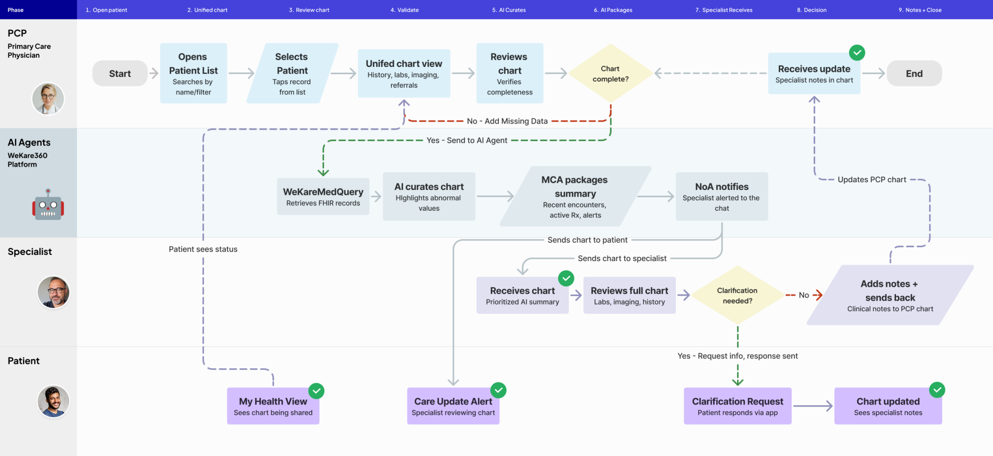
A single view consolidates visit history, labs, imaging, and prior referrals across all providers
Unified chart drives referrals and connects care teams
User stories
Primary Care Physician (PCP)
As a primary care physician (PCP), I want to open a single unified patient chart that consolidates visit history, labs, imaging, and prior referrals across all providers so that I can have complete clinical context before initiating a chart share with a specialist.
As a specialist, I want to receive an AI-curated patient summary that highlights abnormal values, recent encounters, and active medications so that I can quickly orient myself to the case without manually searching through a full chart.
The referral process entails: the PCP completing the chart via SOAP note transcription and the specialist receiving the patient’s vital information for seamless communication for efficient treatment.

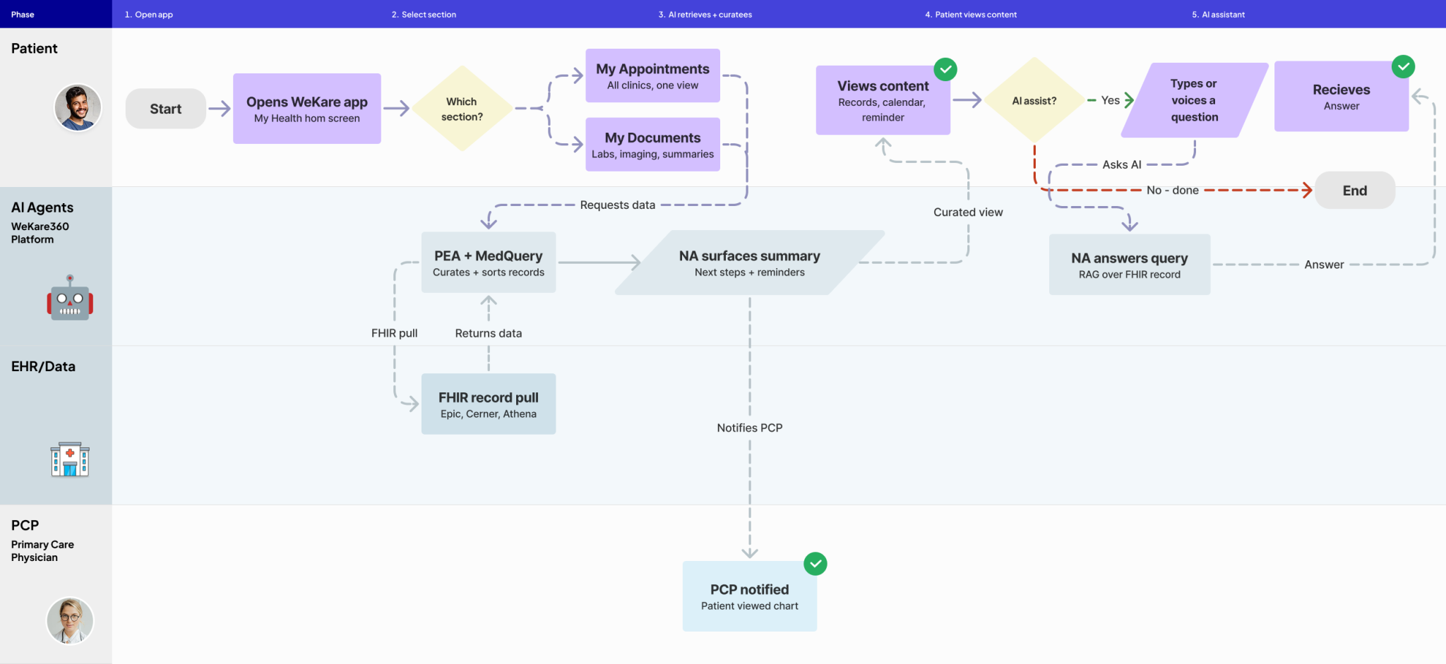
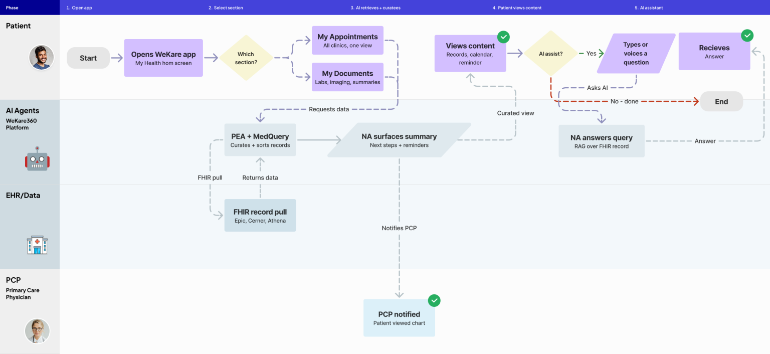
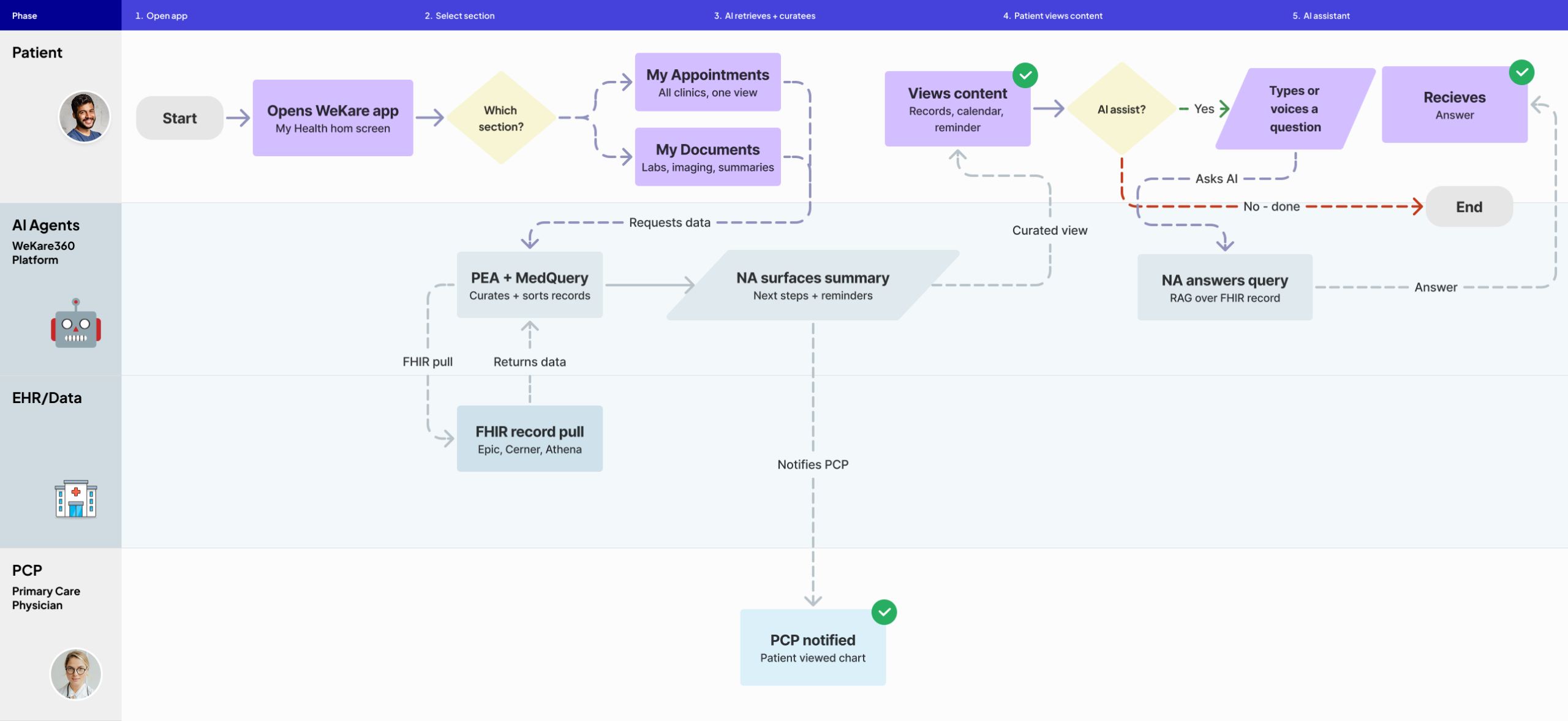
Patients can easily access their appointments and multi-clinic records without delays or confusion
One-tap appointment visibility
All appointments across every clinic and provider surface in a single calendar view – no portal-switching required.
Unified health records on demand
Labs, imaging, visit summaries, and referral documents from all providers live in one place, instantly accessible.
Ask anything, get answers instantly
One tap opens the WeKare AI assistant – patients ask, their chart answers.
One place for appointments, records, and answers
All appointments, records, and documents live in one place across every provider. One tap opens the WeKare AI assistant so patients can ask their chart anything.
Patient User Story
Patient
As a patient, I want to ask the WeKare AI assistant questions about my chart in plain language so that I can get instant answers about my care without waiting to speak to my doctor.
As a patient, I want to see all my appointments and health records from every provider in one app so that I never have to log into multiple portals or chase down my own information.
On the patient side, the strongest early value was transparency and actionability: seeing appointments, asking questions, accessing previous information, and understanding what happened next.
Cross-functional collaboration
This was not a purely design-led exercise. The product was being shaped alongside AI, product, architecture, and healthcare perspectives. Working as the founding designer meant I had to translate between these layers: technical ambition, healthcare workflow complexity, and user comprehension.
The AI and architecture side of the product described a sophisticated orchestration model involving referral handling, specialist matching, insurance authorization, record packaging, scheduling, patient engagement, and notifications.
My role was to help turn that system-level ambition into user-facing moments that were understandable, structured, and usable. That required close collaboration with product and technical stakeholders so the UX reflected both real operational constraints and the intended product value.
Rather than designing in a vacuum, I used workflows as a shared decision-making tool. Flows made it easier to align around where AI appeared, where humans needed control, what the MVP should include, and what would remain future-state.
Influence and product shaping
As the founding designer, my role was not limited to interface polish. I helped shape how the product would be understood and experienced.
A lot of startup health-tech material can stay at the level of architecture, features, and business promise. The more important design contribution was helping turn that into a coherent experience people could actually picture using. That meant grounding product discussions in flows, screens, user moments, and workflow simplification rather than abstract capability.
Instead of only describing the platform at a conceptual level, it begins to show concrete experiences such as encounter recording, summary generation, recommendation display, referral discussion, patient appointment booking, and access to previous encounter information.
That movement from concept to visible workflow is one of the strongest design contributions in a 0→1 setting.
Key decisions and tradeoffs
Several decisions shaped the work:
1. Prioritize workflow clarity over feature breadth
In a product with many moving parts, the bigger risk was overwhelming users. Prioritizing the core referral journey helped create coherence.
2. Embed AI into task flows rather than treating it as a separate feature layer
3. Support multiple user groups with shared logic, not identical interfaces
4. Use MVP scope to prove simplification first
At 0→1 stage, the right goal was not to design everything at once, but to make the most painful workflow more understandable and actionable.
5. Balance automation with user trust
🤖 How AI plays a role
Designing AI into the workflow
A major part of the Wekare360 vision depended on AI, but the design challenge was not simply to “add AI features.” It was to make AI useful at the exact points where the healthcare referral process was already breaking down.
The product vision combined several AI-assisted capabilities across the workflow: encounter transcription, patient summary generation, referral recommendations, specialist matching, scheduling support, patient messaging, and assistant-driven guidance. This was a multi-agent orchestration model, but from a UX perspective, my job was to translate that backend complexity into moments users could actually understand and act on.
That meant treating AI as part of the workflow rather than as a separate layer. In the physician flow, AI-supported steps such as transcription, summary creation, and referral recommendation appeared within the encounter-to-referral journey instead of being surfaced as disconnected tools.
In the patient experience, AI was positioned as an assistant that could help users book appointments, retrieve prior information, and navigate next steps without forcing them through multiple disconnected systems.
Trust, review, and human oversight
Because Wekare360 sits inside a healthcare workflow, trust was a key design consideration.
AI-generated content in this context could not feel opaque or overly magical. Outputs like transcriptions, patient summaries, referral suggestions, and assistant responses had to appear in places where users could understand what had been generated and what they needed to do next. That shaped how I thought about the UI: AI needed to support human action, not obscure it. The physician still had to move through the encounter flow, review what was surfaced, choose a specialist, and continue the referral process intentionally. The patient still needed clear next steps, not just automation happening invisibly in the background.
If users cannot tell what the system is helping with, what they can rely on, or what they need to confirm themselves, trust breaks quickly. In the patient experience, AI was positioned as an assistant that could help users book appointments, retrieve prior information, and navigate next steps without forcing them through multiple disconnected systems.
At this stage of the product, the strongest UX contribution was making those AI-supported moments legible and actionable. Rather than presenting the system as fully autonomous from the user’s perspective, the design kept humans visibly inside the loop at key points of task completion and decision-making.
🏆 Measurable Impact
App released on 4/2/26
0→1 MVP
The work translated a complex healthcare AI vision into concrete MVP flows spanning physician encounter handling, SOAP-note related processes, referral generation, specialist coordination, patient messaging, and appointment-related interactions
$18k+ increase
In physician monthly revenue
↓ 80% reduction in manual tasks
For primary care physicians (PCPs), specialists, front-desk schedulers and patients
↓ 72% reduction in referral processing time
Increased patient bookings from primary care physicians (PCPs) to specialists
Reflection
The biggest lesson from Wekare360 was that AI products in healthcare cannot rely on technical sophistication alone. The experience has to reduce ambiguity for users at the exact points where the system is trying to save them time. In this project, that meant thinking carefully about where generated outputs appeared, how the referral workflow moved from encounter to coordination, and how different users could stay oriented in a complicated process.
If I were continuing this work, I would want to deepen the explicit trust layer even further: making clearer when AI is generating versus confirming, where users can verify or correct content, and how confidence and accountability are communicated across clinician and patient experiences.
What this project says about how I work
This project reflects how I approach 0→1 product design in complex domains: I do not start with interface styling or feature checklists. I start by understanding where a workflow is breaking down, which actors are involved, where trust is fragile, and where simplification can create the most leverage.
On Wekare360, that meant translating a fragmented healthcare service problem and an ambitious AI platform vision into a more coherent user experience for physicians and patients.
It also reinforced how important it is to make AI feel like a practical assistant inside the workflow rather than a layer of abstraction users are expected to trust blindly.
Designing a unified AI-assisted referral workflow for physicians, specialists, and patients
Wekare360 is a 0→1 healthcare AI platform focused on fixing one of the most fragmented parts of the care journey: referrals. Existing workflows force physicians and staff to move across multiple portals, repeat information manually, chase insurance approvals, coordinate records, and manage scheduling with little visibility for themselves or for patients.
This work involved translating an ambitious product vision into an MVP experience across multiple actors: primary care physicians, specialists, staff, and patients. The design challenge was not just making the product “look good,” but turning a high-friction, multi-step, multi-system process into a coherent workflow that could support AI-generated summaries, referral recommendations, messaging, and patient navigation. The aim was to reduce manual work by 80% and referral processing time by 72%.
Snapshot
- Role: Founding Designer
- Team: 0→1 MVP
- Scope: Founder/CEO, AI lead & architect, product/healthcare architect, product manager & architect, me
- Users: Primary care physicians, specialists, patients
- Timeline: 13 months
- Market context: U.S. referral management market framed at $4B growing to $11B by 2030
- Goal: Reduce referral processing time by 72% and manual tasks by 80%
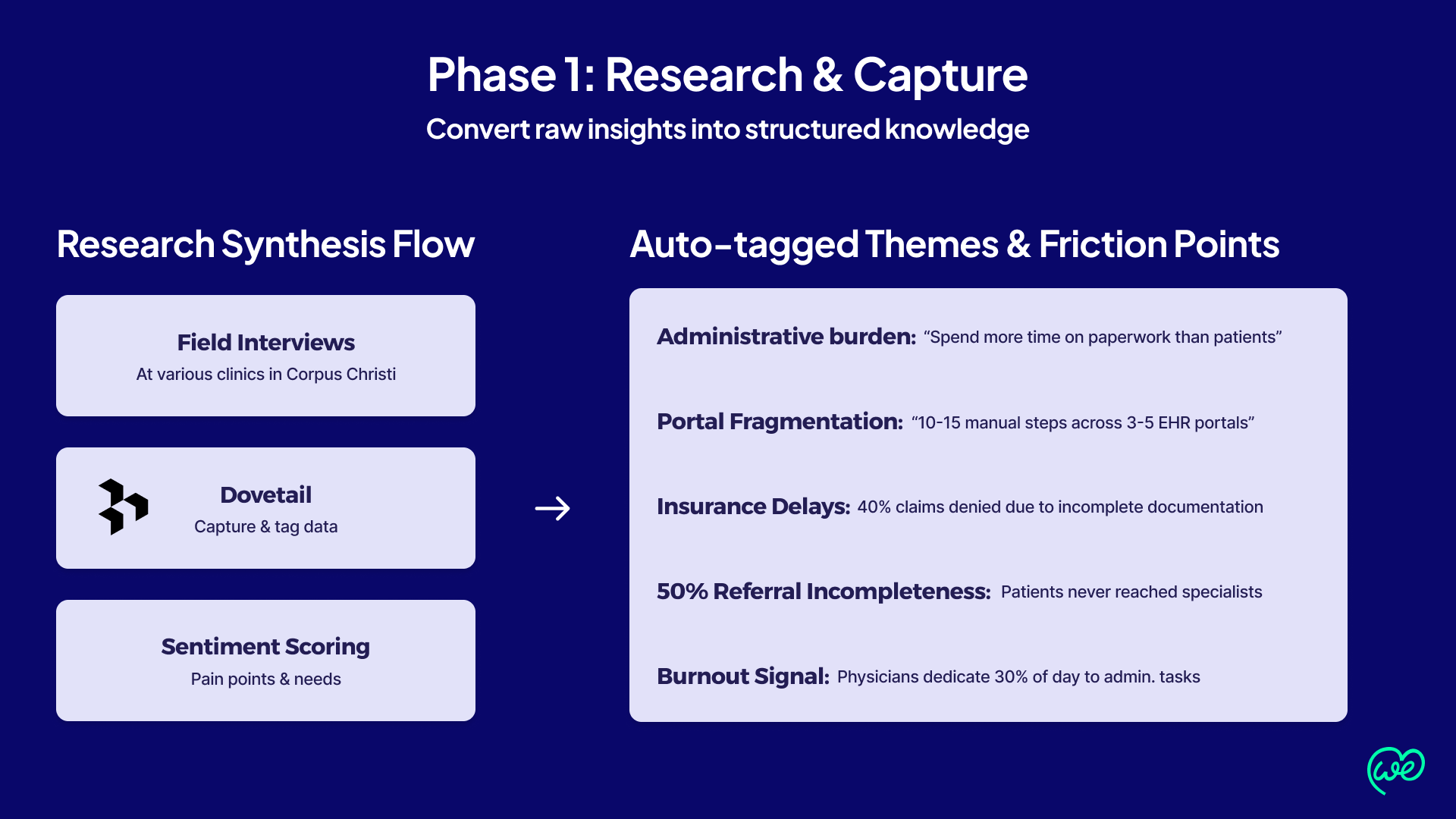
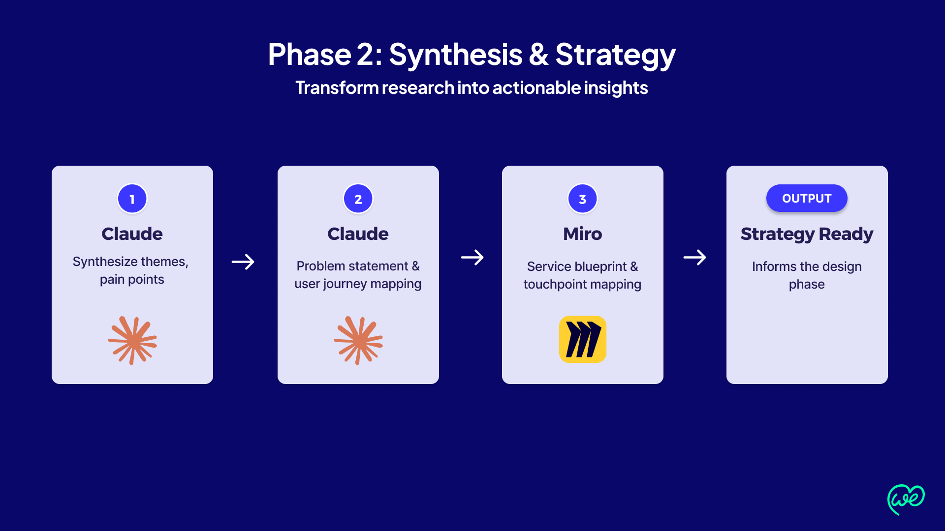
My approach: AI-driven Lean UX process
Why this mattered
🛑 The underlying problem was not simply “inefficient EHR software.” The referral process itself is broken.
50% of referrals go uncompleted
Day-to-day consequences existed with the current EHR systems: system fragmentation, time spent on paperwork instead of care, incomplete referrals, denied claims, no-shows, and confusion across patient journeys.
Platform fragmentation
Physicians and staff were expected to navigate 3-5 separate systems, re-enter information manually, coordinate records, manage insurance steps, and keep patients informed along the way. Each referral involved 10-15 manual steps and consuming up to 2 hours of staff time, with poor transparency across PCPs, specialists, and patients. These inefficiencies contributed to delays in specialist care, confusion for patients, and financial leakage for providers.
50% of referrals go uncompleted
Practices lose $200M-$500M annually to incomplete referrals, denials, and no-shows. Physicians spend up to 30% of their time on administrative tasks, fueling burnout.
The UX perspective
The challenge was significant: users were not just navigating one bad interface. They were being forced through a fragmented EHR ecosystem with too many different touchpoints and too little clarity navigating between them.
My role
This included designing:
- Physician-side referral workflows
- Encounter recording and SOAP-note related flows
- Patient summary and recommendation flows
- Physician-side referral workflows
- Patient-side appointment and information flows
- Messaging and coordination touchpoints
- The overall structure of the MVP experience across mobile and desktop patterns shown in the deck
🎯 Design challenge
The design challenge was bigger than creating a physician dashboard or a patient app.
⏱️ Time & resource constraints
Solo Founding Designer
Moving Goalposts
Requirements and architecture were still evolving throughout the design process
MVP Complexity at High-Stakes Domain
Had to simplify a multi-system, AI-driven healthcare workflow fast – without cutting corners that matter
⚖️ How I advocated for users & balanced priorities
Designed for people, not portals
Balanced conflicting needs through shared logic rather than three separate experiences
Kept humans in the loop
Embedded AI where it reduced the burden without removing physician control or trusting corners that matter
How WeKare360 AI helps its users
For primary care physicians (PCPs)
- Cuts administrative costs
- Faster insurance approvals = Faster payments
- Keep more patients in-network
- Needs: Faster referral processing, reduced administrative burden
- Pain Points: Incomplete referrals, slow insurance approvals and payments
- Goals: Focus on patient care, not paperwork
For specialists
- More completed referrals = more revenue
- Reduce revenue loss from no shows
- Fewer fuplicate tests = lower costs
- Needs: Complete patient context, efficient scheduling
- Pain Points: Incomplete referrals, duplicate tests, no-shows
- Goals: Maximize revenue, improve patient outcomes
- Consolidates multi-clinic records, appointments and messaging
- 24/7 intelligent health assistant
- Real-time status tracking of referrals and appointments
- Needs: Transparency, convenience, guidance
- Pain Points: Confusion, delays, multiple portals
- Goals: Timely care, clear communication
My approach
1. Frame the problem around workflow breakdown, not just UI fragmentation
2. Synthesized research findings into visual artifacts
After interviewing PCPs, Specialists and Patients locally at a local hospital in Corpus Christi, Texas – the following user types and their needs were mapped out to give us a starting point.
👩⚕️ Primary Care Physician
Need: Speed + Context
Unified encounter → AI-summary → Referral flow Every AI step reduces admin. work without removing clinical judgement.
→ SOAP note transcription in-flow
→ AI-generated referral recommendation
Need: Speed + Context
Design approach
Richer referral context on intake. Consolidated communication thread with PCP. Clearer scheduling and record access.
Need: Speed + Context
Synthesized research findings ito visual artifacts
Claude Prompt:
Analyze this transcript and map out the user’s workflow, noting any interruptions, cognitive load or workarounds by the primary care physician.
Context:
AI Agent reduces friction. The physician stays in control. Patients receive more seamless care.
Used Claude Code and Figma MCP to create mid-fidelity vibe-coded prototypes
Based on the transcription and meeting notes, take these mockups in prototype mode and create a detailed prototype for the Document Screen that addresses:
- All required display elements mentioned in the meeting
- Integration with the referral workflow (especially with the chat function mentioned)
- Design patterns for differentiating between external documents and internal reports
- Information architecture recommendations
- A wireframe showing both grid and list view options
Context:
Used my human designer’s eye to fine-tune those prototypes
Main use cases
1. PCP Sends Referral to Specialist
2. PCPs and Specialists Share Patient Charts Seamlessly
Primary care physician (PCP) creates an AI-assisted referral
PCP transcribes SOAP notes
Primary care physician (PCP) records the patient encounter and SOAP notes are automatically transcribed
SOAP notes generate referrals
Once the Encounter Summary picks up on the patient’s needs, referrals are automatically generated
PCP transcribes, refers, and connects – automatically
The PCP records the patient encounter, and SOAP notes are automatically transcribed. Once the Encounter Summary picks up on the patient’s needs, referrals are automatically generated. The PCP then selects a referral specialist, opening a chat window that connects the PCP, specialist, and patient in one conversation.
User stories
As a primary care physician (PCP), I want to initiate a referral with a single click during or after an encounter so that I can reduce the time I spend on administrative tasks and focus on patient care.
Specialist
As a specialist, I want to receive a complete referral packing including demographics, insurance info, DX codes, and clinical notes so that I can make an informed accept or reject decision without requesting additional information
The physician encounter-to-referral flow became especially important because it tied together documentation, summarization, recommendation, specialist selection, and communication.
Patient Management Portal for PCPs and specialists to share patient charts seamlessly
SOAP notes generate referrals
Once the Encounter Summary picks up on the patient’s needs, referrals are automatically generated
PCP selects patient referral
PCP selects the referral specialist and a chat window appears to have the PCP, specialist and patient be in communication
Unified chart drives referrals and connects care teams
A single view surfaces visit history, labs, imaging, and prior referrals. Referrals generate automatically from the Encounter Summary, and selecting a specialist opens a shared chat with the PCP, specialist, and patient.
User stories
Primary Care Physician (PCP)
As a primary care physician (PCP), I want to open a single unified patient chart that consolidates visit history, labs, imaging, and prior referrals across all providers so that I can have complete clinical context before initiating a chart share with a specialist.
Specialist
As a specialist, I want to receive an AI-curated patient summary that highlights abnormal values, recent encounters, and active medications so that I can quickly orient myself to the case without manually searching through a full chart.
Patients can easily access their appointments and multi-clinic records without delays or confusion
User stories
Patient
As a patient, I want to ask the WeKare AI assistant questions about my chart in plain language so that I can get instant answers about my care without waiting to speak to my doctor.
On the patient side, the strongest early value was transparency and actionability: seeing appointments, asking questions, accessing previous information, and understanding what happened next.
Cross-functional collaboration
This was not a purely design-led exercise. The product was being shaped alongside AI, product, architecture, and healthcare perspectives. Working as the founding designer meant I had to translate between these layers: technical ambition, healthcare workflow complexity, and user comprehension.
This made adoption easier because teams recognized their own work inside the system.
My role was to help turn that system-level ambition into user-facing moments that were understandable, structured, and usable. That required close collaboration with product and technical stakeholders so the UX reflected both real operational constraints and the intended product value.
Rather than designing in a vacuum, I used workflows as a shared decision-making tool. Flows made it easier to align around where AI appeared, where humans needed control, what the MVP should include, and what would remain future-state.
Influence and product shaping
Key decisions and tradeoffs
Several decisions shaped the work:
1. Prioritize workflow clarity over feature breadth
This made adoption easier because teams recognized their own work inside the system.
2. Embed AI into task flows rather than treating it as a separate feature layer
This made the product feel more useful and less gimmicky.
3. Support multiple user groups with shared logic, not identical interfaces
PCPs, specialists, and patients needed different workflows, but the system still had to feel connected.
4. Use MVP scope to prove simplification first
At 0→1 stage, the right goal was not to design everything at once, but to make the most painful workflow more understandable and actionable.
5. Balance automation with user trust
In healthcare, automation only helps if users understand what was generated, what they can verify, and what happens next.
🤖 How AI plays a role
The design goal was not to make AI feel impressive. It was to make it feel useful, well-timed, and operationally relevant. In a high-friction healthcare process, that meant embedding AI where it reduced cognitive load and admin burden, while keeping users oriented in the overall flow.
This project reinforced an important design principle for me: in sensitive domains, the real challenge is not whether AI can generate an output. It’s whether the product makes that output understandable, usable, and appropriately placed in the workflow.
If users cannot tell what the system is helping with, what they can rely on, or what they need to confirm themselves, trust breaks quickly. In the patient experience, AI was positioned as an assistant that could help users book appointments, retrieve prior information, and navigate next steps without forcing them through multiple disconnected systems.
🏆 Measurable Impact
0→1 MVP
$18k+ increase
↓ 80% reduction in manual tasks
↓ 72% reduction in referral processing time
Increased patient bookings from primary care physicians (PCPs) to specialists
Reflection
The biggest lesson from Wekare360 was that AI products in healthcare cannot rely on technical sophistication alone. The experience has to reduce ambiguity for users at the exact points where the system is trying to save them time. In this project, that meant thinking carefully about where generated outputs appeared, how the referral workflow moved from encounter to coordination, and how different users could stay oriented in a complicated process.
If I were continuing this work, I would want to deepen the explicit trust layer even further: making clearer when AI is generating versus confirming, where users can verify or correct content, and how confidence and accountability are communicated across clinician and patient experiences.
What this project says about how I work
This project reflects how I approach 0→1 product design in complex domains: I do not start with interface styling or feature checklists. I start by understanding where a workflow is breaking down, which actors are involved, where trust is fragile, and where simplification can create the most leverage.
It also reinforced how important it is to make AI feel like a practical assistant inside the workflow rather than a layer of abstraction users are expected to trust blindly.

Wanna see more? let's get in touch
For a deeper-dive Figma presentation that showcases my research, methodology, and outcomes. This includes journey mapping, userflows, data-driven metrics that drive design-thinking and more UX-artifacts.
Designing a unified AI-assisted referral workflow for physicians, specialists, and patients
WeKare360 is a 0→1 healthcare AI platform built to fix one of medicine’s most fragmented workflows: referrals. Physicians and staff routinely juggle multiple portals, manual data entry, insurance chasing, and record coordination — with little visibility for anyone involved.
As Founding Designer, I led the end-to-end UX to unify this experience across four actors: PCPs, specialists, staff, and patients. The challenge wasn’t aesthetics — it was turning a high-friction, multi-system process into a coherent workflow that made AI-generated summaries, referral recommendations, and patient navigation feel usable and trustworthy. The result: 80% reduction in manual work, 72% faster referral processing.
Snapshot
- Role: Founding Designer
- Stage: 0→1 MVP
- Team: Founder/CEO, AI Lead & Architect, Product/Healthcare Architect, Product Manager & Architect, Me
- Users: Primary Care Physicians, Specialists, Patients
- Market context: U.S. referral management market framed at $4B growing to $11B by 2030
- Goal: Reduce referral processing time by 72% and manual tasks by 80%
My approach:
AI-driven Lean UX process
Research & Capture
Field interviews + Dovetail tagging + sentiment analysis
Synthesis & Strategy
Design & Features
Miro ideation + Claude features + Claude userflows + Figma Hi-Fi
Conversational Design
Design to Code
Miro ideation + Claude features + Claude userflows + Figma Hi-Fi
Staging & Iteration
Miro ideation + Claude features + Claude userflows + Figma Hi-Fi
Synthesis App Store & Launch
HIPAA compliance + Testflight + Apple Review + Live
Why this mattered
🛑 The underlying problem was not simply “inefficient EHR software.” The referral process itself is broken.
50% of referrals go uncompleted
Day-to-day consequences existed with the current EHR systems: system fragmentation, time spent on paperwork instead of care, incomplete referrals, denied claims, no-shows, and confusion across patient journeys.
Platform fragmentation
Physicians and staff navigated 3–5 separate systems, manually re-entering data, chasing insurance approvals, and coordinating records – all with little visibility across PCPs, specialists, and patients. Each referral consumed up to 2 hours and 10–15 manual steps, causing care delays, patient confusion, and revenue leakage.
Financial Impact
Practices lose $200M-$500M annually to incomplete referrals, denials, and no-shows. Physicians spend up to 30% of their time on administrative tasks, fueling burnout.
The UX perspective
The challenge was significant: users were not just navigating one bad interface. They were being forced through a fragmented EHR ecosystem with too many different touchpoints and too little clarity navigating between them.
My role
As Founding Designer, I led the product experience from concept to MVP — shaping interaction models for physicians and patients, defining how referral orchestration surfaced in the UI, and translating AI ambition into flows people could actually use.
This meant making complexity legible in a fast-moving, cross-functional environment where vision and architecture were still evolving.
- Physician-side referral workflows
- Encounter recording and SOAP-note related flows
- Patient summary and recommendation flows
- Patient-side appointment and information flows
- Messaging and coordination touchpoints
- The overall structure of the MVP experience across mobile and desktop patterns shown in the deck
🎯 Design challenge
The design challenge was bigger than creating a physician dashboard or a patient app.
The real challenge was to design one coherent experience across multiple users, each with different needs, responsibilities, and mental models, while also integrating AI into a sensitive healthcare workflow.
⏱️ Time & resource constraints
Solo Founding Designer
⚖️ How I advocated for users & balanced priorities
Designed for people, not portals
Every decision traced back to reducing real friction, not modernizing UI
Three user groups, one product
Balanced conflicting needs through shared logic rather than three separate experiences
Kept humans in the loop
Embedded AI where it reduced the burden without removing physician control or trust
How WeKare360 AI helps its users

For primary care physicians (PCPs)
- Cuts administrative costs
- Faster insurance approvals = Faster payments
- Keep more patients in-network
- Needs: Faster referral processing, reduced administrative burden
- Pain Points: Incomplete referrals, slow insurance approvals and payments
- Goals: Focus on patient care, not paperwork
For specialists
- More completed referrals = more revenue
- Reduce revenue loss from no shows
- Fewer duplicate tests = lower costs
- Needs: Complete patient context, efficient scheduling
- Pain Points: Incomplete referrals, duplicate tests, no-shows
- Goals: Maximize revenue, improve patient outcomes
For patients
- Consolidates multi-clinic records, appointments and messaging
- 24/7 intelligent health assistant
- Real-time status tracking of referrals and appointments
- Needs: Transparency, convenience, guidance
- Pain Points: Confusion, delays, multiple portals
- Goals: Timely care, clear communication
My design approach
🔍 User Research Finding:
After interviewing PCPs, Specialists and Patients locally at a local hospital in Corpus Christi, Texas – the following user types and their needs were mapped out to give us a starting point.
👩⚕️ Primary Care Physician
Synthesized research findings ito visual artifacts
Claude Prompt:
Context:
Claude Prompt:
Context:
Used Claude Code and Figma MCP to create mid-fidelity vibe-coded prototypes
Claude Prompt:
Context:
Used my human designer’s eye to fine-tune those prototypes
Main use cases
Primary care physician (PCP) creates an AI-assisted referral
PCP transcribes, refers, and connects - automatically
The PCP records the encounter, and SOAP notes transcribe automatically. Referrals generate from the Encounter Summary, and selecting a specialist opens a shared chat with the PCP, specialist, and patient.
User stories
Primary Care Physician (PCP)
“As a primary care physician (PCP), I want to initiate a referral with a single click during or after an encounter so that I can reduce the time I spend on administrative tasks and focus on patient care.”
Specialist
The physician encounter-to-referral flow became especially important because it tied together documentation, summarization, recommendation, specialist selection, and communication.
Patient Management Portal for PCPs and specialists to share patient charts seamlessly
Unified chart drives referrals and connects care teams
User stories
Primary Care Physician (PCP)
As a primary care physician (PCP), I want to open a single unified patient chart that consolidates visit history, labs, imaging, and prior referrals across all providers so that I can have complete clinical context before initiating a chart share with a specialist.
Specialist
“As a specialist, I want to receive an AI-curated patient summary that highlights abnormal values, recent encounters, and active medications so that I can quickly orient myself to the case without manually searching through a full chart.”
The referral process entails: the PCP completing the chart via SOAP note transcription and the specialist receiving the patient’s vital information for seamless communication for efficient treatment.
Patients can easily access their appointments and multi-clinic records without delays or confusion
One-tap appointment visibility
All appointments across every clinic and provider surface in a single calendar view – no portal-switching required.
Unified health records on demand
Labs, imaging, visit summaries, and referral documents from all providers live in one place, instantly accessible.
One place for appointments, records, and answers
Patient User Story
Patient
“As a patient, I want to ask the WeKare AI assistant questions about my chart in plain language so that I can get instant answers about my care without waiting to speak to my doctor.”
“As a patient, I want to see all my appointments and health records from every provider in one app so that I never have to log into multiple portals or chase down my own information.”
On the patient side, the strongest early value was transparency and actionability: seeing appointments, asking questions, accessing previous information, and understanding what happened next.
🤖 How AI plays a role
Designing AI into the workflow
The design challenge wasn’t to “add AI features” — it was to make AI useful exactly where the referral process was already breaking down.
My job was to translate backend complexity into moments users could understand and act on — embedding AI within the workflow to reduce cognitive load and keep users oriented from encounter to referral.
The goal wasn’t to impress. It was to make AI feel useful, well-timed, and operationally relevant.
Trust, review, and human oversight
🏆 Measurable Impact
Wanna see more? let's get in touch
For a deeper-dive Figma presentation that showcases my research, methodology, and outcomes.
Gotta have the password 😉
Incorrect password. Please try again.
Designing a unified AI-assisted referral workflow for physicians, specialists, and patients
Wekare360 is a 0→1 healthcare AI platform focused on fixing one of the most fragmented parts of the care journey: referrals. Existing workflows force physicians and staff to move across multiple portals, repeat information manually, chase insurance approvals, coordinate records, and manage scheduling with little visibility for themselves or for patients.
As the Founding Designer, I led the design of a unified experience intended to reduce referral friction across providers and patients while making AI-driven workflow support feel usable, trustworthy, and actionable.
This work involved translating an ambitious product vision into an MVP experience across multiple actors: primary care physicians, specialists, staff, and patients. The design challenge was not just making the product “look good,” but turning a high-friction, multi-step, multi-system process into a coherent workflow that could support AI-generated summaries, referral recommendations, messaging, and patient navigation. The aim was to reduce manual work by 80% and referral processing time by 72%.
Snapshot
- Role: Founding Designer
- Stage: 0→1 MVP
- Team: Founder/CEO, AI Lead & Architect, Product/Healthcare Architect, Product Manager & Architect, Me
- Users: Primary Care Physicians, Specialists, Patients
- Market context: U.S. referral management market framed at $4B growing to $11B by 2030
- Goal: Reduce referral processing time by 72% and manual tasks by 80%
My approach: AI-driven Lean UX process
Claude personas + Problem statement + Service Blueprint
Miro ideation + Claude features +
Claude userflows + Figma Hi-Fi
4-5 day sprints + Real feedback + 3-4 cycles/month
Synthesis App Store & Launch
HIPAA compliance + Testflight + Apple Review + Live
Why this mattered
50% of referrals go uncompleted
Day-to-day consequences existed with the current EHR systems: system fragmentation, time spent on paperwork instead of care, incomplete referrals, denied claims, no-shows, and confusion across patient journeys.
Platform fragmentation
Physicians and staff were expected to navigate 3-5 separate systems, re-enter information manually, coordinate records, manage insurance steps, and keep patients informed along the way. Each referral involved 10-15 manual steps and consuming up to 2 hours of staff time, with poor transparency across PCPs, specialists, and patients. These inefficiencies contributed to delays in specialist care, confusion for patients, and financial leakage for providers.
Financial Impact
Practices lose $200M-$500M annually to incomplete referrals, denials, and no-shows. Physicians spend up to 30% of their time on administrative tasks, fueling burnout.
The UX perspective
The challenge was significant: users were not just navigating one bad interface. They were being forced through a fragmented EHR ecosystem with too many different touchpoints and too little clarity navigating between them.
My role
As Founding Designer, I led the design of the product experience from early concept into MVP-level workflows. My work focused on shaping the interaction model for physicians and patients, defining how referral orchestration would appear in the interface, and translating product and AI ambition into flows that people could realistically understand and use.
I was also working in a highly cross-functional, early-stage environment where the product vision, AI architecture, and implementation details were still evolving. A large part of my role was helping make that complexity visible and usable.
This included designing:
- Physician-side referral workflows
- Encounter recording and SOAP-note related flows
- Patient summary and recommendation flows
- Patient-side appointment and information flows
- Messaging and coordination touchpoints
- The overall structure of the MVP experience across mobile and desktop patterns shown in the deck
As the Founding UX/UI Designer, it was my task to translate a complex AI vision into a coherent 0 ➝ 1 MPV by conducting user research, mapping a service blueprint and designing a user experience for physicians, specialists and patients that made AI feel useful and not opaque
🎯 Design challenge
The design challenge was bigger than creating a physician dashboard or a patient app.
The real challenge was to design one coherent experience across multiple users, each with different user needs, responsibilities, and mental models, while also integrating AI into a sensitive healthcare workflow.
⏱️ Time & resource constraints
One designer supporting a full cross-functional team with no design backup
Moving Goalposts
Requirements and architecture were still evolving throughout the design process
MVP Complexity at High-Stakes Domain
Had to simplify a multi-system, AI-driven healthcare workflow fast – without cutting corners that matter
⚖️ How I advocated for users & balanced priorities
Designed for people, not portals
Every decision traced back to reducing real friction, not modernizing UI
Three user groups, One product
Balanced conflicting needs through shared logic rather than three separate experiences
Kept humans in the loop
Embedded AI where it reduced the burden without removing physician control or trust
How WeKare360 AI helps its users
For primary care physicians (PCPs)
- Cuts administrative costs
- Faster insurance approvals = Faster payments
- Keep more patients in-network
Needs: Faster referral processing, reduced administrative burden
Pain Points: Incomplete referrals, slow insurance approvals and payments
Goals: Focus on patient care, not paperwork
For specialists
- More completed referrals = more revenue
- Reduce revenue loss from no shows
- Fewer fuplicate tests = lower costs
Needs: Complete patient context, efficient scheduling
Pain Points: Incomplete referrals, duplicate tests, no-shows
Goals: Maximize revenue, improve patient outcomes
For patients
- Consolidates multi-clinic records, appointments and messaging
- 24/7 intelligent health assistant
- Real-time status tracking of referrals and appointments
My design approach
#1 – Held user research sessions at various clinics in the Corpus Christi area
#2 – Synthesized research findings into visual artifacts
#3 – Used Claude Code and Figma MCP to create mid-fidelity vibe-coded prototypes
#4 – Used my human designer’s eye to fine-tune those prototypes
🔍 User Research Finding:
After interviewing PCPs, Specialists and Patients locally at a local hospital in Corpus Christi, Texas – the following user types and their needs were mapped out to give us a starting point.
👩⚕️ Primary Care Physician
Need: Speed + Context
Design approach
Unified encounter → AI-summary → Referral flow Every AI step reduces admin. work without removing clinical judgement.
→ AI-generated referral recommendation
→ Single referral discussion thread
👨⚕️ Specialist
Need: Speed + Context
Design approach
Richer referral context on intake. Consolidated communication thread with PCP. Clearer scheduling and record access.
→ Direct messaging thread with PCP
→ Structured appointment + record view
👨🏽 Patient
Need: Speed + Context
Design approach
Consolidated appointment view, AI assistant for next-step questions, previous encounter summaries accessible on demand.
→ AI assistant answers scheduling questions
Synthesized research findings ito visual artifacts
Claude Prompt:
Summarize the key findings from this clinical user research session. Focus on the user’s role (e.g. PCP, specialist, or medical scheduler), main goals, unmet needs, and critical pain points.
Use this for a high-level overview of a 1-on-1 interview or usability session.
AI Agent reduces friction. The physician stays in control. Patients receive more seamless care.
Used Claude Code and Figma MCP to create mid-fidelity vibe-coded prototypes
Claude Code Prompt:
Based on the transcription and meeting notes, take these mockups in prototype mode and create a detailed prototype for the Document Screen that addresses:
- All required display elements mentioned in the meeting
- Integration with the referral workflow (especially with the chat function mentioned).
- Design patterns for differentiating between external documents and internal reports
- Information architecture recommendations
- A wireframe showing both grid and list view options
This is for WeKare360’s physician portal where doctors need to manage patient documents efficiently while coordinating referrals
Used my human designer’s eye to fine-tune those prototypes
Main use cases
#1 – PCP sends referral to a specialist
#2 – PCPs and specialists share patient charts seamlessly
#3 – Patients get quick notifications on their appointments, clinic records, and prescriptions
Primary care physician (PCP) creates an AI-assisted referral
PCP transcribes SOAP notes
Primary care physician (PCP) records the patient encounter and SOAP notes are automatically transcribed
SOAP notes generate referrals
Once the Encounter Summary picks up on the patient’s needs, referrals are automatically generated
PCP transcribes, refers, and connects - automatically
The PCP records the patient encounter, and SOAP notes are automatically transcribed. Once the Encounter Summary picks up on the patient’s needs, referrals are automatically generated. The PCP then selects a referral specialist, opening a chat window that connects the PCP, specialist, and patient in one conversation.
User stories
Primary Care Physician (PCP)
As a primary care physician (PCP), I want to initiate a referral with a single click during or after an encounter so that I can reduce the time I spend on administrative tasks and focus on patient care.
As a specialist, I want to receive a complete referral packing including demographics, insurance info, DX codes, and clinical notes so that I can make an informed accept or reject decision without requesting additional information
The physician encounter-to-referral flow became especially important because it tied together documentation, summarization, recommendation, specialist selection, and communication.
Patient Management Portal for PCPs and specialists to share patient charts seamlessly
PCP opens unified patient chart
A single view consolidates visit history, labs, imaging, and prior referrals across all providers
Unified chart drives referrals and connects care teams
User stories
Primary Care Physician (PCP)
As a primary care physician (PCP), I want to open a single unified patient chart that consolidates visit history, labs, imaging, and prior referrals across all providers so that I can have complete clinical context before initiating a chart share with a specialist.
As a specialist, I want to receive an AI-curated patient summary that highlights abnormal values, recent encounters, and active medications so that I can quickly orient myself to the case without manually searching through a full chart.
The referral process entails: the PCP completing the chart via SOAP note transcription and the specialist receiving the patient’s vital information for seamless communication for efficient treatment.
Patients can easily access their appointments and multi-clinic records without delays or confusion
One-tap appointment visibility
All appointments across every clinic and provider surface in a single calendar view – no portal-switching required.
Unified health records on demand
Labs, imaging, visit summaries, and referral documents from all providers live in one place, instantly accessible.
Ask anything, get answers instantly
One tap opens the WeKare AI assistant – patients ask, their chart answers.
One place for appointments, records, and answers
All appointments, records, and documents live in one place across every provider. One tap opens the WeKare AI assistant so patients can ask their chart anything.
Patient User Story
Patient
As a patient, I want to ask the WeKare AI assistant questions about my chart in plain language so that I can get instant answers about my care without waiting to speak to my doctor.
As a patient, I want to see all my appointments and health records from every provider in one app so that I never have to log into multiple portals or chase down my own information.
On the patient side, the strongest early value was transparency and actionability: seeing appointments, asking questions, accessing previous information, and understanding what happened next.
Cross-functional collaboration
This was not a purely design-led exercise. The product was being shaped alongside AI, product, architecture, and healthcare perspectives. Working as the founding designer meant I had to translate between these layers: technical ambition, healthcare workflow complexity, and user comprehension.
The AI and architecture side of the product described a sophisticated orchestration model involving referral handling, specialist matching, insurance authorization, record packaging, scheduling, patient engagement, and notifications.
My role was to help turn that system-level ambition into user-facing moments that were understandable, structured, and usable. That required close collaboration with product and technical stakeholders so the UX reflected both real operational constraints and the intended product value.
Rather than designing in a vacuum, I used workflows as a shared decision-making tool. Flows made it easier to align around where AI appeared, where humans needed control, what the MVP should include, and what would remain future-state.
Influence and product shaping
As the founding designer, my role was not limited to interface polish. I helped shape how the product would be understood and experienced.
A lot of startup health-tech material can stay at the level of architecture, features, and business promise. The more important design contribution was helping turn that into a coherent experience people could actually picture using. That meant grounding product discussions in flows, screens, user moments, and workflow simplification rather than abstract capability.
Instead of only describing the platform at a conceptual level, it begins to show concrete experiences such as encounter recording, summary generation, recommendation display, referral discussion, patient appointment booking, and access to previous encounter information.
That movement from concept to visible workflow is one of the strongest design contributions in a 0→1 setting.
Key decisions and tradeoffs
Several decisions shaped the work:
1. Prioritize workflow clarity over feature breadth
In a product with many moving parts, the bigger risk was overwhelming users. Prioritizing the core referral journey helped create coherence.
2. Embed AI into task flows rather than treating it as a separate feature layer
3. Support multiple user groups with shared logic, not identical interfaces
4. Use MVP scope to prove simplification first
At 0→1 stage, the right goal was not to design everything at once, but to make the most painful workflow more understandable and actionable.
5. Balance automation with user trust
🤖 How AI plays a role
Designing AI into the workflow
A major part of the Wekare360 vision depended on AI, but the design challenge was not simply to “add AI features.” It was to make AI useful at the exact points where the healthcare referral process was already breaking down.
The product vision combined several AI-assisted capabilities across the workflow: encounter transcription, patient summary generation, referral recommendations, specialist matching, scheduling support, patient messaging, and assistant-driven guidance. This was a multi-agent orchestration model, but from a UX perspective, my job was to translate that backend complexity into moments users could actually understand and act on.
That meant treating AI as part of the workflow rather than as a separate layer. In the physician flow, AI-supported steps such as transcription, summary creation, and referral recommendation appeared within the encounter-to-referral journey instead of being surfaced as disconnected tools.
In the patient experience, AI was positioned as an assistant that could help users book appointments, retrieve prior information, and navigate next steps without forcing them through multiple disconnected systems.
Trust, review, and human oversight
Because Wekare360 sits inside a healthcare workflow, trust was a key design consideration.
AI-generated content in this context could not feel opaque or overly magical. Outputs like transcriptions, patient summaries, referral suggestions, and assistant responses had to appear in places where users could understand what had been generated and what they needed to do next. That shaped how I thought about the UI: AI needed to support human action, not obscure it. The physician still had to move through the encounter flow, review what was surfaced, choose a specialist, and continue the referral process intentionally. The patient still needed clear next steps, not just automation happening invisibly in the background.
If users cannot tell what the system is helping with, what they can rely on, or what they need to confirm themselves, trust breaks quickly. In the patient experience, AI was positioned as an assistant that could help users book appointments, retrieve prior information, and navigate next steps without forcing them through multiple disconnected systems.
At this stage of the product, the strongest UX contribution was making those AI-supported moments legible and actionable. Rather than presenting the system as fully autonomous from the user’s perspective, the design kept humans visibly inside the loop at key points of task completion and decision-making.
🏆 Measurable Impact
App released on 4/2/26
0→1 MVP
The work translated a complex healthcare AI vision into concrete MVP flows spanning physician encounter handling, SOAP-note related processes, referral generation, specialist coordination, patient messaging, and appointment-related interactions
$18k+ increase
In physician monthly revenue
↓ 80% reduction in manual tasks
For primary care physicians (PCPs), specialists, front-desk schedulers and patients
↓ 72% reduction in referral processing time
Increased patient bookings from primary care physicians (PCPs) to specialists
Reflection
The biggest lesson from Wekare360 was that AI products in healthcare cannot rely on technical sophistication alone. The experience has to reduce ambiguity for users at the exact points where the system is trying to save them time. In this project, that meant thinking carefully about where generated outputs appeared, how the referral workflow moved from encounter to coordination, and how different users could stay oriented in a complicated process.
If I were continuing this work, I would want to deepen the explicit trust layer even further: making clearer when AI is generating versus confirming, where users can verify or correct content, and how confidence and accountability are communicated across clinician and patient experiences.
What this project says about how I work
This project reflects how I approach 0→1 product design in complex domains: I do not start with interface styling or feature checklists. I start by understanding where a workflow is breaking down, which actors are involved, where trust is fragile, and where simplification can create the most leverage.
On Wekare360, that meant translating a fragmented healthcare service problem and an ambitious AI platform vision into a more coherent user experience for physicians and patients.
It also reinforced how important it is to make AI feel like a practical assistant inside the workflow rather than a layer of abstraction users are expected to trust blindly.
Designing a unified AI-assisted referral workflow for physicians, specialists, and patients
Wekare360 is a 0→1 healthcare AI platform focused on fixing one of the most fragmented parts of the care journey: referrals. Existing workflows force physicians and staff to move across multiple portals, repeat information manually, chase insurance approvals, coordinate records, and manage scheduling with little visibility for themselves or for patients.
This work involved translating an ambitious product vision into an MVP experience across multiple actors: primary care physicians, specialists, staff, and patients. The design challenge was not just making the product “look good,” but turning a high-friction, multi-step, multi-system process into a coherent workflow that could support AI-generated summaries, referral recommendations, messaging, and patient navigation. The aim was to reduce manual work by 80% and referral processing time by 72%.
Snapshot
- Role: Founding Designer
- Team: 0→1 MVP
- Scope: Founder/CEO, AI lead & architect, product/healthcare architect, product manager & architect, me
- Users: Primary care physicians, specialists, patients
- Timeline: 13 months
- Market context: U.S. referral management market framed at $4B growing to $11B by 2030
- Goal: Reduce referral processing time by 72% and manual tasks by 80%
My approach: AI-driven Lean UX process
Why this mattered
🛑 The underlying problem was not simply “inefficient EHR software.” The referral process itself is broken.
50% of referrals go uncompleted
Day-to-day consequences existed with the current EHR systems: system fragmentation, time spent on paperwork instead of care, incomplete referrals, denied claims, no-shows, and confusion across patient journeys.
Platform fragmentation
Physicians and staff were expected to navigate 3-5 separate systems, re-enter information manually, coordinate records, manage insurance steps, and keep patients informed along the way. Each referral involved 10-15 manual steps and consuming up to 2 hours of staff time, with poor transparency across PCPs, specialists, and patients. These inefficiencies contributed to delays in specialist care, confusion for patients, and financial leakage for providers.
50% of referrals go uncompleted
Practices lose $200M-$500M annually to incomplete referrals, denials, and no-shows. Physicians spend up to 30% of their time on administrative tasks, fueling burnout.
The UX perspective
The challenge was significant: users were not just navigating one bad interface. They were being forced through a fragmented EHR ecosystem with too many different touchpoints and too little clarity navigating between them.
My role
This included designing:
- Physician-side referral workflows
- Encounter recording and SOAP-note related flows
- Patient summary and recommendation flows
- Physician-side referral workflows
- Patient-side appointment and information flows
- Messaging and coordination touchpoints
- The overall structure of the MVP experience across mobile and desktop patterns shown in the deck
🎯 Design challenge
The design challenge was bigger than creating a physician dashboard or a patient app.
⏱️ Time & resource constraints
Solo Founding Designer
Moving Goalposts
Requirements and architecture were still evolving throughout the design process
MVP Complexity at High-Stakes Domain
Had to simplify a multi-system, AI-driven healthcare workflow fast – without cutting corners that matter
⚖️ How I advocated for users & balanced priorities
Designed for people, not portals
Balanced conflicting needs through shared logic rather than three separate experiences
Kept humans in the loop
Embedded AI where it reduced the burden without removing physician control or trusting corners that matter
How WeKare360 AI helps its users
For primary care physicians (PCPs)
- Cuts administrative costs
- Faster insurance approvals = Faster payments
- Keep more patients in-network
- Needs: Faster referral processing, reduced administrative burden
- Pain Points: Incomplete referrals, slow insurance approvals and payments
- Goals: Focus on patient care, not paperwork
For specialists
- More completed referrals = more revenue
- Reduce revenue loss from no shows
- Fewer fuplicate tests = lower costs
- Needs: Complete patient context, efficient scheduling
- Pain Points: Incomplete referrals, duplicate tests, no-shows
- Goals: Maximize revenue, improve patient outcomes
- Consolidates multi-clinic records, appointments and messaging
- 24/7 intelligent health assistant
- Real-time status tracking of referrals and appointments
- Needs: Transparency, convenience, guidance
- Pain Points: Confusion, delays, multiple portals
- Goals: Timely care, clear communication
My approach
1. Frame the problem around workflow breakdown, not just UI fragmentation
2. Synthesized research findings into visual artifacts
After interviewing PCPs, Specialists and Patients locally at a local hospital in Corpus Christi, Texas – the following user types and their needs were mapped out to give us a starting point.
👩⚕️ Primary Care Physician
Need: Speed + Context
Unified encounter → AI-summary → Referral flow Every AI step reduces admin. work without removing clinical judgement.
→ SOAP note transcription in-flow
→ AI-generated referral recommendation
Need: Speed + Context
Design approach
Richer referral context on intake. Consolidated communication thread with PCP. Clearer scheduling and record access.
Need: Speed + Context
Synthesized research findings ito visual artifacts
Claude Prompt:
Analyze this transcript and map out the user’s workflow, noting any interruptions, cognitive load or workarounds by the primary care physician.
Context:
AI Agent reduces friction. The physician stays in control. Patients receive more seamless care.
Used Claude Code and Figma MCP to create mid-fidelity vibe-coded prototypes
Based on the transcription and meeting notes, take these mockups in prototype mode and create a detailed prototype for the Document Screen that addresses:
- All required display elements mentioned in the meeting
- Integration with the referral workflow (especially with the chat function mentioned)
- Design patterns for differentiating between external documents and internal reports
- Information architecture recommendations
- A wireframe showing both grid and list view options
Context:
Used my human designer’s eye to fine-tune those prototypes
Main use cases
1. PCP Sends Referral to Specialist
2. PCPs and Specialists Share Patient Charts Seamlessly
Primary care physician (PCP) creates an AI-assisted referral
PCP transcribes SOAP notes
Primary care physician (PCP) records the patient encounter and SOAP notes are automatically transcribed
SOAP notes generate referrals
Once the Encounter Summary picks up on the patient’s needs, referrals are automatically generated
PCP transcribes, refers, and connects – automatically
The PCP records the patient encounter, and SOAP notes are automatically transcribed. Once the Encounter Summary picks up on the patient’s needs, referrals are automatically generated. The PCP then selects a referral specialist, opening a chat window that connects the PCP, specialist, and patient in one conversation.
User stories
As a primary care physician (PCP), I want to initiate a referral with a single click during or after an encounter so that I can reduce the time I spend on administrative tasks and focus on patient care.
Specialist
As a specialist, I want to receive a complete referral packing including demographics, insurance info, DX codes, and clinical notes so that I can make an informed accept or reject decision without requesting additional information
The physician encounter-to-referral flow became especially important because it tied together documentation, summarization, recommendation, specialist selection, and communication.
Patient Management Portal for PCPs and specialists to share patient charts seamlessly
SOAP notes generate referrals
Once the Encounter Summary picks up on the patient’s needs, referrals are automatically generated
PCP selects patient referral
PCP selects the referral specialist and a chat window appears to have the PCP, specialist and patient be in communication
Unified chart drives referrals and connects care teams
A single view surfaces visit history, labs, imaging, and prior referrals. Referrals generate automatically from the Encounter Summary, and selecting a specialist opens a shared chat with the PCP, specialist, and patient.
User stories
Primary Care Physician (PCP)
As a primary care physician (PCP), I want to open a single unified patient chart that consolidates visit history, labs, imaging, and prior referrals across all providers so that I can have complete clinical context before initiating a chart share with a specialist.
Specialist
As a specialist, I want to receive an AI-curated patient summary that highlights abnormal values, recent encounters, and active medications so that I can quickly orient myself to the case without manually searching through a full chart.
Patients can easily access their appointments and multi-clinic records without delays or confusion
User stories
Patient
As a patient, I want to ask the WeKare AI assistant questions about my chart in plain language so that I can get instant answers about my care without waiting to speak to my doctor.
On the patient side, the strongest early value was transparency and actionability: seeing appointments, asking questions, accessing previous information, and understanding what happened next.
Cross-functional collaboration
This was not a purely design-led exercise. The product was being shaped alongside AI, product, architecture, and healthcare perspectives. Working as the founding designer meant I had to translate between these layers: technical ambition, healthcare workflow complexity, and user comprehension.
This made adoption easier because teams recognized their own work inside the system.
My role was to help turn that system-level ambition into user-facing moments that were understandable, structured, and usable. That required close collaboration with product and technical stakeholders so the UX reflected both real operational constraints and the intended product value.
Rather than designing in a vacuum, I used workflows as a shared decision-making tool. Flows made it easier to align around where AI appeared, where humans needed control, what the MVP should include, and what would remain future-state.
Influence and product shaping
Key decisions and tradeoffs
Several decisions shaped the work:
1. Prioritize workflow clarity over feature breadth
This made adoption easier because teams recognized their own work inside the system.
2. Embed AI into task flows rather than treating it as a separate feature layer
This made the product feel more useful and less gimmicky.
3. Support multiple user groups with shared logic, not identical interfaces
PCPs, specialists, and patients needed different workflows, but the system still had to feel connected.
4. Use MVP scope to prove simplification first
At 0→1 stage, the right goal was not to design everything at once, but to make the most painful workflow more understandable and actionable.
5. Balance automation with user trust
In healthcare, automation only helps if users understand what was generated, what they can verify, and what happens next.
🤖 How AI plays a role
The design goal was not to make AI feel impressive. It was to make it feel useful, well-timed, and operationally relevant. In a high-friction healthcare process, that meant embedding AI where it reduced cognitive load and admin burden, while keeping users oriented in the overall flow.
This project reinforced an important design principle for me: in sensitive domains, the real challenge is not whether AI can generate an output. It’s whether the product makes that output understandable, usable, and appropriately placed in the workflow.
If users cannot tell what the system is helping with, what they can rely on, or what they need to confirm themselves, trust breaks quickly. In the patient experience, AI was positioned as an assistant that could help users book appointments, retrieve prior information, and navigate next steps without forcing them through multiple disconnected systems.
🏆 Measurable Impact
0→1 MVP
$18k+ increase
↓ 80% reduction in manual tasks
↓ 72% reduction in referral processing time
Increased patient bookings from primary care physicians (PCPs) to specialists
Reflection
The biggest lesson from Wekare360 was that AI products in healthcare cannot rely on technical sophistication alone. The experience has to reduce ambiguity for users at the exact points where the system is trying to save them time. In this project, that meant thinking carefully about where generated outputs appeared, how the referral workflow moved from encounter to coordination, and how different users could stay oriented in a complicated process.
If I were continuing this work, I would want to deepen the explicit trust layer even further: making clearer when AI is generating versus confirming, where users can verify or correct content, and how confidence and accountability are communicated across clinician and patient experiences.
What this project says about how I work
This project reflects how I approach 0→1 product design in complex domains: I do not start with interface styling or feature checklists. I start by understanding where a workflow is breaking down, which actors are involved, where trust is fragile, and where simplification can create the most leverage.
It also reinforced how important it is to make AI feel like a practical assistant inside the workflow rather than a layer of abstraction users are expected to trust blindly.
Wanna see more? let's get in touch
For a deeper-dive Figma presentation that showcases my research, methodology, and outcomes. This includes journey mapping, userflows, data-driven metrics that drive design-thinking and more UX-artifacts.
Designing a unified AI-assisted referral workflow for physicians, specialists, and patients
WeKare360 is a 0→1 healthcare AI platform built to fix one of medicine’s most fragmented workflows: referrals. Physicians and staff routinely juggle multiple portals, manual data entry, insurance chasing, and record coordination — with little visibility for anyone involved.
As Founding Designer, I led the end-to-end UX to unify this experience across four actors: PCPs, specialists, staff, and patients. The challenge wasn’t aesthetics — it was turning a high-friction, multi-system process into a coherent workflow that made AI-generated summaries, referral recommendations, and patient navigation feel usable and trustworthy. The result: 80% reduction in manual work, 72% faster referral processing.
Snapshot
- Role: Founding Designer
- Stage: 0→1 MVP
- Team: Founder/CEO, AI Lead & Architect, Product/Healthcare Architect, Product Manager & Architect, Me
- Users: Primary Care Physicians, Specialists, Patients
- Market context: U.S. referral management market framed at $4B growing to $11B by 2030
- Goal: Reduce referral processing time by 72% and manual tasks by 80%
My approach:
AI-driven Lean UX process
Research & Capture
Field interviews + Dovetail tagging + sentiment analysis
Synthesis & Strategy
Design & Features
Miro ideation + Claude features + Claude userflows + Figma Hi-Fi
Conversational Design
Design to Code
Miro ideation + Claude features + Claude userflows + Figma Hi-Fi
Staging & Iteration
Miro ideation + Claude features + Claude userflows + Figma Hi-Fi
Synthesis App Store & Launch
HIPAA compliance + Testflight + Apple Review + Live
Why this mattered
🛑 The underlying problem was not simply “inefficient EHR software.” The referral process itself is broken.
50% of referrals go uncompleted
Day-to-day consequences existed with the current EHR systems: system fragmentation, time spent on paperwork instead of care, incomplete referrals, denied claims, no-shows, and confusion across patient journeys.
Platform fragmentation
Physicians and staff navigated 3–5 separate systems, manually re-entering data, chasing insurance approvals, and coordinating records – all with little visibility across PCPs, specialists, and patients. Each referral consumed up to 2 hours and 10–15 manual steps, causing care delays, patient confusion, and revenue leakage.
Financial Impact
Practices lose $200M-$500M annually to incomplete referrals, denials, and no-shows. Physicians spend up to 30% of their time on administrative tasks, fueling burnout.
The UX perspective
The challenge was significant: users were not just navigating one bad interface. They were being forced through a fragmented EHR ecosystem with too many different touchpoints and too little clarity navigating between them.
My role
As Founding Designer, I led the product experience from concept to MVP — shaping interaction models for physicians and patients, defining how referral orchestration surfaced in the UI, and translating AI ambition into flows people could actually use.
This meant making complexity legible in a fast-moving, cross-functional environment where vision and architecture were still evolving.
- Physician-side referral workflows
- Encounter recording and SOAP-note related flows
- Patient summary and recommendation flows
- Patient-side appointment and information flows
- Messaging and coordination touchpoints
- The overall structure of the MVP experience across mobile and desktop patterns shown in the deck
🎯 Design challenge
The design challenge was bigger than creating a physician dashboard or a patient app.
The real challenge was to design one coherent experience across multiple users, each with different needs, responsibilities, and mental models, while also integrating AI into a sensitive healthcare workflow.
⏱️ Time & resource constraints
Solo Founding Designer
⚖️ How I advocated for users & balanced priorities
Designed for people, not portals
Every decision traced back to reducing real friction, not modernizing UI
Three user groups, one product
Balanced conflicting needs through shared logic rather than three separate experiences
Kept humans in the loop
Embedded AI where it reduced the burden without removing physician control or trust
How WeKare360 AI helps its users
For primary care physicians (PCPs)
- Cuts administrative costs
- Faster insurance approvals = Faster payments
- Keep more patients in-network
- Needs: Faster referral processing, reduced administrative burden
- Pain Points: Incomplete referrals, slow insurance approvals and payments
- Goals: Focus on patient care, not paperwork
For specialists
- More completed referrals = more revenue
- Reduce revenue loss from no shows
- Fewer duplicate tests = lower costs
- Needs: Complete patient context, efficient scheduling
- Pain Points: Incomplete referrals, duplicate tests, no-shows
- Goals: Maximize revenue, improve patient outcomes
For patients
- Consolidates multi-clinic records, appointments and messaging
- 24/7 intelligent health assistant
- Real-time status tracking of referrals and appointments
- Needs: Transparency, convenience, guidance
- Pain Points: Confusion, delays, multiple portals
- Goals: Timely care, clear communication
My design approach
🔍 User Research Finding:
After interviewing PCPs, Specialists and Patients locally at a local hospital in Corpus Christi, Texas – the following user types and their needs were mapped out to give us a starting point.
👩⚕️ Primary Care Physician
Synthesized research findings ito visual artifacts
Claude Prompt:
Context:
Claude Prompt:
Context:
Used Claude Code and Figma MCP to create mid-fidelity vibe-coded prototypes
Claude Prompt:
Context:
Used my human designer’s eye to fine-tune those prototypes
Main use cases
Primary care physician (PCP) creates an AI-assisted referral
PCP transcribes, refers, and connects - automatically
The PCP records the encounter, and SOAP notes transcribe automatically. Referrals generate from the Encounter Summary, and selecting a specialist opens a shared chat with the PCP, specialist, and patient.
User stories
Primary Care Physician (PCP)
“As a primary care physician (PCP), I want to initiate a referral with a single click during or after an encounter so that I can reduce the time I spend on administrative tasks and focus on patient care.”
Specialist
The physician encounter-to-referral flow became especially important because it tied together documentation, summarization, recommendation, specialist selection, and communication.
Patient Management Portal for PCPs and specialists to share patient charts seamlessly
Unified chart drives referrals and connects care teams
User stories
Primary Care Physician (PCP)
As a primary care physician (PCP), I want to open a single unified patient chart that consolidates visit history, labs, imaging, and prior referrals across all providers so that I can have complete clinical context before initiating a chart share with a specialist.
Specialist
“As a specialist, I want to receive an AI-curated patient summary that highlights abnormal values, recent encounters, and active medications so that I can quickly orient myself to the case without manually searching through a full chart.”
The referral process entails: the PCP completing the chart via SOAP note transcription and the specialist receiving the patient’s vital information for seamless communication for efficient treatment.
Patients can easily access their appointments and multi-clinic records without delays or confusion
One-tap appointment visibility
All appointments across every clinic and provider surface in a single calendar view – no portal-switching required.
Unified health records on demand
Labs, imaging, visit summaries, and referral documents from all providers live in one place, instantly accessible.
One place for appointments, records, and answers
Patient User Story
Patient
“As a patient, I want to ask the WeKare AI assistant questions about my chart in plain language so that I can get instant answers about my care without waiting to speak to my doctor.”
“As a patient, I want to see all my appointments and health records from every provider in one app so that I never have to log into multiple portals or chase down my own information.”
On the patient side, the strongest early value was transparency and actionability: seeing appointments, asking questions, accessing previous information, and understanding what happened next.
🤖 How AI plays a role
Designing AI into the workflow
The design challenge wasn’t to “add AI features” — it was to make AI useful exactly where the referral process was already breaking down.
My job was to translate backend complexity into moments users could understand and act on — embedding AI within the workflow to reduce cognitive load and keep users oriented from encounter to referral.
The goal wasn’t to impress. It was to make AI feel useful, well-timed, and operationally relevant.
Trust, review, and human oversight
🏆 Measurable Impact
Wanna see more? let's get in touch
For a deeper-dive Figma presentation that showcases my research, methodology, and outcomes.
Gotta have the password 😉
Incorrect password. Please try again.
Designing a unified AI-assisted referral workflow for physicians, specialists, and patients
Wekare360 is a 0→1 healthcare AI platform focused on fixing one of the most fragmented parts of the care journey: referrals. Existing workflows force physicians and staff to move across multiple portals, repeat information manually, chase insurance approvals, coordinate records, and manage scheduling with little visibility for themselves or for patients.
As the Founding Designer, I led the design of a unified experience intended to reduce referral friction across providers and patients while making AI-driven workflow support feel usable, trustworthy, and actionable.
This work involved translating an ambitious product vision into an MVP experience across multiple actors: primary care physicians, specialists, staff, and patients. The design challenge was not just making the product “look good,” but turning a high-friction, multi-step, multi-system process into a coherent workflow that could support AI-generated summaries, referral recommendations, messaging, and patient navigation. The aim was to reduce manual work by 80% and referral processing time by 72%.
Snapshot
- Role: Founding Designer
- Stage: 0→1 MVP
- Team: Founder/CEO, AI Lead & Architect, Product/Healthcare Architect, Product Manager & Architect, Me
- Users: Primary Care Physicians, Specialists, Patients
- Market context: U.S. referral management market framed at $4B growing to $11B by 2030
- Goal: Reduce referral processing time by 72% and manual tasks by 80%
My approach: AI-driven Lean UX process
Claude personas + Problem statement + Service Blueprint
Miro ideation + Claude features +
Claude userflows + Figma Hi-Fi
4-5 day sprints + Real feedback + 3-4 cycles/month
Synthesis App Store & Launch
HIPAA compliance + Testflight + Apple Review + Live
Why this mattered
50% of referrals go uncompleted
Day-to-day consequences existed with the current EHR systems: system fragmentation, time spent on paperwork instead of care, incomplete referrals, denied claims, no-shows, and confusion across patient journeys.
Platform fragmentation
Physicians and staff were expected to navigate 3-5 separate systems, re-enter information manually, coordinate records, manage insurance steps, and keep patients informed along the way. Each referral involved 10-15 manual steps and consuming up to 2 hours of staff time, with poor transparency across PCPs, specialists, and patients. These inefficiencies contributed to delays in specialist care, confusion for patients, and financial leakage for providers.
Financial Impact
Practices lose $200M-$500M annually to incomplete referrals, denials, and no-shows. Physicians spend up to 30% of their time on administrative tasks, fueling burnout.
The UX perspective
The challenge was significant: users were not just navigating one bad interface. They were being forced through a fragmented EHR ecosystem with too many different touchpoints and too little clarity navigating between them.
My role
As Founding Designer, I led the design of the product experience from early concept into MVP-level workflows. My work focused on shaping the interaction model for physicians and patients, defining how referral orchestration would appear in the interface, and translating product and AI ambition into flows that people could realistically understand and use.
I was also working in a highly cross-functional, early-stage environment where the product vision, AI architecture, and implementation details were still evolving. A large part of my role was helping make that complexity visible and usable.
This included designing:
- Physician-side referral workflows
- Encounter recording and SOAP-note related flows
- Patient summary and recommendation flows
- Patient-side appointment and information flows
- Messaging and coordination touchpoints
- The overall structure of the MVP experience across mobile and desktop patterns shown in the deck
As the Founding UX/UI Designer, it was my task to translate a complex AI vision into a coherent 0 ➝ 1 MPV by conducting user research, mapping a service blueprint and designing a user experience for physicians, specialists and patients that made AI feel useful and not opaque
🎯 Design challenge
The design challenge was bigger than creating a physician dashboard or a patient app.
The real challenge was to design one coherent experience across multiple users, each with different user needs, responsibilities, and mental models, while also integrating AI into a sensitive healthcare workflow.
⏱️ Time & resource constraints
One designer supporting a full cross-functional team with no design backup
Moving Goalposts
Requirements and architecture were still evolving throughout the design process
MVP Complexity at High-Stakes Domain
Had to simplify a multi-system, AI-driven healthcare workflow fast – without cutting corners that matter
⚖️ How I advocated for users & balanced priorities
Designed for people, not portals
Every decision traced back to reducing real friction, not modernizing UI
Three user groups, One product
Balanced conflicting needs through shared logic rather than three separate experiences
Kept humans in the loop
Embedded AI where it reduced the burden without removing physician control or trust
How WeKare360 AI helps its users
For primary care physicians (PCPs)
- Cuts administrative costs
- Faster insurance approvals = Faster payments
- Keep more patients in-network
Needs: Faster referral processing, reduced administrative burden
Pain Points: Incomplete referrals, slow insurance approvals and payments
Goals: Focus on patient care, not paperwork
For specialists
- More completed referrals = more revenue
- Reduce revenue loss from no shows
- Fewer fuplicate tests = lower costs
Needs: Complete patient context, efficient scheduling
Pain Points: Incomplete referrals, duplicate tests, no-shows
Goals: Maximize revenue, improve patient outcomes
For patients
- Consolidates multi-clinic records, appointments and messaging
- 24/7 intelligent health assistant
- Real-time status tracking of referrals and appointments
My design approach
#1 – Held user research sessions at various clinics in the Corpus Christi area
#2 – Synthesized research findings into visual artifacts
#3 – Used Claude Code and Figma MCP to create mid-fidelity vibe-coded prototypes
#4 – Used my human designer’s eye to fine-tune those prototypes
🔍 User Research Finding:
After interviewing PCPs, Specialists and Patients locally at a local hospital in Corpus Christi, Texas – the following user types and their needs were mapped out to give us a starting point.
👩⚕️ Primary Care Physician
Need: Speed + Context
Design approach
Unified encounter → AI-summary → Referral flow Every AI step reduces admin. work without removing clinical judgement.
→ AI-generated referral recommendation
→ Single referral discussion thread
👨⚕️ Specialist
Need: Speed + Context
Design approach
Richer referral context on intake. Consolidated communication thread with PCP. Clearer scheduling and record access.
→ Direct messaging thread with PCP
→ Structured appointment + record view
👨🏽 Patient
Need: Speed + Context
Design approach
Consolidated appointment view, AI assistant for next-step questions, previous encounter summaries accessible on demand.
→ AI assistant answers scheduling questions
Synthesized research findings ito visual artifacts
Claude Prompt:
Summarize the key findings from this clinical user research session. Focus on the user’s role (e.g. PCP, specialist, or medical scheduler), main goals, unmet needs, and critical pain points.
Use this for a high-level overview of a 1-on-1 interview or usability session.
AI Agent reduces friction. The physician stays in control. Patients receive more seamless care.
Used Claude Code and Figma MCP to create mid-fidelity vibe-coded prototypes
Claude Code Prompt:
Based on the transcription and meeting notes, take these mockups in prototype mode and create a detailed prototype for the Document Screen that addresses:
- All required display elements mentioned in the meeting
- Integration with the referral workflow (especially with the chat function mentioned).
- Design patterns for differentiating between external documents and internal reports
- Information architecture recommendations
- A wireframe showing both grid and list view options
This is for WeKare360’s physician portal where doctors need to manage patient documents efficiently while coordinating referrals
Used my human designer’s eye to fine-tune those prototypes
Main use cases
#1 – PCP sends referral to a specialist
#2 – PCPs and specialists share patient charts seamlessly
#3 – Patients get quick notifications on their appointments, clinic records, and prescriptions
Primary care physician (PCP) creates an AI-assisted referral
PCP transcribes SOAP notes
Primary care physician (PCP) records the patient encounter and SOAP notes are automatically transcribed
SOAP notes generate referrals
Once the Encounter Summary picks up on the patient’s needs, referrals are automatically generated
PCP transcribes, refers, and connects - automatically
The PCP records the patient encounter, and SOAP notes are automatically transcribed. Once the Encounter Summary picks up on the patient’s needs, referrals are automatically generated. The PCP then selects a referral specialist, opening a chat window that connects the PCP, specialist, and patient in one conversation.
User stories
Primary Care Physician (PCP)
As a primary care physician (PCP), I want to initiate a referral with a single click during or after an encounter so that I can reduce the time I spend on administrative tasks and focus on patient care.
As a specialist, I want to receive a complete referral packing including demographics, insurance info, DX codes, and clinical notes so that I can make an informed accept or reject decision without requesting additional information
The physician encounter-to-referral flow became especially important because it tied together documentation, summarization, recommendation, specialist selection, and communication.
Patient Management Portal for PCPs and specialists to share patient charts seamlessly
PCP opens unified patient chart
A single view consolidates visit history, labs, imaging, and prior referrals across all providers
Unified chart drives referrals and connects care teams
User stories
Primary Care Physician (PCP)
As a primary care physician (PCP), I want to open a single unified patient chart that consolidates visit history, labs, imaging, and prior referrals across all providers so that I can have complete clinical context before initiating a chart share with a specialist.
As a specialist, I want to receive an AI-curated patient summary that highlights abnormal values, recent encounters, and active medications so that I can quickly orient myself to the case without manually searching through a full chart.
The referral process entails: the PCP completing the chart via SOAP note transcription and the specialist receiving the patient’s vital information for seamless communication for efficient treatment.
Patients can easily access their appointments and multi-clinic records without delays or confusion
One-tap appointment visibility
All appointments across every clinic and provider surface in a single calendar view – no portal-switching required.
Unified health records on demand
Labs, imaging, visit summaries, and referral documents from all providers live in one place, instantly accessible.
Ask anything, get answers instantly
One tap opens the WeKare AI assistant – patients ask, their chart answers.
One place for appointments, records, and answers
All appointments, records, and documents live in one place across every provider. One tap opens the WeKare AI assistant so patients can ask their chart anything.
Patient User Story
Patient
As a patient, I want to ask the WeKare AI assistant questions about my chart in plain language so that I can get instant answers about my care without waiting to speak to my doctor.
As a patient, I want to see all my appointments and health records from every provider in one app so that I never have to log into multiple portals or chase down my own information.
On the patient side, the strongest early value was transparency and actionability: seeing appointments, asking questions, accessing previous information, and understanding what happened next.
Cross-functional collaboration
This was not a purely design-led exercise. The product was being shaped alongside AI, product, architecture, and healthcare perspectives. Working as the founding designer meant I had to translate between these layers: technical ambition, healthcare workflow complexity, and user comprehension.
The AI and architecture side of the product described a sophisticated orchestration model involving referral handling, specialist matching, insurance authorization, record packaging, scheduling, patient engagement, and notifications.
My role was to help turn that system-level ambition into user-facing moments that were understandable, structured, and usable. That required close collaboration with product and technical stakeholders so the UX reflected both real operational constraints and the intended product value.
Rather than designing in a vacuum, I used workflows as a shared decision-making tool. Flows made it easier to align around where AI appeared, where humans needed control, what the MVP should include, and what would remain future-state.
Influence and product shaping
As the founding designer, my role was not limited to interface polish. I helped shape how the product would be understood and experienced.
A lot of startup health-tech material can stay at the level of architecture, features, and business promise. The more important design contribution was helping turn that into a coherent experience people could actually picture using. That meant grounding product discussions in flows, screens, user moments, and workflow simplification rather than abstract capability.
Instead of only describing the platform at a conceptual level, it begins to show concrete experiences such as encounter recording, summary generation, recommendation display, referral discussion, patient appointment booking, and access to previous encounter information.
That movement from concept to visible workflow is one of the strongest design contributions in a 0→1 setting.
Key decisions and tradeoffs
Several decisions shaped the work:
1. Prioritize workflow clarity over feature breadth
In a product with many moving parts, the bigger risk was overwhelming users. Prioritizing the core referral journey helped create coherence.
2. Embed AI into task flows rather than treating it as a separate feature layer
3. Support multiple user groups with shared logic, not identical interfaces
4. Use MVP scope to prove simplification first
At 0→1 stage, the right goal was not to design everything at once, but to make the most painful workflow more understandable and actionable.
5. Balance automation with user trust
🤖 How AI plays a role
Designing AI into the workflow
A major part of the Wekare360 vision depended on AI, but the design challenge was not simply to “add AI features.” It was to make AI useful at the exact points where the healthcare referral process was already breaking down.
The product vision combined several AI-assisted capabilities across the workflow: encounter transcription, patient summary generation, referral recommendations, specialist matching, scheduling support, patient messaging, and assistant-driven guidance. This was a multi-agent orchestration model, but from a UX perspective, my job was to translate that backend complexity into moments users could actually understand and act on.
That meant treating AI as part of the workflow rather than as a separate layer. In the physician flow, AI-supported steps such as transcription, summary creation, and referral recommendation appeared within the encounter-to-referral journey instead of being surfaced as disconnected tools.
In the patient experience, AI was positioned as an assistant that could help users book appointments, retrieve prior information, and navigate next steps without forcing them through multiple disconnected systems.
Trust, review, and human oversight
Because Wekare360 sits inside a healthcare workflow, trust was a key design consideration.
AI-generated content in this context could not feel opaque or overly magical. Outputs like transcriptions, patient summaries, referral suggestions, and assistant responses had to appear in places where users could understand what had been generated and what they needed to do next. That shaped how I thought about the UI: AI needed to support human action, not obscure it. The physician still had to move through the encounter flow, review what was surfaced, choose a specialist, and continue the referral process intentionally. The patient still needed clear next steps, not just automation happening invisibly in the background.
If users cannot tell what the system is helping with, what they can rely on, or what they need to confirm themselves, trust breaks quickly. In the patient experience, AI was positioned as an assistant that could help users book appointments, retrieve prior information, and navigate next steps without forcing them through multiple disconnected systems.
At this stage of the product, the strongest UX contribution was making those AI-supported moments legible and actionable. Rather than presenting the system as fully autonomous from the user’s perspective, the design kept humans visibly inside the loop at key points of task completion and decision-making.
🏆 Measurable Impact
App released on 4/2/26
0→1 MVP
The work translated a complex healthcare AI vision into concrete MVP flows spanning physician encounter handling, SOAP-note related processes, referral generation, specialist coordination, patient messaging, and appointment-related interactions
$18k+ increase
In physician monthly revenue
↓ 80% reduction in manual tasks
For primary care physicians (PCPs), specialists, front-desk schedulers and patients
↓ 72% reduction in referral processing time
Increased patient bookings from primary care physicians (PCPs) to specialists
Reflection
The biggest lesson from Wekare360 was that AI products in healthcare cannot rely on technical sophistication alone. The experience has to reduce ambiguity for users at the exact points where the system is trying to save them time. In this project, that meant thinking carefully about where generated outputs appeared, how the referral workflow moved from encounter to coordination, and how different users could stay oriented in a complicated process.
If I were continuing this work, I would want to deepen the explicit trust layer even further: making clearer when AI is generating versus confirming, where users can verify or correct content, and how confidence and accountability are communicated across clinician and patient experiences.
What this project says about how I work
This project reflects how I approach 0→1 product design in complex domains: I do not start with interface styling or feature checklists. I start by understanding where a workflow is breaking down, which actors are involved, where trust is fragile, and where simplification can create the most leverage.
On Wekare360, that meant translating a fragmented healthcare service problem and an ambitious AI platform vision into a more coherent user experience for physicians and patients.
It also reinforced how important it is to make AI feel like a practical assistant inside the workflow rather than a layer of abstraction users are expected to trust blindly.
Designing a unified AI-assisted referral workflow for physicians, specialists, and patients
Wekare360 is a 0→1 healthcare AI platform focused on fixing one of the most fragmented parts of the care journey: referrals. Existing workflows force physicians and staff to move across multiple portals, repeat information manually, chase insurance approvals, coordinate records, and manage scheduling with little visibility for themselves or for patients.
This work involved translating an ambitious product vision into an MVP experience across multiple actors: primary care physicians, specialists, staff, and patients. The design challenge was not just making the product “look good,” but turning a high-friction, multi-step, multi-system process into a coherent workflow that could support AI-generated summaries, referral recommendations, messaging, and patient navigation. The aim was to reduce manual work by 80% and referral processing time by 72%.
Snapshot
- Role: Founding Designer
- Team: 0→1 MVP
- Scope: Founder/CEO, AI lead & architect, product/healthcare architect, product manager & architect, me
- Users: Primary care physicians, specialists, patients
- Timeline: 13 months
- Market context: U.S. referral management market framed at $4B growing to $11B by 2030
- Goal: Reduce referral processing time by 72% and manual tasks by 80%
My approach: AI-driven Lean UX process
Why this mattered
🛑 The underlying problem was not simply “inefficient EHR software.” The referral process itself is broken.
50% of referrals go uncompleted
Day-to-day consequences existed with the current EHR systems: system fragmentation, time spent on paperwork instead of care, incomplete referrals, denied claims, no-shows, and confusion across patient journeys.
Platform fragmentation
Physicians and staff were expected to navigate 3-5 separate systems, re-enter information manually, coordinate records, manage insurance steps, and keep patients informed along the way. Each referral involved 10-15 manual steps and consuming up to 2 hours of staff time, with poor transparency across PCPs, specialists, and patients. These inefficiencies contributed to delays in specialist care, confusion for patients, and financial leakage for providers.
50% of referrals go uncompleted
Practices lose $200M-$500M annually to incomplete referrals, denials, and no-shows. Physicians spend up to 30% of their time on administrative tasks, fueling burnout.
The UX perspective
The challenge was significant: users were not just navigating one bad interface. They were being forced through a fragmented EHR ecosystem with too many different touchpoints and too little clarity navigating between them.
My role
This included designing:
- Physician-side referral workflows
- Encounter recording and SOAP-note related flows
- Patient summary and recommendation flows
- Physician-side referral workflows
- Patient-side appointment and information flows
- Messaging and coordination touchpoints
- The overall structure of the MVP experience across mobile and desktop patterns shown in the deck
🎯 Design challenge
The design challenge was bigger than creating a physician dashboard or a patient app.
⏱️ Time & resource constraints
Solo Founding Designer
Moving Goalposts
Requirements and architecture were still evolving throughout the design process
MVP Complexity at High-Stakes Domain
Had to simplify a multi-system, AI-driven healthcare workflow fast – without cutting corners that matter
⚖️ How I advocated for users & balanced priorities
Designed for people, not portals
Balanced conflicting needs through shared logic rather than three separate experiences
Kept humans in the loop
Embedded AI where it reduced the burden without removing physician control or trusting corners that matter
How WeKare360 AI helps its users
For primary care physicians (PCPs)
- Cuts administrative costs
- Faster insurance approvals = Faster payments
- Keep more patients in-network
- Needs: Faster referral processing, reduced administrative burden
- Pain Points: Incomplete referrals, slow insurance approvals and payments
- Goals: Focus on patient care, not paperwork
For specialists
- More completed referrals = more revenue
- Reduce revenue loss from no shows
- Fewer fuplicate tests = lower costs
- Needs: Complete patient context, efficient scheduling
- Pain Points: Incomplete referrals, duplicate tests, no-shows
- Goals: Maximize revenue, improve patient outcomes
- Consolidates multi-clinic records, appointments and messaging
- 24/7 intelligent health assistant
- Real-time status tracking of referrals and appointments
- Needs: Transparency, convenience, guidance
- Pain Points: Confusion, delays, multiple portals
- Goals: Timely care, clear communication
My approach
1. Frame the problem around workflow breakdown, not just UI fragmentation
2. Synthesized research findings into visual artifacts
After interviewing PCPs, Specialists and Patients locally at a local hospital in Corpus Christi, Texas – the following user types and their needs were mapped out to give us a starting point.
👩⚕️ Primary Care Physician
Need: Speed + Context
Unified encounter → AI-summary → Referral flow Every AI step reduces admin. work without removing clinical judgement.
→ SOAP note transcription in-flow
→ AI-generated referral recommendation
Need: Speed + Context
Design approach
Richer referral context on intake. Consolidated communication thread with PCP. Clearer scheduling and record access.
Need: Speed + Context
Synthesized research findings ito visual artifacts
Claude Prompt:
Analyze this transcript and map out the user’s workflow, noting any interruptions, cognitive load or workarounds by the primary care physician.
Context:
AI Agent reduces friction. The physician stays in control. Patients receive more seamless care.
Used Claude Code and Figma MCP to create mid-fidelity vibe-coded prototypes
Based on the transcription and meeting notes, take these mockups in prototype mode and create a detailed prototype for the Document Screen that addresses:
- All required display elements mentioned in the meeting
- Integration with the referral workflow (especially with the chat function mentioned)
- Design patterns for differentiating between external documents and internal reports
- Information architecture recommendations
- A wireframe showing both grid and list view options
Context:
Used my human designer’s eye to fine-tune those prototypes
Main use cases
1. PCP Sends Referral to Specialist
2. PCPs and Specialists Share Patient Charts Seamlessly
Primary care physician (PCP) creates an AI-assisted referral
PCP transcribes SOAP notes
Primary care physician (PCP) records the patient encounter and SOAP notes are automatically transcribed
SOAP notes generate referrals
Once the Encounter Summary picks up on the patient’s needs, referrals are automatically generated
PCP transcribes, refers, and connects – automatically
The PCP records the patient encounter, and SOAP notes are automatically transcribed. Once the Encounter Summary picks up on the patient’s needs, referrals are automatically generated. The PCP then selects a referral specialist, opening a chat window that connects the PCP, specialist, and patient in one conversation.
User stories
As a primary care physician (PCP), I want to initiate a referral with a single click during or after an encounter so that I can reduce the time I spend on administrative tasks and focus on patient care.
Specialist
As a specialist, I want to receive a complete referral packing including demographics, insurance info, DX codes, and clinical notes so that I can make an informed accept or reject decision without requesting additional information
The physician encounter-to-referral flow became especially important because it tied together documentation, summarization, recommendation, specialist selection, and communication.
Patient Management Portal for PCPs and specialists to share patient charts seamlessly
SOAP notes generate referrals
Once the Encounter Summary picks up on the patient’s needs, referrals are automatically generated
PCP selects patient referral
PCP selects the referral specialist and a chat window appears to have the PCP, specialist and patient be in communication
Unified chart drives referrals and connects care teams
A single view surfaces visit history, labs, imaging, and prior referrals. Referrals generate automatically from the Encounter Summary, and selecting a specialist opens a shared chat with the PCP, specialist, and patient.
User stories
Primary Care Physician (PCP)
As a primary care physician (PCP), I want to open a single unified patient chart that consolidates visit history, labs, imaging, and prior referrals across all providers so that I can have complete clinical context before initiating a chart share with a specialist.
Specialist
As a specialist, I want to receive an AI-curated patient summary that highlights abnormal values, recent encounters, and active medications so that I can quickly orient myself to the case without manually searching through a full chart.
Patients can easily access their appointments and multi-clinic records without delays or confusion
User stories
Patient
As a patient, I want to ask the WeKare AI assistant questions about my chart in plain language so that I can get instant answers about my care without waiting to speak to my doctor.
On the patient side, the strongest early value was transparency and actionability: seeing appointments, asking questions, accessing previous information, and understanding what happened next.
Cross-functional collaboration
This was not a purely design-led exercise. The product was being shaped alongside AI, product, architecture, and healthcare perspectives. Working as the founding designer meant I had to translate between these layers: technical ambition, healthcare workflow complexity, and user comprehension.
This made adoption easier because teams recognized their own work inside the system.
My role was to help turn that system-level ambition into user-facing moments that were understandable, structured, and usable. That required close collaboration with product and technical stakeholders so the UX reflected both real operational constraints and the intended product value.
Rather than designing in a vacuum, I used workflows as a shared decision-making tool. Flows made it easier to align around where AI appeared, where humans needed control, what the MVP should include, and what would remain future-state.
Influence and product shaping
Key decisions and tradeoffs
Several decisions shaped the work:
1. Prioritize workflow clarity over feature breadth
This made adoption easier because teams recognized their own work inside the system.
2. Embed AI into task flows rather than treating it as a separate feature layer
This made the product feel more useful and less gimmicky.
3. Support multiple user groups with shared logic, not identical interfaces
PCPs, specialists, and patients needed different workflows, but the system still had to feel connected.
4. Use MVP scope to prove simplification first
At 0→1 stage, the right goal was not to design everything at once, but to make the most painful workflow more understandable and actionable.
5. Balance automation with user trust
In healthcare, automation only helps if users understand what was generated, what they can verify, and what happens next.
🤖 How AI plays a role
The design goal was not to make AI feel impressive. It was to make it feel useful, well-timed, and operationally relevant. In a high-friction healthcare process, that meant embedding AI where it reduced cognitive load and admin burden, while keeping users oriented in the overall flow.
This project reinforced an important design principle for me: in sensitive domains, the real challenge is not whether AI can generate an output. It’s whether the product makes that output understandable, usable, and appropriately placed in the workflow.
If users cannot tell what the system is helping with, what they can rely on, or what they need to confirm themselves, trust breaks quickly. In the patient experience, AI was positioned as an assistant that could help users book appointments, retrieve prior information, and navigate next steps without forcing them through multiple disconnected systems.
🏆 Measurable Impact
0→1 MVP
$18k+ increase
↓ 80% reduction in manual tasks
↓ 72% reduction in referral processing time
Increased patient bookings from primary care physicians (PCPs) to specialists
Reflection
The biggest lesson from Wekare360 was that AI products in healthcare cannot rely on technical sophistication alone. The experience has to reduce ambiguity for users at the exact points where the system is trying to save them time. In this project, that meant thinking carefully about where generated outputs appeared, how the referral workflow moved from encounter to coordination, and how different users could stay oriented in a complicated process.
If I were continuing this work, I would want to deepen the explicit trust layer even further: making clearer when AI is generating versus confirming, where users can verify or correct content, and how confidence and accountability are communicated across clinician and patient experiences.
What this project says about how I work
This project reflects how I approach 0→1 product design in complex domains: I do not start with interface styling or feature checklists. I start by understanding where a workflow is breaking down, which actors are involved, where trust is fragile, and where simplification can create the most leverage.
It also reinforced how important it is to make AI feel like a practical assistant inside the workflow rather than a layer of abstraction users are expected to trust blindly.
Wanna see more? let's get in touch
For a deeper-dive Figma presentation that showcases my research, methodology, and outcomes. This includes journey mapping, userflows, data-driven metrics that drive design-thinking and more UX-artifacts.
Designing a unified AI-assisted referral workflow for physicians, specialists, and patients
WeKare360 is a 0→1 healthcare AI platform built to fix one of medicine’s most fragmented workflows: referrals. Physicians and staff routinely juggle multiple portals, manual data entry, insurance chasing, and record coordination — with little visibility for anyone involved.
As Founding Designer, I led the end-to-end UX to unify this experience across four actors: PCPs, specialists, staff, and patients. The challenge wasn’t aesthetics — it was turning a high-friction, multi-system process into a coherent workflow that made AI-generated summaries, referral recommendations, and patient navigation feel usable and trustworthy. The result: 80% reduction in manual work, 72% faster referral processing.
Snapshot
- Role: Founding Designer
- Stage: 0→1 MVP
- Team: Founder/CEO, AI Lead & Architect, Product/Healthcare Architect, Product Manager & Architect, Me
- Users: Primary Care Physicians, Specialists, Patients
- Market context: U.S. referral management market framed at $4B growing to $11B by 2030
- Goal: Reduce referral processing time by 72% and manual tasks by 80%
My approach:
AI-driven Lean UX process
Research & Capture
Field interviews + Dovetail tagging + sentiment analysis
Synthesis & Strategy
Design & Features
Miro ideation + Claude features + Claude userflows + Figma Hi-Fi
Conversational Design
Design to Code
Miro ideation + Claude features + Claude userflows + Figma Hi-Fi
Staging & Iteration
Miro ideation + Claude features + Claude userflows + Figma Hi-Fi
Synthesis App Store & Launch
HIPAA compliance + Testflight + Apple Review + Live
Why this mattered
🛑 The underlying problem was not simply “inefficient EHR software.” The referral process itself is broken.
50% of referrals go uncompleted
Day-to-day consequences existed with the current EHR systems: system fragmentation, time spent on paperwork instead of care, incomplete referrals, denied claims, no-shows, and confusion across patient journeys.
Platform fragmentation
Physicians and staff navigated 3–5 separate systems, manually re-entering data, chasing insurance approvals, and coordinating records – all with little visibility across PCPs, specialists, and patients. Each referral consumed up to 2 hours and 10–15 manual steps, causing care delays, patient confusion, and revenue leakage.
Financial Impact
Practices lose $200M-$500M annually to incomplete referrals, denials, and no-shows. Physicians spend up to 30% of their time on administrative tasks, fueling burnout.
The UX perspective
The challenge was significant: users were not just navigating one bad interface. They were being forced through a fragmented EHR ecosystem with too many different touchpoints and too little clarity navigating between them.
My role
As Founding Designer, I led the product experience from concept to MVP — shaping interaction models for physicians and patients, defining how referral orchestration surfaced in the UI, and translating AI ambition into flows people could actually use.
This meant making complexity legible in a fast-moving, cross-functional environment where vision and architecture were still evolving.
- Physician-side referral workflows
- Encounter recording and SOAP-note related flows
- Patient summary and recommendation flows
- Patient-side appointment and information flows
- Messaging and coordination touchpoints
- The overall structure of the MVP experience across mobile and desktop patterns shown in the deck
🎯 Design challenge
The design challenge was bigger than creating a physician dashboard or a patient app.
The real challenge was to design one coherent experience across multiple users, each with different needs, responsibilities, and mental models, while also integrating AI into a sensitive healthcare workflow.
⏱️ Time & resource constraints
Solo Founding Designer
⚖️ How I advocated for users & balanced priorities
Designed for people, not portals
Every decision traced back to reducing real friction, not modernizing UI
Three user groups, one product
Balanced conflicting needs through shared logic rather than three separate experiences
Kept humans in the loop
Embedded AI where it reduced the burden without removing physician control or trust
How WeKare360 AI helps its users
For primary care physicians (PCPs)
- Cuts administrative costs
- Faster insurance approvals = Faster payments
- Keep more patients in-network
- Needs: Faster referral processing, reduced administrative burden
- Pain Points: Incomplete referrals, slow insurance approvals and payments
- Goals: Focus on patient care, not paperwork
For specialists
- More completed referrals = more revenue
- Reduce revenue loss from no shows
- Fewer duplicate tests = lower costs
- Needs: Complete patient context, efficient scheduling
- Pain Points: Incomplete referrals, duplicate tests, no-shows
- Goals: Maximize revenue, improve patient outcomes
For patients
- Consolidates multi-clinic records, appointments and messaging
- 24/7 intelligent health assistant
- Real-time status tracking of referrals and appointments
- Needs: Transparency, convenience, guidance
- Pain Points: Confusion, delays, multiple portals
- Goals: Timely care, clear communication
My design approach
🔍 User Research Finding:
After interviewing PCPs, Specialists and Patients locally at a local hospital in Corpus Christi, Texas – the following user types and their needs were mapped out to give us a starting point.
👩⚕️ Primary Care Physician
Synthesized research findings ito visual artifacts
Claude Prompt:
Context:
Claude Prompt:
Context:
Used Claude Code and Figma MCP to create mid-fidelity vibe-coded prototypes
Claude Prompt:
Context:
Used my human designer’s eye to fine-tune those prototypes
Main use cases
Primary care physician (PCP) creates an AI-assisted referral
PCP transcribes, refers, and connects - automatically
The PCP records the encounter, and SOAP notes transcribe automatically. Referrals generate from the Encounter Summary, and selecting a specialist opens a shared chat with the PCP, specialist, and patient.
User stories
Primary Care Physician (PCP)
“As a primary care physician (PCP), I want to initiate a referral with a single click during or after an encounter so that I can reduce the time I spend on administrative tasks and focus on patient care.”
Specialist
The physician encounter-to-referral flow became especially important because it tied together documentation, summarization, recommendation, specialist selection, and communication.
Patient Management Portal for PCPs and specialists to share patient charts seamlessly
Unified chart drives referrals and connects care teams
User stories
Primary Care Physician (PCP)
As a primary care physician (PCP), I want to open a single unified patient chart that consolidates visit history, labs, imaging, and prior referrals across all providers so that I can have complete clinical context before initiating a chart share with a specialist.
Specialist
“As a specialist, I want to receive an AI-curated patient summary that highlights abnormal values, recent encounters, and active medications so that I can quickly orient myself to the case without manually searching through a full chart.”
The referral process entails: the PCP completing the chart via SOAP note transcription and the specialist receiving the patient’s vital information for seamless communication for efficient treatment.
Patients can easily access their appointments and multi-clinic records without delays or confusion
One-tap appointment visibility
All appointments across every clinic and provider surface in a single calendar view – no portal-switching required.
Unified health records on demand
Labs, imaging, visit summaries, and referral documents from all providers live in one place, instantly accessible.
One place for appointments, records, and answers
Patient User Story
Patient
“As a patient, I want to ask the WeKare AI assistant questions about my chart in plain language so that I can get instant answers about my care without waiting to speak to my doctor.”
“As a patient, I want to see all my appointments and health records from every provider in one app so that I never have to log into multiple portals or chase down my own information.”
On the patient side, the strongest early value was transparency and actionability: seeing appointments, asking questions, accessing previous information, and understanding what happened next.
🤖 How AI plays a role
Designing AI into the workflow
The design challenge wasn’t to “add AI features” — it was to make AI useful exactly where the referral process was already breaking down.
My job was to translate backend complexity into moments users could understand and act on — embedding AI within the workflow to reduce cognitive load and keep users oriented from encounter to referral.
The goal wasn’t to impress. It was to make AI feel useful, well-timed, and operationally relevant.
Trust, review, and human oversight
🏆 Measurable Impact