
Gotta have the password 😉
Incorrect password. Please try again.
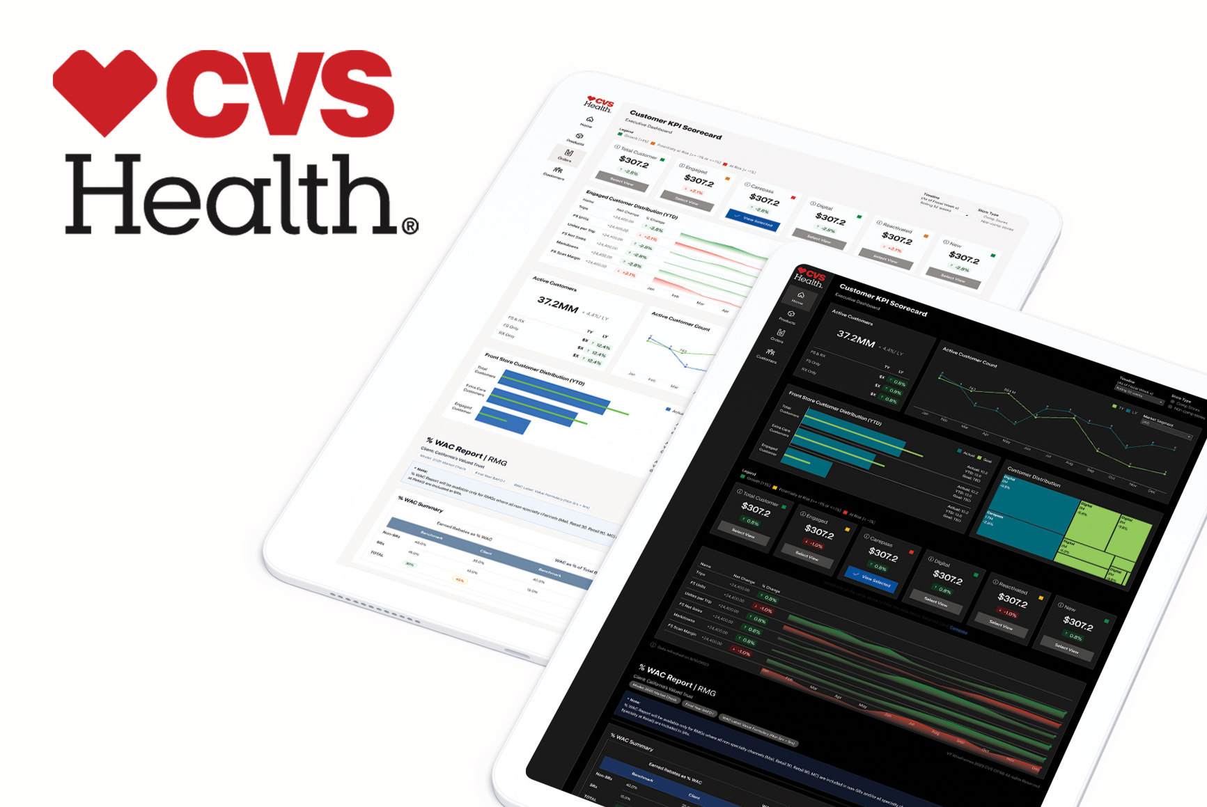
Scaling Data Visualization Across 5 Enterprise Teams
CVS Health had five cross-functional data teams building dashboards and data visualization components across Tableau, MicroStrategy, Power BI, React, and Angular. Without a shared system, teams were recreating similar components in different ways, design and engineering effort was duplicated, and governance had become too slow to support adoption at scale.
My role was to help define and lead a data visualization design system that teams would actually use, not just admire in theory. Over an 8-month period, we created a foundations layer, piloted reusable components, tested them across real dashboards, and established a contribution model that helped five teams adopt shared standards.
Snapshot
- Role: Lead Visual Product Designer (working alongside a Senior UX Product Manager)
- Team: Lean 2-person initiative following broader design systems layoffs
- Scope: 5 cross-functional teams, ~15 designers, ~50 engineers
- Platforms: Tableau, MicroStrategy, Power BI, React, Angular
- Timeline: 8 months
Impact: Key Metrics
- Core standards adopted across 5 teams
- Estimated 800 team hours saved weekly
- ~$3M in yearly labor cost avoided
The Transformation
Before: Legacy Version

After: Modernized BI Dashboard
Where to Start?
This was not just a UI consistency problem.
Each team was solving similar visualization problems in isolation. That meant the same chart types, KPI tiles, filters, tables, and alert patterns were being rebuilt multiple times with different visual rules, token usage, and behaviors. Over time, this created more than visual drift. It slowed product work, weakened reuse, made contribution harder, and created friction between design intent and engineering implementation.
The deeper issue was organizational: teams could not easily discover what already existed, and the process for contributing back into a shared system was slow enough that many teams worked around it instead.
What made this especially important
The platform spread. This was not a single-product design system. It had to work across BI tools and front-end frameworks, while still feeling coherent enough that teams would recognize it as one system.
System Architecture
The architecture below maps how a single Foundations layer feeds five platform branches — each cascading through components, layout templates, and deployment targets. Red dots mark priority deliverables for the initial rollout.
My role
I led the design side of the Vizion initiative as part of a lean two-person team. My responsibility was not just to produce components, but to help shape an approach that could work in reality across five teams with different workflows, technologies, and existing patterns.
I audited live products, identified reusable patterns, helped define the token foundation, designed pilot components, shaped testing across teams, and contributed to the documentation and governance model that supported adoption.
I also helped bridge the gap between system thinking and day-to-day product work by grounding the system in what teams were already building, rather than asking them to abandon their current reality for a theoretical framework.
The core challenge
The challenge was not simply to “create a design system.”
The real challenge was to build a data visualization system that:
- Emerged from real product work already in use
- Could span five different platforms and implementation contexts
- Reduced duplication without becoming too rigid
- Moved fast despite lean resourcing
- And created a contribution model that teams would actually participate in
That meant solving for adoption and governance at the same time as structure and consistency.
Constraints
- The system had to support five teams working across different tools and codebases
- The broader design systems team had already been reduced, so resourcing was lean
- Existing products already contained many diverging patterns, so standardization could not begin from a blank slate
- Governance had previously been too slow, which had already discouraged contribution and reuse
- The system had to feel credible to teams who had already built their own working dashboards and components
My approach
1. Start from the products, not from theory
Instead of designing a system in isolation, I started by auditing live dashboards and components across all five teams. Screens and Figma files were brought together side by side so patterns, duplication, and divergence became visible quickly. This allowed us to work from proven production patterns rather than abstract assumptions.
From that audit, I extracted recurring elements such as chart types, KPI tiles, filter panels, data tables, and alert cards. If a pattern appeared across three or more teams, it became a candidate for system inclusion. One-off components with narrow relevance were flagged for deprecation rather than promotion.
2. Define the foundation before scaling components
Before scaling any reusable components, I helped establish a token foundation that could support both UI and data visualization needs. One of the key issues surfaced during the audit was that UI color tokens and data viz color tokens were not clearly separated, which created risk around meaning, accessibility, and clinical semantics.
From that audit, I extracted recurring elements such as chart types, KPI tiles, filter panels, data tables, and alert cards. If a pattern appeared across three or more teams, it became a candidate for system inclusion. One-off components with narrow relevance were flagged for deprecation rather than promotion.
3. Use pilots to prove the system in real work
Rather than trying to launch a massive system all at once, I helped structure the rollout around pilot components that had both high reuse potential and clear business value. The first pilots included KPI tiles, chart components, alert cards, filter/control panels, and data table patterns. These were chosen because they were widely used and represented the highest leverage points across teams.
Each pilot was scored against a set of criteria adapted for the organization’s goals, including reuse, business value, feasibility, available champions, and rollout potential. This helped move prioritization away from subjective preference and toward a more defensible sequence. KPI tiles and the chart library rose to the top and shipped first.
4. Test across all five teams at the same time
5. Reduce handoff friction between design and engineering with AI-powered prompts
Part of the system’s success came from reducing translation work between Figma and engineering. The workflow connected design tokens, structured outputs, Git-based sync, and reference documentation so that changes did not need to be manually redefined per platform. The design-to-code flow moved from Figma through Token Studio to JSON, Git, Supernova, and into five platform outputs.
We also used AI-assisted workflows to speed up component scaffolding, variations, and engineer-readable documentation, including state handling and ARIA-ready code patterns. This helped reduce friction in early implementation and made it easier for engineers to onboard to components without needing separate handoff meetings for every case.
6. Build governance around contribution, not gatekeeping
One reason earlier systems had struggled was that governance felt too slow and too centralized. Instead of reinforcing that model, we moved toward a lighter contribution workflow. Teams proposed components by showing evidence of existing use, and contributions were reviewed for abstraction eligibility using a simple rule-based threshold. Approved components were then added back into both the design library and the engineering reference site, with credit given to contributing teams.
That mattered because governance stopped feeling like top-down control and started feeling like a shared mechanism for system growth. Teams were more willing to adopt something they could see themselves shaping.
🤖 How AI played a role
Shaping, not making – the core shift
At no point was AI used to replace design judgment. It was used to compress the distance between a decision and a working artifact. The token architecture, the component structure, the clinical color constraints — those were human decisions made upfront. AI was the execution layer that turned those decisions into structured, production-ready outputs in minutes rather than days.
1. Generating tokens with the RTCFF framework
Primitive tokens
Semantic tokens
2. From Token Studio JSON to React and Tailwind
3. AI-assisted component validation and documentation
What this approach made possible
Cross-functional collaboration
This project only worked because it was not treated as a design exercise in isolation.
From the beginning, I had to work across multiple teams with different priorities, tools, and constraints. Designers needed clarity and consistency in the system. Engineers needed implementation logic that could work within real platform limitations. Different data visualization teams were already operating with their own established patterns and needed to see that the proposed system would support their work rather than slow it down. Because of that, a large part of my role was not just designing foundations and components, but creating shared understanding across teams.
That meant bringing product screens, patterns, and existing workflows into the conversation early so teams could recognize their reality in the system. It also meant working closely with engineering around token structure, naming logic, component states, and the practical implications of supporting five different implementation environments. Instead of forcing a purely top-down framework, I used live product work and pilot components as a common language between design and engineering so decisions could be debated against something real, not something hypothetical.
The more cross-functional alignment improved, the less the system felt like an external imposition. It started to feel like shared infrastructure.
Influence and adoption
One of the most important parts of this work was helping the system gain trust.
Design systems often fail not because the components are poor, but because teams do not believe the system reflects their reality. I knew early on that if teams felt this was something abstract or imposed from above, adoption would be weak. So instead of asking teams to abandon what they had built, I anchored the system in patterns already visible across their dashboards and workflows. When teams saw familiar structures, components, and needs represented back to them in a more organized way, the system became easier to trust.
The pilot structure helped reinforce that trust. Teams were not just told what the system should be — they tested it against their own dashboards. That changed the dynamic. Adoption stopped being theoretical and became experiential. By the time pilot issues had been resolved, the teams who had tested the system had become some of its strongest internal advocates. They could show others what improved, what still needed adjustment, and why the system was worth using. As a result, adoption became more of a pull mechanism than a push campaign.
I also contributed to reshaping governance so it felt more participatory and less like a slow approval bottleneck. Moving toward a contribution model helped the system feel like something teams could help grow, rather than something they simply had to comply with. That shift made adoption more sustainable.
Key decisions and tradeoffs
Several decisions shaped the final outcome:
Start from existing products instead of designing the “perfect” system from scratch – This made adoption easier because teams recognized their own work inside the system.
Pilot in parallel instead of sequential rollout – This increased early complexity, but it sped up validation and revealed platform-specific conflicts much earlier.
Promote only patterns with repeatability – Not every component deserved to become a system component. Some needed to remain local or be deprecated.
Separate token semantics carefully – In a healthcare environment, color cannot be treated casually. Clinical urgency and data trends needed clear distinction.
Treat documentation as part of the build, not a final step – Documentation written during extraction and piloting reduced downstream friction and made the system easier to defend.
Outcomes
800 hours/week saved across 5 data visualization teams
~ $3M in labor cost from resuse, shared tokens & pipeline
↓ 40% faster design-to-dev handoff from weeks to days
How we calculated this
15 designers +
50 developers
~ 65 contractors total
X
~12-15 hours/week
=
800 hours/week
X
~$62/hr X 52 weeks
~$62/hr X 52 weeks
contractor rate (range: $50-$75/hr)
≈
~$3M/year
labor cost avoided
Wanna see more? let's get in touch
For a deeper-dive Figma presentation that showcases my research, methodology, and outcomes. This includes journey mapping, userflows, data-driven metrics that drive design-thinking and more UX-artifacts.
Scaling Data Visualization Across 5 Enterprise Teams
My role was to help define and lead a data visualization design system that teams would actually use, not just admire in theory. Over an 8-month period, we created a foundations layer, piloted reusable components, tested them across real dashboards, and established a contribution model that helped five teams adopt shared standards.
Snapshot
- Role: Lead Product Designer
- Team: Lean 2-person initiative following broader design systems layoffs
- Scope: 5 cross-functional teams, ~15 designers, ~50 engineers
- Platforms: Tableau, MicroStrategy, Power BI, React, Angular
- Timeline: 8 months
Outcome
- Core standards adopted across 5 teams
- Estimated 800 team hours saved weekly
- ~$3M in yearly labor cost avoided
The Transformation
Before: Legacy Version
After: Modernized BI Dashboard
Where to Start?
Why this mattered
This was not just a UI consistency problem.
Each team was solving similar visualization problems in isolation. That meant the same chart types, KPI tiles, filters, tables, and alert patterns were being rebuilt multiple times with different visual rules, token usage, and behaviors. Over time, this created more than visual drift. It slowed product work, weakened reuse, made contribution harder, and created friction between design intent and engineering implementation.
The deeper issue was organizational: teams could not easily discover what already existed, and the process for contributing back into a shared system was slow enough that many teams worked around it instead.
What made this especially important
The platform spread. This was not a single-product design system. It had to work across BI tools and front-end frameworks, while still feeling coherent enough that teams would recognize it as one system.
The architecture below maps how a single Foundations layer feeds five platform branches — each cascading through components, layout templates, and deployment targets. Red dots mark priority deliverables for the initial rollout.
My role
I led the design side of the Vizion initiative as part of a lean two-person team. My responsibility was not just to produce components, but to help shape an approach that could work in reality across five teams with different workflows, technologies, and existing patterns.
I audited live products, identified reusable patterns, helped define the token foundation, designed pilot components, shaped testing across teams, and contributed to the documentation and governance model that supported adoption.
I also helped bridge the gap between system thinking and day-to-day product work by grounding the system in what teams were already building, rather than asking them to abandon their current reality for a theoretical framework.
The core challenge
The challenge was not simply to “create a design system.”
The real challenge was to build a data visualization system that:
- Emerged from real product work already in use
- Could span five different platforms and implementation contexts
- Reduced duplication without becoming too rigid
- Moved fast despite lean resourcing
- And created a contribution model that teams would actually participate i
That meant solving for adoption and governance at the same time as structure and consistency.
Constraints
Several constraints shaped the work from the beginning:
- The system had to support five teams working across different tools and codebases
- The broader design systems team had already been reduced, so resourcing was lean
- Reduced duplication without becoming too rigid
- Moved fast despite lean resourcing
- Existing products already contained many diverging patterns, so standardization could not begin from a blank slate
- Governance had previously been too slow, which had already discouraged contribution and reuse
- The system had to feel credible to teams who had already built their own working dashboards and components
My approach
1. Start from the products, not from theory
Instead of designing a system in isolation, I started by auditing live dashboards and components across all five teams. Screens and Figma files were brought together side by side so patterns, duplication, and divergence became visible quickly. This allowed us to work from proven production patterns rather than abstract assumptions.
From that audit, I extracted recurring elements such as chart types, KPI tiles, filter panels, data tables, and alert cards. If a pattern appeared across three or more teams, it became a candidate for system inclusion. One-off components with narrow relevance were flagged for deprecation rather than promotion
2. Define the foundation before scaling components
Before scaling any reusable components, I helped establish a token foundation that could support both UI and data visualization needs. One of the key issues surfaced during the audit was that UI color tokens and data viz color tokens were not clearly separated, which created risk around meaning, accessibility, and clinical semantics.
From that audit, I extracted recurring elements such as chart types, KPI tiles, filter panels, data tables, and alert cards. If a pattern appeared across three or more teams, it became a candidate for system inclusion. One-off components with narrow relevance were flagged for deprecation rather than promotion.
3. Use pilots to prove the system in real work
Rather than trying to launch a massive system all at once, I helped structure the rollout around pilot components that had both high reuse potential and clear business value. The first pilots included KPI tiles, chart components, alert cards, filter/control panels, and data table patterns. These were chosen because they were widely used and represented the highest leverage points across teams.
Each pilot was scored against a set of criteria adapted for the organization’s goals, including reuse, business value, feasibility, available champions, and rollout potential. This helped move prioritization away from subjective preference and toward a more defensible sequence. KPI tiles and the chart library rose to the top and shipped first.
4. Test across all five teams at the same time
A key decision was to run pilots across all five teams in parallel rather than sequentially. A sequential rollout might have looked safer, but it would have delayed learning and hidden cross-platform conflicts until much later. By testing simultaneously, we compressed the feedback loop and surfaced issues earlier.
Each team rebuilt one or two existing dashboards using Vizion pilot components only. That constraint was important. If a component could not support a real dashboard without workarounds, the gap needed to appear during the pilot stage rather than after rollout. This surfaced issues like missing chart states, MicroStrategy naming adjustments, and platform-specific interaction needs for Power BI. At the same time, KPI tiles performed cleanly across all five platforms and validated themselves as the right first component to scale.
5. Reduce handoff friction between design and engineering with AI-powered prompts
6. Build governance around contribution, not gatekeeping
🤖 How AI played a role
Shaping, not making – the core shift
A design system serving five platforms, 15 designers, and 50 engineers cannot be built manually at the speed enterprise timelines demand — not by a lean two-person team. AI made the math work without sacrificing the quality of the underlying decisions.
2. Define the foundation before scaling components
Before scaling any reusable components, I helped establish a token foundation that could support both UI and data visualization needs. One of the key issues surfaced during the audit was that UI color tokens and data viz color tokens were not clearly separated, which created risk around meaning, accessibility, and clinical semantics.
From that audit, I extracted recurring elements such as chart types, KPI tiles, filter panels, data tables, and alert cards. If a pattern appeared across three or more teams, it became a candidate for system inclusion. One-off components with narrow relevance were flagged for deprecation rather than promotion.
3. Use pilots to prove the system in real work
Rather than trying to launch a massive system all at once, I helped structure the rollout around pilot components that had both high reuse potential and clear business value. The first pilots included KPI tiles, chart components, alert cards, filter/control panels, and data table patterns. These were chosen because they were widely used and represented the highest leverage points across teams.
Each pilot was scored against a set of criteria adapted for the organization’s goals, including reuse, business value, feasibility, available champions, and rollout potential. This helped move prioritization away from subjective preference and toward a more defensible sequence. KPI tiles and the chart library rose to the top and shipped first.
4. Test across all five teams at the same time
A key decision was to run pilots across all five teams in parallel rather than sequentially. A sequential rollout might have looked safer, but it would have delayed learning and hidden cross-platform conflicts until much later. By testing simultaneously, we compressed the feedback loop and surfaced issues earlier.
Each team rebuilt one or two existing dashboards using Vizion pilot components only. That constraint was important. If a component could not support a real dashboard without workarounds, the gap needed to appear during the pilot stage rather than after rollout. This surfaced issues like missing chart states, MicroStrategy naming adjustments, and platform-specific interaction needs for Power BI. At the same time, KPI tiles performed cleanly across all five platforms and validated themselves as the right first component to scale.
5. Reduce handoff friction between design and engineering with AI-powered prompts
6. Build governance around contribution, not gatekeeping
Key decisions and tradeoffs
Several decisions shaped the final outcome:
Cross-functional collaboration
From the beginning, I had to work across multiple teams with different priorities, tools, and constraints. Designers needed clarity and consistency in the system. Engineers needed implementation logic that could work within real platform limitations. Different data visualization teams were already operating with their own established patterns and needed to see that the proposed system would support their work rather than slow it down. Because of that, a large part of my role was not just designing foundations and components, but creating shared understanding across teams.
Outcomes
800 hours/week saved across 5 data visualization teams
~ $3M in labor cost from reuse, shared tokens & pipeline
↓ 40% faster design-to-dev handoff from weeks to days

Wanna see more? let's get in touch
For a deeper-dive Figma presentation that showcases my research, methodology, and outcomes. This includes journey mapping, userflows, data-driven metrics that drive design-thinking and more UX-artifacts.
Scaling data visualization across 5 enterprise teams
CVS Health had five cross-functional data teams building dashboards across Tableau, MicroStrategy, Power BI, React, and Angular — with no shared system, leading to duplicated effort and governance too slow to scale.
My role was to define and lead a data visualization design system built for real adoption. Over 8 months, we delivered a foundations layer, reusable components tested across live dashboards, and a contribution model that brought five teams onto shared standards.
Snapshot
- Role: Lead Product Designer
- Team: Lean 2-person initiative following broader design systems layoffs
- Scope: 5 cross-functional teams, ~15 designers, ~50 engineers
- Platforms: Tableau, MicroStrategy, Power BI, React, Angular
- Timeline: 8 months
Outcome
- Core standards adopted across 5 teams
- Estimated 800 team hours saved weekly
- ~$3M in yearly labor cost avoided
The Transformation
Before: Legacy Version
After: Modernized BI Dashboard
Where to Start?
Why this mattered
This was not just a UI consistency problem.
Each team was solving similar visualization problems in isolation. That meant the same chart types, KPI tiles, filters, tables, and alert patterns were being rebuilt multiple times with different visual rules, token usage, and behaviors. Over time, this created more than visual drift. It slowed product work, weakened reuse, made contribution harder, and created friction between design intent and engineering implementation.
The deeper issue was organizational: teams could not easily discover what already existed, and the process for contributing back into a shared system was slow enough that many teams worked around it instead.
What made this especially important
The platform spread. This was not a single-product design system. It had to work across BI tools and front-end frameworks, while still feeling coherent enough that teams would recognize it as one system.
System Architecture
The architecture below maps how a single Foundations layer feeds five platform branches — each cascading through components, layout templates, and deployment targets. Red dots mark priority deliverables for the initial rollout.
My role
I led the design side of the Vizion initiative as part of a lean two-person team. My responsibility was not just to produce components, but to help shape an approach that could work in reality across five teams with different workflows, technologies, and existing patterns.
I audited live products, identified reusable patterns, helped define the token foundation, designed pilot components, shaped testing across teams, and contributed to the documentation and governance model that supported adoption.
I also helped bridge the gap between system thinking and day-to-day product work by grounding the system in what teams were already building, rather than asking them to abandon their current reality for a theoretical framework.
The core challenge
The challenge was not simply to “create a design system.”
- Emerged from real product work already in use
- Could span five different platforms and implementation contexts
- Reduced duplication without becoming too rigid
- Moved fast despite lean resourcing
- Created a contribution model that teams would actually participate in
The real challenge was to build a data visualization system that:
That meant solving for adoption and governance at the same time as structure and consistency.
Constraints
- The system had to support five teams working across different tools and codebases
- The broader design systems team had already been reduced, so resourcing was lean
- Existing products already contained many diverging patterns, so standardization could not begin from a blank slate
- Governance had previously been too slow, which had already discouraged contribution and reuse
- The system had to feel credible to teams who had already built their own working dashboards and components
My approach
1. Start from the products, not from theory
2. Define the foundation before scaling components
3. Use pilots to prove the system in real work
4. Test across all five teams at the same time
5. Reduce handoff friction between design and engineering with AI-powered prompts
6. Build governance around contribution, not gatekeeping
Cross-functional collaboration
Key decisions & tradeoffs
Outcomes
800 hours/week saved across 5 data visualization teams
Team hours recovered from duplicated component work and fixed capacity to shipping new features and product iteration
Wanna see more? let's get in touch
For a deeper-dive Figma presentation that showcases my research, methodology, and outcomes.
Gotta have the password 😉
Incorrect password. Please try again.
Scaling Data Visualization Across 5 Enterprise Teams
CVS Health had five cross-functional data teams building dashboards and data visualization components across Tableau, MicroStrategy, Power BI, React, and Angular. Without a shared system, teams were recreating similar components in different ways, design and engineering effort was duplicated, and governance had become too slow to support adoption at scale.
My role was to help define and lead a data visualization design system that teams would actually use, not just admire in theory. Over an 8-month period, we created a foundations layer, piloted reusable components, tested them across real dashboards, and established a contribution model that helped five teams adopt shared standards.
Snapshot
- Role: Lead Visual Product Designer (working alongside a Senior UX Product Manager)
- Team: Lean 2-person initiative following broader design systems layoffs
- Scope: 5 cross-functional teams, ~15 designers, ~50 engineers
- Platforms: Tableau, MicroStrategy, Power BI, React, Angular
- Timeline: 8 months
Impact: Key Metrics
- Core standards adopted across 5 teams
- Estimated 800 team hours saved weekly
- ~$3M in yearly labor cost avoided
The Transformation
Before: Legacy Version
After: Modernized BI Dashboard
Where to Start?
This was not just a UI consistency problem.
Each team was solving similar visualization problems in isolation. That meant the same chart types, KPI tiles, filters, tables, and alert patterns were being rebuilt multiple times with different visual rules, token usage, and behaviors. Over time, this created more than visual drift. It slowed product work, weakened reuse, made contribution harder, and created friction between design intent and engineering implementation.
The deeper issue was organizational: teams could not easily discover what already existed, and the process for contributing back into a shared system was slow enough that many teams worked around it instead.
What made this especially important
The platform spread. This was not a single-product design system. It had to work across BI tools and front-end frameworks, while still feeling coherent enough that teams would recognize it as one system.
System Architecture
The architecture below maps how a single Foundations layer feeds five platform branches — each cascading through components, layout templates, and deployment targets. Red dots mark priority deliverables for the initial rollout.
My role
I led the design side of the Vizion initiative as part of a lean two-person team. My responsibility was not just to produce components, but to help shape an approach that could work in reality across five teams with different workflows, technologies, and existing patterns.
I audited live products, identified reusable patterns, helped define the token foundation, designed pilot components, shaped testing across teams, and contributed to the documentation and governance model that supported adoption.
I also helped bridge the gap between system thinking and day-to-day product work by grounding the system in what teams were already building, rather than asking them to abandon their current reality for a theoretical framework.
The core challenge
The challenge was not simply to “create a design system.”
The real challenge was to build a data visualization system that:
- Emerged from real product work already in use
- Could span five different platforms and implementation contexts
- Reduced duplication without becoming too rigid
- Moved fast despite lean resourcing
- And created a contribution model that teams would actually participate in
That meant solving for adoption and governance at the same time as structure and consistency.
Constraints
- The system had to support five teams working across different tools and codebases
- The broader design systems team had already been reduced, so resourcing was lean
- Existing products already contained many diverging patterns, so standardization could not begin from a blank slate
- Governance had previously been too slow, which had already discouraged contribution and reuse
- The system had to feel credible to teams who had already built their own working dashboards and components
My approach
1. Start from the products, not from theory
Instead of designing a system in isolation, I started by auditing live dashboards and components across all five teams. Screens and Figma files were brought together side by side so patterns, duplication, and divergence became visible quickly. This allowed us to work from proven production patterns rather than abstract assumptions.
From that audit, I extracted recurring elements such as chart types, KPI tiles, filter panels, data tables, and alert cards. If a pattern appeared across three or more teams, it became a candidate for system inclusion. One-off components with narrow relevance were flagged for deprecation rather than promotion.
2. Define the foundation before scaling components
Before scaling any reusable components, I helped establish a token foundation that could support both UI and data visualization needs. One of the key issues surfaced during the audit was that UI color tokens and data viz color tokens were not clearly separated, which created risk around meaning, accessibility, and clinical semantics.
From that audit, I extracted recurring elements such as chart types, KPI tiles, filter panels, data tables, and alert cards. If a pattern appeared across three or more teams, it became a candidate for system inclusion. One-off components with narrow relevance were flagged for deprecation rather than promotion.
3. Use pilots to prove the system in real work
Rather than trying to launch a massive system all at once, I helped structure the rollout around pilot components that had both high reuse potential and clear business value. The first pilots included KPI tiles, chart components, alert cards, filter/control panels, and data table patterns. These were chosen because they were widely used and represented the highest leverage points across teams.
Each pilot was scored against a set of criteria adapted for the organization’s goals, including reuse, business value, feasibility, available champions, and rollout potential. This helped move prioritization away from subjective preference and toward a more defensible sequence. KPI tiles and the chart library rose to the top and shipped first.
4. Test across all five teams at the same time
5. Reduce handoff friction between design and engineering with AI-powered prompts
Part of the system’s success came from reducing translation work between Figma and engineering. The workflow connected design tokens, structured outputs, Git-based sync, and reference documentation so that changes did not need to be manually redefined per platform. The design-to-code flow moved from Figma through Token Studio to JSON, Git, Supernova, and into five platform outputs.
We also used AI-assisted workflows to speed up component scaffolding, variations, and engineer-readable documentation, including state handling and ARIA-ready code patterns. This helped reduce friction in early implementation and made it easier for engineers to onboard to components without needing separate handoff meetings for every case.
6. Build governance around contribution, not gatekeeping
One reason earlier systems had struggled was that governance felt too slow and too centralized. Instead of reinforcing that model, we moved toward a lighter contribution workflow. Teams proposed components by showing evidence of existing use, and contributions were reviewed for abstraction eligibility using a simple rule-based threshold. Approved components were then added back into both the design library and the engineering reference site, with credit given to contributing teams.
That mattered because governance stopped feeling like top-down control and started feeling like a shared mechanism for system growth. Teams were more willing to adopt something they could see themselves shaping.
🤖 How AI played a role
Shaping, not making – the core shift
At no point was AI used to replace design judgment. It was used to compress the distance between a decision and a working artifact. The token architecture, the component structure, the clinical color constraints — those were human decisions made upfront. AI was the execution layer that turned those decisions into structured, production-ready outputs in minutes rather than days.
1. Generating tokens with the RTCFF framework
Primitive tokens
Semantic tokens
2. From Token Studio JSON to React and Tailwind
3. AI-assisted component validation and documentation
What this approach made possible
Cross-functional collaboration
This project only worked because it was not treated as a design exercise in isolation.
From the beginning, I had to work across multiple teams with different priorities, tools, and constraints. Designers needed clarity and consistency in the system. Engineers needed implementation logic that could work within real platform limitations. Different data visualization teams were already operating with their own established patterns and needed to see that the proposed system would support their work rather than slow it down. Because of that, a large part of my role was not just designing foundations and components, but creating shared understanding across teams.
That meant bringing product screens, patterns, and existing workflows into the conversation early so teams could recognize their reality in the system. It also meant working closely with engineering around token structure, naming logic, component states, and the practical implications of supporting five different implementation environments. Instead of forcing a purely top-down framework, I used live product work and pilot components as a common language between design and engineering so decisions could be debated against something real, not something hypothetical.
The more cross-functional alignment improved, the less the system felt like an external imposition. It started to feel like shared infrastructure.
Influence and adoption
One of the most important parts of this work was helping the system gain trust.
Design systems often fail not because the components are poor, but because teams do not believe the system reflects their reality. I knew early on that if teams felt this was something abstract or imposed from above, adoption would be weak. So instead of asking teams to abandon what they had built, I anchored the system in patterns already visible across their dashboards and workflows. When teams saw familiar structures, components, and needs represented back to them in a more organized way, the system became easier to trust.
The pilot structure helped reinforce that trust. Teams were not just told what the system should be — they tested it against their own dashboards. That changed the dynamic. Adoption stopped being theoretical and became experiential. By the time pilot issues had been resolved, the teams who had tested the system had become some of its strongest internal advocates. They could show others what improved, what still needed adjustment, and why the system was worth using. As a result, adoption became more of a pull mechanism than a push campaign.
I also contributed to reshaping governance so it felt more participatory and less like a slow approval bottleneck. Moving toward a contribution model helped the system feel like something teams could help grow, rather than something they simply had to comply with. That shift made adoption more sustainable.
Key decisions and tradeoffs
Several decisions shaped the final outcome:
Start from existing products instead of designing the “perfect” system from scratch – This made adoption easier because teams recognized their own work inside the system.
Pilot in parallel instead of sequential rollout – This increased early complexity, but it sped up validation and revealed platform-specific conflicts much earlier.
Promote only patterns with repeatability – Not every component deserved to become a system component. Some needed to remain local or be deprecated.
Separate token semantics carefully – In a healthcare environment, color cannot be treated casually. Clinical urgency and data trends needed clear distinction.
Treat documentation as part of the build, not a final step – Documentation written during extraction and piloting reduced downstream friction and made the system easier to defend.
Outcomes
800 hours/week saved across 5 data visualization teams
~ $3M in labor cost from resuse, shared tokens & pipeline
↓ 40% faster design-to-dev handoff from weeks to days
How we calculated this
15 designers +
50 developers
~ 65 contractors total
X
~12-15 hours/week
=
800 hours/week
X
~$62/hr X 52 weeks
~$62/hr X 52 weeks
contractor rate (range: $50-$75/hr)
≈
~$3M/year
labor cost avoided
Wanna see more? let's get in touch
For a deeper-dive Figma presentation that showcases my research, methodology, and outcomes. This includes journey mapping, userflows, data-driven metrics that drive design-thinking and more UX-artifacts.
Scaling Data Visualization Across 5 Enterprise Teams
My role was to help define and lead a data visualization design system that teams would actually use, not just admire in theory. Over an 8-month period, we created a foundations layer, piloted reusable components, tested them across real dashboards, and established a contribution model that helped five teams adopt shared standards.
Snapshot
- Role: Lead Product Designer
- Team: Lean 2-person initiative following broader design systems layoffs
- Scope: 5 cross-functional teams, ~15 designers, ~50 engineers
- Platforms: Tableau, MicroStrategy, Power BI, React, Angular
- Timeline: 8 months
Outcome
- Core standards adopted across 5 teams
- Estimated 800 team hours saved weekly
- ~$3M in yearly labor cost avoided
The Transformation
Before: Legacy Version
After: Modernized BI Dashboard
Where to Start?
Why this mattered
This was not just a UI consistency problem.
Each team was solving similar visualization problems in isolation. That meant the same chart types, KPI tiles, filters, tables, and alert patterns were being rebuilt multiple times with different visual rules, token usage, and behaviors. Over time, this created more than visual drift. It slowed product work, weakened reuse, made contribution harder, and created friction between design intent and engineering implementation.
The deeper issue was organizational: teams could not easily discover what already existed, and the process for contributing back into a shared system was slow enough that many teams worked around it instead.
What made this especially important
The platform spread. This was not a single-product design system. It had to work across BI tools and front-end frameworks, while still feeling coherent enough that teams would recognize it as one system.
The architecture below maps how a single Foundations layer feeds five platform branches — each cascading through components, layout templates, and deployment targets. Red dots mark priority deliverables for the initial rollout.
My role
I led the design side of the Vizion initiative as part of a lean two-person team. My responsibility was not just to produce components, but to help shape an approach that could work in reality across five teams with different workflows, technologies, and existing patterns.
I audited live products, identified reusable patterns, helped define the token foundation, designed pilot components, shaped testing across teams, and contributed to the documentation and governance model that supported adoption.
I also helped bridge the gap between system thinking and day-to-day product work by grounding the system in what teams were already building, rather than asking them to abandon their current reality for a theoretical framework.
The core challenge
The challenge was not simply to “create a design system.”
The real challenge was to build a data visualization system that:
- Emerged from real product work already in use
- Could span five different platforms and implementation contexts
- Reduced duplication without becoming too rigid
- Moved fast despite lean resourcing
- And created a contribution model that teams would actually participate i
That meant solving for adoption and governance at the same time as structure and consistency.
Constraints
Several constraints shaped the work from the beginning:
- The system had to support five teams working across different tools and codebases
- The broader design systems team had already been reduced, so resourcing was lean
- Reduced duplication without becoming too rigid
- Moved fast despite lean resourcing
- Existing products already contained many diverging patterns, so standardization could not begin from a blank slate
- Governance had previously been too slow, which had already discouraged contribution and reuse
- The system had to feel credible to teams who had already built their own working dashboards and components
My approach
1. Start from the products, not from theory
Instead of designing a system in isolation, I started by auditing live dashboards and components across all five teams. Screens and Figma files were brought together side by side so patterns, duplication, and divergence became visible quickly. This allowed us to work from proven production patterns rather than abstract assumptions.
From that audit, I extracted recurring elements such as chart types, KPI tiles, filter panels, data tables, and alert cards. If a pattern appeared across three or more teams, it became a candidate for system inclusion. One-off components with narrow relevance were flagged for deprecation rather than promotion
2. Define the foundation before scaling components
Before scaling any reusable components, I helped establish a token foundation that could support both UI and data visualization needs. One of the key issues surfaced during the audit was that UI color tokens and data viz color tokens were not clearly separated, which created risk around meaning, accessibility, and clinical semantics.
From that audit, I extracted recurring elements such as chart types, KPI tiles, filter panels, data tables, and alert cards. If a pattern appeared across three or more teams, it became a candidate for system inclusion. One-off components with narrow relevance were flagged for deprecation rather than promotion.
3. Use pilots to prove the system in real work
Rather than trying to launch a massive system all at once, I helped structure the rollout around pilot components that had both high reuse potential and clear business value. The first pilots included KPI tiles, chart components, alert cards, filter/control panels, and data table patterns. These were chosen because they were widely used and represented the highest leverage points across teams.
Each pilot was scored against a set of criteria adapted for the organization’s goals, including reuse, business value, feasibility, available champions, and rollout potential. This helped move prioritization away from subjective preference and toward a more defensible sequence. KPI tiles and the chart library rose to the top and shipped first.
4. Test across all five teams at the same time
A key decision was to run pilots across all five teams in parallel rather than sequentially. A sequential rollout might have looked safer, but it would have delayed learning and hidden cross-platform conflicts until much later. By testing simultaneously, we compressed the feedback loop and surfaced issues earlier.
Each team rebuilt one or two existing dashboards using Vizion pilot components only. That constraint was important. If a component could not support a real dashboard without workarounds, the gap needed to appear during the pilot stage rather than after rollout. This surfaced issues like missing chart states, MicroStrategy naming adjustments, and platform-specific interaction needs for Power BI. At the same time, KPI tiles performed cleanly across all five platforms and validated themselves as the right first component to scale.
5. Reduce handoff friction between design and engineering with AI-powered prompts
6. Build governance around contribution, not gatekeeping
🤖 How AI played a role
Shaping, not making – the core shift
A design system serving five platforms, 15 designers, and 50 engineers cannot be built manually at the speed enterprise timelines demand — not by a lean two-person team. AI made the math work without sacrificing the quality of the underlying decisions.
2. Define the foundation before scaling components
Before scaling any reusable components, I helped establish a token foundation that could support both UI and data visualization needs. One of the key issues surfaced during the audit was that UI color tokens and data viz color tokens were not clearly separated, which created risk around meaning, accessibility, and clinical semantics.
From that audit, I extracted recurring elements such as chart types, KPI tiles, filter panels, data tables, and alert cards. If a pattern appeared across three or more teams, it became a candidate for system inclusion. One-off components with narrow relevance were flagged for deprecation rather than promotion.
3. Use pilots to prove the system in real work
Rather than trying to launch a massive system all at once, I helped structure the rollout around pilot components that had both high reuse potential and clear business value. The first pilots included KPI tiles, chart components, alert cards, filter/control panels, and data table patterns. These were chosen because they were widely used and represented the highest leverage points across teams.
Each pilot was scored against a set of criteria adapted for the organization’s goals, including reuse, business value, feasibility, available champions, and rollout potential. This helped move prioritization away from subjective preference and toward a more defensible sequence. KPI tiles and the chart library rose to the top and shipped first.
4. Test across all five teams at the same time
A key decision was to run pilots across all five teams in parallel rather than sequentially. A sequential rollout might have looked safer, but it would have delayed learning and hidden cross-platform conflicts until much later. By testing simultaneously, we compressed the feedback loop and surfaced issues earlier.
Each team rebuilt one or two existing dashboards using Vizion pilot components only. That constraint was important. If a component could not support a real dashboard without workarounds, the gap needed to appear during the pilot stage rather than after rollout. This surfaced issues like missing chart states, MicroStrategy naming adjustments, and platform-specific interaction needs for Power BI. At the same time, KPI tiles performed cleanly across all five platforms and validated themselves as the right first component to scale.
5. Reduce handoff friction between design and engineering with AI-powered prompts
6. Build governance around contribution, not gatekeeping
Key decisions and tradeoffs
Several decisions shaped the final outcome:
Cross-functional collaboration
From the beginning, I had to work across multiple teams with different priorities, tools, and constraints. Designers needed clarity and consistency in the system. Engineers needed implementation logic that could work within real platform limitations. Different data visualization teams were already operating with their own established patterns and needed to see that the proposed system would support their work rather than slow it down. Because of that, a large part of my role was not just designing foundations and components, but creating shared understanding across teams.
Outcomes
800 hours/week saved across 5 data visualization teams
~ $3M in labor cost from reuse, shared tokens & pipeline
↓ 40% faster design-to-dev handoff from weeks to days
Wanna see more? let's get in touch
For a deeper-dive Figma presentation that showcases my research, methodology, and outcomes. This includes journey mapping, userflows, data-driven metrics that drive design-thinking and more UX-artifacts.
Scaling data visualization across 5 enterprise teams
CVS Health had five cross-functional data teams building dashboards across Tableau, MicroStrategy, Power BI, React, and Angular — with no shared system, leading to duplicated effort and governance too slow to scale.
My role was to define and lead a data visualization design system built for real adoption. Over 8 months, we delivered a foundations layer, reusable components tested across live dashboards, and a contribution model that brought five teams onto shared standards.
Snapshot
- Role: Lead Product Designer
- Team: Lean 2-person initiative following broader design systems layoffs
- Scope: 5 cross-functional teams, ~15 designers, ~50 engineers
- Platforms: Tableau, MicroStrategy, Power BI, React, Angular
- Timeline: 8 months
Outcome
- Core standards adopted across 5 teams
- Estimated 800 team hours saved weekly
- ~$3M in yearly labor cost avoided
The Transformation
Before: Legacy Version
After: Modernized BI Dashboard
Where to Start?
Why this mattered
This was not just a UI consistency problem.
Each team was solving similar visualization problems in isolation. That meant the same chart types, KPI tiles, filters, tables, and alert patterns were being rebuilt multiple times with different visual rules, token usage, and behaviors. Over time, this created more than visual drift. It slowed product work, weakened reuse, made contribution harder, and created friction between design intent and engineering implementation.
The deeper issue was organizational: teams could not easily discover what already existed, and the process for contributing back into a shared system was slow enough that many teams worked around it instead.
What made this especially important
The platform spread. This was not a single-product design system. It had to work across BI tools and front-end frameworks, while still feeling coherent enough that teams would recognize it as one system.
System Architecture
The architecture below maps how a single Foundations layer feeds five platform branches — each cascading through components, layout templates, and deployment targets. Red dots mark priority deliverables for the initial rollout.
My role
I led the design side of the Vizion initiative as part of a lean two-person team. My responsibility was not just to produce components, but to help shape an approach that could work in reality across five teams with different workflows, technologies, and existing patterns.
I audited live products, identified reusable patterns, helped define the token foundation, designed pilot components, shaped testing across teams, and contributed to the documentation and governance model that supported adoption.
I also helped bridge the gap between system thinking and day-to-day product work by grounding the system in what teams were already building, rather than asking them to abandon their current reality for a theoretical framework.
The core challenge
The challenge was not simply to “create a design system.”
- Emerged from real product work already in use
- Could span five different platforms and implementation contexts
- Reduced duplication without becoming too rigid
- Moved fast despite lean resourcing
- Created a contribution model that teams would actually participate in
The real challenge was to build a data visualization system that:
That meant solving for adoption and governance at the same time as structure and consistency.
Constraints
- The system had to support five teams working across different tools and codebases
- The broader design systems team had already been reduced, so resourcing was lean
- Existing products already contained many diverging patterns, so standardization could not begin from a blank slate
- Governance had previously been too slow, which had already discouraged contribution and reuse
- The system had to feel credible to teams who had already built their own working dashboards and components
My approach
1. Start from the products, not from theory
2. Define the foundation before scaling components
3. Use pilots to prove the system in real work
4. Test across all five teams at the same time
5. Reduce handoff friction between design and engineering with AI-powered prompts
6. Build governance around contribution, not gatekeeping
Cross-functional collaboration
Key decisions & tradeoffs
Outcomes
800 hours/week saved across 5 data visualization teams
Team hours recovered from duplicated component work and fixed capacity to shipping new features and product iteration
Wanna see more? let's get in touch
For a deeper-dive Figma presentation that showcases my research, methodology, and outcomes.
Gotta have the password 😉
Incorrect password. Please try again.
Scaling Data Visualization Across 5 Enterprise Teams
CVS Health had five cross-functional data teams building dashboards and data visualization components across Tableau, MicroStrategy, Power BI, React, and Angular. Without a shared system, teams were recreating similar components in different ways, design and engineering effort was duplicated, and governance had become too slow to support adoption at scale.
My role was to help define and lead a data visualization design system that teams would actually use, not just admire in theory. Over an 8-month period, we created a foundations layer, piloted reusable components, tested them across real dashboards, and established a contribution model that helped five teams adopt shared standards.
Snapshot
- Role: Lead Visual Product Designer (working alongside a Senior UX Product Manager)
- Team: Lean 2-person initiative following broader design systems layoffs
- Scope: 5 cross-functional teams, ~15 designers, ~50 engineers
- Platforms: Tableau, MicroStrategy, Power BI, React, Angular
- Timeline: 8 months
Impact: Key Metrics
- Core standards adopted across 5 teams
- Estimated 800 team hours saved weekly
- ~$3M in yearly labor cost avoided
The Transformation
Before: Legacy Version
After: Modernized BI Dashboard
Where to Start?
This was not just a UI consistency problem.
Each team was solving similar visualization problems in isolation. That meant the same chart types, KPI tiles, filters, tables, and alert patterns were being rebuilt multiple times with different visual rules, token usage, and behaviors. Over time, this created more than visual drift. It slowed product work, weakened reuse, made contribution harder, and created friction between design intent and engineering implementation.
The deeper issue was organizational: teams could not easily discover what already existed, and the process for contributing back into a shared system was slow enough that many teams worked around it instead.
What made this especially important
The platform spread. This was not a single-product design system. It had to work across BI tools and front-end frameworks, while still feeling coherent enough that teams would recognize it as one system.
System Architecture
The architecture below maps how a single Foundations layer feeds five platform branches — each cascading through components, layout templates, and deployment targets. Red dots mark priority deliverables for the initial rollout.
My role
I led the design side of the Vizion initiative as part of a lean two-person team. My responsibility was not just to produce components, but to help shape an approach that could work in reality across five teams with different workflows, technologies, and existing patterns.
I audited live products, identified reusable patterns, helped define the token foundation, designed pilot components, shaped testing across teams, and contributed to the documentation and governance model that supported adoption.
I also helped bridge the gap between system thinking and day-to-day product work by grounding the system in what teams were already building, rather than asking them to abandon their current reality for a theoretical framework.
The core challenge
The challenge was not simply to “create a design system.”
The real challenge was to build a data visualization system that:
- Emerged from real product work already in use
- Could span five different platforms and implementation contexts
- Reduced duplication without becoming too rigid
- Moved fast despite lean resourcing
- And created a contribution model that teams would actually participate in
That meant solving for adoption and governance at the same time as structure and consistency.
Constraints
- The system had to support five teams working across different tools and codebases
- The broader design systems team had already been reduced, so resourcing was lean
- Existing products already contained many diverging patterns, so standardization could not begin from a blank slate
- Governance had previously been too slow, which had already discouraged contribution and reuse
- The system had to feel credible to teams who had already built their own working dashboards and components
My approach
1. Start from the products, not from theory
Instead of designing a system in isolation, I started by auditing live dashboards and components across all five teams. Screens and Figma files were brought together side by side so patterns, duplication, and divergence became visible quickly. This allowed us to work from proven production patterns rather than abstract assumptions.
From that audit, I extracted recurring elements such as chart types, KPI tiles, filter panels, data tables, and alert cards. If a pattern appeared across three or more teams, it became a candidate for system inclusion. One-off components with narrow relevance were flagged for deprecation rather than promotion.
2. Define the foundation before scaling components
Before scaling any reusable components, I helped establish a token foundation that could support both UI and data visualization needs. One of the key issues surfaced during the audit was that UI color tokens and data viz color tokens were not clearly separated, which created risk around meaning, accessibility, and clinical semantics.
From that audit, I extracted recurring elements such as chart types, KPI tiles, filter panels, data tables, and alert cards. If a pattern appeared across three or more teams, it became a candidate for system inclusion. One-off components with narrow relevance were flagged for deprecation rather than promotion.
3. Use pilots to prove the system in real work
Rather than trying to launch a massive system all at once, I helped structure the rollout around pilot components that had both high reuse potential and clear business value. The first pilots included KPI tiles, chart components, alert cards, filter/control panels, and data table patterns. These were chosen because they were widely used and represented the highest leverage points across teams.
Each pilot was scored against a set of criteria adapted for the organization’s goals, including reuse, business value, feasibility, available champions, and rollout potential. This helped move prioritization away from subjective preference and toward a more defensible sequence. KPI tiles and the chart library rose to the top and shipped first.
4. Test across all five teams at the same time
5. Reduce handoff friction between design and engineering with AI-powered prompts
Part of the system’s success came from reducing translation work between Figma and engineering. The workflow connected design tokens, structured outputs, Git-based sync, and reference documentation so that changes did not need to be manually redefined per platform. The design-to-code flow moved from Figma through Token Studio to JSON, Git, Supernova, and into five platform outputs.
We also used AI-assisted workflows to speed up component scaffolding, variations, and engineer-readable documentation, including state handling and ARIA-ready code patterns. This helped reduce friction in early implementation and made it easier for engineers to onboard to components without needing separate handoff meetings for every case.
6. Build governance around contribution, not gatekeeping
One reason earlier systems had struggled was that governance felt too slow and too centralized. Instead of reinforcing that model, we moved toward a lighter contribution workflow. Teams proposed components by showing evidence of existing use, and contributions were reviewed for abstraction eligibility using a simple rule-based threshold. Approved components were then added back into both the design library and the engineering reference site, with credit given to contributing teams.
That mattered because governance stopped feeling like top-down control and started feeling like a shared mechanism for system growth. Teams were more willing to adopt something they could see themselves shaping.
🤖 How AI played a role
Shaping, not making – the core shift
At no point was AI used to replace design judgment. It was used to compress the distance between a decision and a working artifact. The token architecture, the component structure, the clinical color constraints — those were human decisions made upfront. AI was the execution layer that turned those decisions into structured, production-ready outputs in minutes rather than days.
1. Generating tokens with the RTCFF framework
Primitive tokens
Semantic tokens
2. From Token Studio JSON to React and Tailwind
3. AI-assisted component validation and documentation
What this approach made possible
Cross-functional collaboration
This project only worked because it was not treated as a design exercise in isolation.
From the beginning, I had to work across multiple teams with different priorities, tools, and constraints. Designers needed clarity and consistency in the system. Engineers needed implementation logic that could work within real platform limitations. Different data visualization teams were already operating with their own established patterns and needed to see that the proposed system would support their work rather than slow it down. Because of that, a large part of my role was not just designing foundations and components, but creating shared understanding across teams.
That meant bringing product screens, patterns, and existing workflows into the conversation early so teams could recognize their reality in the system. It also meant working closely with engineering around token structure, naming logic, component states, and the practical implications of supporting five different implementation environments. Instead of forcing a purely top-down framework, I used live product work and pilot components as a common language between design and engineering so decisions could be debated against something real, not something hypothetical.
The more cross-functional alignment improved, the less the system felt like an external imposition. It started to feel like shared infrastructure.
Influence and adoption
One of the most important parts of this work was helping the system gain trust.
Design systems often fail not because the components are poor, but because teams do not believe the system reflects their reality. I knew early on that if teams felt this was something abstract or imposed from above, adoption would be weak. So instead of asking teams to abandon what they had built, I anchored the system in patterns already visible across their dashboards and workflows. When teams saw familiar structures, components, and needs represented back to them in a more organized way, the system became easier to trust.
The pilot structure helped reinforce that trust. Teams were not just told what the system should be — they tested it against their own dashboards. That changed the dynamic. Adoption stopped being theoretical and became experiential. By the time pilot issues had been resolved, the teams who had tested the system had become some of its strongest internal advocates. They could show others what improved, what still needed adjustment, and why the system was worth using. As a result, adoption became more of a pull mechanism than a push campaign.
I also contributed to reshaping governance so it felt more participatory and less like a slow approval bottleneck. Moving toward a contribution model helped the system feel like something teams could help grow, rather than something they simply had to comply with. That shift made adoption more sustainable.
Key decisions and tradeoffs
Several decisions shaped the final outcome:
Start from existing products instead of designing the “perfect” system from scratch – This made adoption easier because teams recognized their own work inside the system.
Pilot in parallel instead of sequential rollout – This increased early complexity, but it sped up validation and revealed platform-specific conflicts much earlier.
Promote only patterns with repeatability – Not every component deserved to become a system component. Some needed to remain local or be deprecated.
Separate token semantics carefully – In a healthcare environment, color cannot be treated casually. Clinical urgency and data trends needed clear distinction.
Treat documentation as part of the build, not a final step – Documentation written during extraction and piloting reduced downstream friction and made the system easier to defend.
Outcomes
800 hours/week saved across 5 data visualization teams
~ $3M in labor cost from resuse, shared tokens & pipeline
↓ 40% faster design-to-dev handoff from weeks to days
How we calculated this
15 designers +
50 developers
~ 65 contractors total
X
~12-15 hours/week
=
800 hours/week
X
~$62/hr X 52 weeks
~$62/hr X 52 weeks
contractor rate (range: $50-$75/hr)
≈
~$3M/year
labor cost avoided
Wanna see more? let's get in touch
For a deeper-dive Figma presentation that showcases my research, methodology, and outcomes. This includes journey mapping, userflows, data-driven metrics that drive design-thinking and more UX-artifacts.
Scaling Data Visualization Across 5 Enterprise Teams
My role was to help define and lead a data visualization design system that teams would actually use, not just admire in theory. Over an 8-month period, we created a foundations layer, piloted reusable components, tested them across real dashboards, and established a contribution model that helped five teams adopt shared standards.
Snapshot
- Role: Lead Product Designer
- Team: Lean 2-person initiative following broader design systems layoffs
- Scope: 5 cross-functional teams, ~15 designers, ~50 engineers
- Platforms: Tableau, MicroStrategy, Power BI, React, Angular
- Timeline: 8 months
Outcome
- Core standards adopted across 5 teams
- Estimated 800 team hours saved weekly
- ~$3M in yearly labor cost avoided
The Transformation
Before: Legacy Version
After: Modernized BI Dashboard
Where to Start?
Why this mattered
This was not just a UI consistency problem.
Each team was solving similar visualization problems in isolation. That meant the same chart types, KPI tiles, filters, tables, and alert patterns were being rebuilt multiple times with different visual rules, token usage, and behaviors. Over time, this created more than visual drift. It slowed product work, weakened reuse, made contribution harder, and created friction between design intent and engineering implementation.
The deeper issue was organizational: teams could not easily discover what already existed, and the process for contributing back into a shared system was slow enough that many teams worked around it instead.
What made this especially important
The platform spread. This was not a single-product design system. It had to work across BI tools and front-end frameworks, while still feeling coherent enough that teams would recognize it as one system.
The architecture below maps how a single Foundations layer feeds five platform branches — each cascading through components, layout templates, and deployment targets. Red dots mark priority deliverables for the initial rollout.
My role
I led the design side of the Vizion initiative as part of a lean two-person team. My responsibility was not just to produce components, but to help shape an approach that could work in reality across five teams with different workflows, technologies, and existing patterns.
I audited live products, identified reusable patterns, helped define the token foundation, designed pilot components, shaped testing across teams, and contributed to the documentation and governance model that supported adoption.
I also helped bridge the gap between system thinking and day-to-day product work by grounding the system in what teams were already building, rather than asking them to abandon their current reality for a theoretical framework.
The core challenge
The challenge was not simply to “create a design system.”
The real challenge was to build a data visualization system that:
- Emerged from real product work already in use
- Could span five different platforms and implementation contexts
- Reduced duplication without becoming too rigid
- Moved fast despite lean resourcing
- And created a contribution model that teams would actually participate i
That meant solving for adoption and governance at the same time as structure and consistency.
Constraints
Several constraints shaped the work from the beginning:
- The system had to support five teams working across different tools and codebases
- The broader design systems team had already been reduced, so resourcing was lean
- Reduced duplication without becoming too rigid
- Moved fast despite lean resourcing
- Existing products already contained many diverging patterns, so standardization could not begin from a blank slate
- Governance had previously been too slow, which had already discouraged contribution and reuse
- The system had to feel credible to teams who had already built their own working dashboards and components
My approach
1. Start from the products, not from theory
Instead of designing a system in isolation, I started by auditing live dashboards and components across all five teams. Screens and Figma files were brought together side by side so patterns, duplication, and divergence became visible quickly. This allowed us to work from proven production patterns rather than abstract assumptions.
From that audit, I extracted recurring elements such as chart types, KPI tiles, filter panels, data tables, and alert cards. If a pattern appeared across three or more teams, it became a candidate for system inclusion. One-off components with narrow relevance were flagged for deprecation rather than promotion
2. Define the foundation before scaling components
Before scaling any reusable components, I helped establish a token foundation that could support both UI and data visualization needs. One of the key issues surfaced during the audit was that UI color tokens and data viz color tokens were not clearly separated, which created risk around meaning, accessibility, and clinical semantics.
From that audit, I extracted recurring elements such as chart types, KPI tiles, filter panels, data tables, and alert cards. If a pattern appeared across three or more teams, it became a candidate for system inclusion. One-off components with narrow relevance were flagged for deprecation rather than promotion.
3. Use pilots to prove the system in real work
Rather than trying to launch a massive system all at once, I helped structure the rollout around pilot components that had both high reuse potential and clear business value. The first pilots included KPI tiles, chart components, alert cards, filter/control panels, and data table patterns. These were chosen because they were widely used and represented the highest leverage points across teams.
Each pilot was scored against a set of criteria adapted for the organization’s goals, including reuse, business value, feasibility, available champions, and rollout potential. This helped move prioritization away from subjective preference and toward a more defensible sequence. KPI tiles and the chart library rose to the top and shipped first.
4. Test across all five teams at the same time
A key decision was to run pilots across all five teams in parallel rather than sequentially. A sequential rollout might have looked safer, but it would have delayed learning and hidden cross-platform conflicts until much later. By testing simultaneously, we compressed the feedback loop and surfaced issues earlier.
Each team rebuilt one or two existing dashboards using Vizion pilot components only. That constraint was important. If a component could not support a real dashboard without workarounds, the gap needed to appear during the pilot stage rather than after rollout. This surfaced issues like missing chart states, MicroStrategy naming adjustments, and platform-specific interaction needs for Power BI. At the same time, KPI tiles performed cleanly across all five platforms and validated themselves as the right first component to scale.
5. Reduce handoff friction between design and engineering with AI-powered prompts
6. Build governance around contribution, not gatekeeping
🤖 How AI played a role
Shaping, not making – the core shift
A design system serving five platforms, 15 designers, and 50 engineers cannot be built manually at the speed enterprise timelines demand — not by a lean two-person team. AI made the math work without sacrificing the quality of the underlying decisions.
2. Define the foundation before scaling components
Before scaling any reusable components, I helped establish a token foundation that could support both UI and data visualization needs. One of the key issues surfaced during the audit was that UI color tokens and data viz color tokens were not clearly separated, which created risk around meaning, accessibility, and clinical semantics.
From that audit, I extracted recurring elements such as chart types, KPI tiles, filter panels, data tables, and alert cards. If a pattern appeared across three or more teams, it became a candidate for system inclusion. One-off components with narrow relevance were flagged for deprecation rather than promotion.
3. Use pilots to prove the system in real work
Rather than trying to launch a massive system all at once, I helped structure the rollout around pilot components that had both high reuse potential and clear business value. The first pilots included KPI tiles, chart components, alert cards, filter/control panels, and data table patterns. These were chosen because they were widely used and represented the highest leverage points across teams.
Each pilot was scored against a set of criteria adapted for the organization’s goals, including reuse, business value, feasibility, available champions, and rollout potential. This helped move prioritization away from subjective preference and toward a more defensible sequence. KPI tiles and the chart library rose to the top and shipped first.
4. Test across all five teams at the same time
A key decision was to run pilots across all five teams in parallel rather than sequentially. A sequential rollout might have looked safer, but it would have delayed learning and hidden cross-platform conflicts until much later. By testing simultaneously, we compressed the feedback loop and surfaced issues earlier.
Each team rebuilt one or two existing dashboards using Vizion pilot components only. That constraint was important. If a component could not support a real dashboard without workarounds, the gap needed to appear during the pilot stage rather than after rollout. This surfaced issues like missing chart states, MicroStrategy naming adjustments, and platform-specific interaction needs for Power BI. At the same time, KPI tiles performed cleanly across all five platforms and validated themselves as the right first component to scale.
5. Reduce handoff friction between design and engineering with AI-powered prompts
6. Build governance around contribution, not gatekeeping
Key decisions and tradeoffs
Several decisions shaped the final outcome:
Cross-functional collaboration
From the beginning, I had to work across multiple teams with different priorities, tools, and constraints. Designers needed clarity and consistency in the system. Engineers needed implementation logic that could work within real platform limitations. Different data visualization teams were already operating with their own established patterns and needed to see that the proposed system would support their work rather than slow it down. Because of that, a large part of my role was not just designing foundations and components, but creating shared understanding across teams.
Outcomes
800 hours/week saved across 5 data visualization teams
~ $3M in labor cost from reuse, shared tokens & pipeline
↓ 40% faster design-to-dev handoff from weeks to days
Wanna see more? let's get in touch
For a deeper-dive Figma presentation that showcases my research, methodology, and outcomes. This includes journey mapping, userflows, data-driven metrics that drive design-thinking and more UX-artifacts.
Scaling data visualization across 5 enterprise teams
CVS Health had five cross-functional data teams building dashboards across Tableau, MicroStrategy, Power BI, React, and Angular — with no shared system, leading to duplicated effort and governance too slow to scale.
My role was to define and lead a data visualization design system built for real adoption. Over 8 months, we delivered a foundations layer, reusable components tested across live dashboards, and a contribution model that brought five teams onto shared standards.
Snapshot
- Role: Lead Product Designer
- Team: Lean 2-person initiative following broader design systems layoffs
- Scope: 5 cross-functional teams, ~15 designers, ~50 engineers
- Platforms: Tableau, MicroStrategy, Power BI, React, Angular
- Timeline: 8 months
Outcome
- Core standards adopted across 5 teams
- Estimated 800 team hours saved weekly
- ~$3M in yearly labor cost avoided
The Transformation
Before: Legacy Version
After: Modernized BI Dashboard
Where to Start?
Why this mattered
This was not just a UI consistency problem.
Each team was solving similar visualization problems in isolation. That meant the same chart types, KPI tiles, filters, tables, and alert patterns were being rebuilt multiple times with different visual rules, token usage, and behaviors. Over time, this created more than visual drift. It slowed product work, weakened reuse, made contribution harder, and created friction between design intent and engineering implementation.
The deeper issue was organizational: teams could not easily discover what already existed, and the process for contributing back into a shared system was slow enough that many teams worked around it instead.
What made this especially important
The platform spread. This was not a single-product design system. It had to work across BI tools and front-end frameworks, while still feeling coherent enough that teams would recognize it as one system.
System Architecture
The architecture below maps how a single Foundations layer feeds five platform branches — each cascading through components, layout templates, and deployment targets. Red dots mark priority deliverables for the initial rollout.
My role
I led the design side of the Vizion initiative as part of a lean two-person team. My responsibility was not just to produce components, but to help shape an approach that could work in reality across five teams with different workflows, technologies, and existing patterns.
I audited live products, identified reusable patterns, helped define the token foundation, designed pilot components, shaped testing across teams, and contributed to the documentation and governance model that supported adoption.
I also helped bridge the gap between system thinking and day-to-day product work by grounding the system in what teams were already building, rather than asking them to abandon their current reality for a theoretical framework.
The core challenge
The challenge was not simply to “create a design system.”
- Emerged from real product work already in use
- Could span five different platforms and implementation contexts
- Reduced duplication without becoming too rigid
- Moved fast despite lean resourcing
- Created a contribution model that teams would actually participate in
The real challenge was to build a data visualization system that:
That meant solving for adoption and governance at the same time as structure and consistency.
Constraints
- The system had to support five teams working across different tools and codebases
- The broader design systems team had already been reduced, so resourcing was lean
- Existing products already contained many diverging patterns, so standardization could not begin from a blank slate
- Governance had previously been too slow, which had already discouraged contribution and reuse
- The system had to feel credible to teams who had already built their own working dashboards and components
My approach
1. Start from the products, not from theory
2. Define the foundation before scaling components
3. Use pilots to prove the system in real work
4. Test across all five teams at the same time
5. Reduce handoff friction between design and engineering with AI-powered prompts
6. Build governance around contribution, not gatekeeping
Cross-functional collaboration
Key decisions & tradeoffs
Outcomes
800 hours/week saved across 5 data visualization teams
Team hours recovered from duplicated component work and fixed capacity to shipping new features and product iteration