
 Challenge
Outcome:
Image leaves & motifs

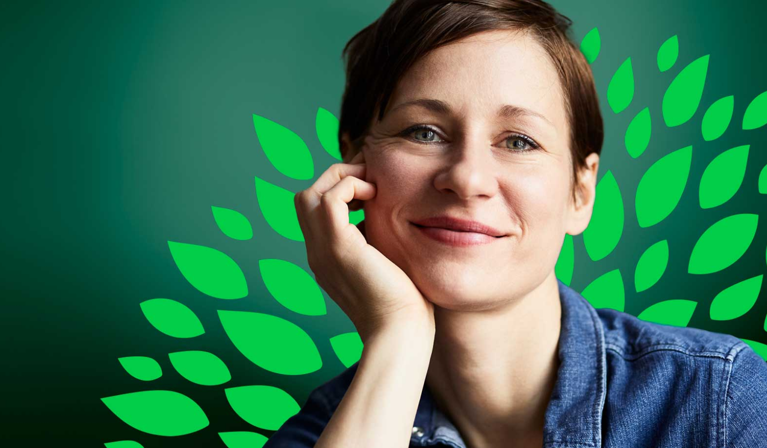
 Supporting leaves
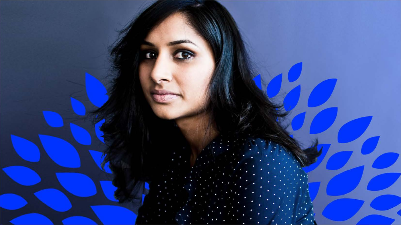
 Supporting leaves with color
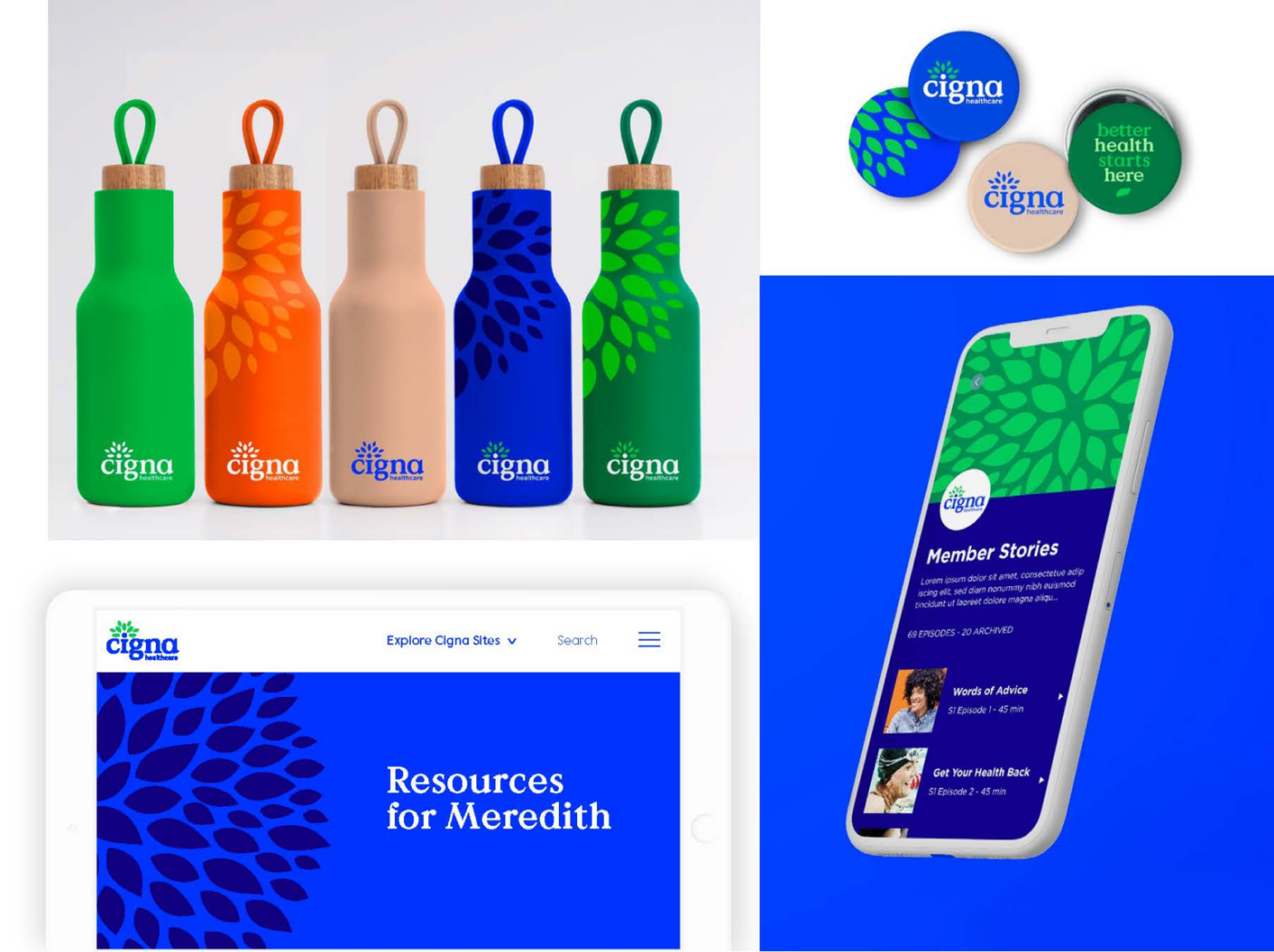
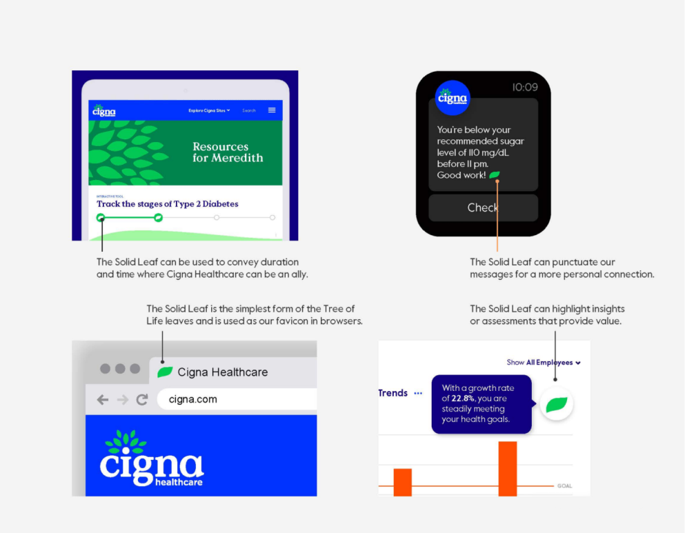
Solid leaf in UI
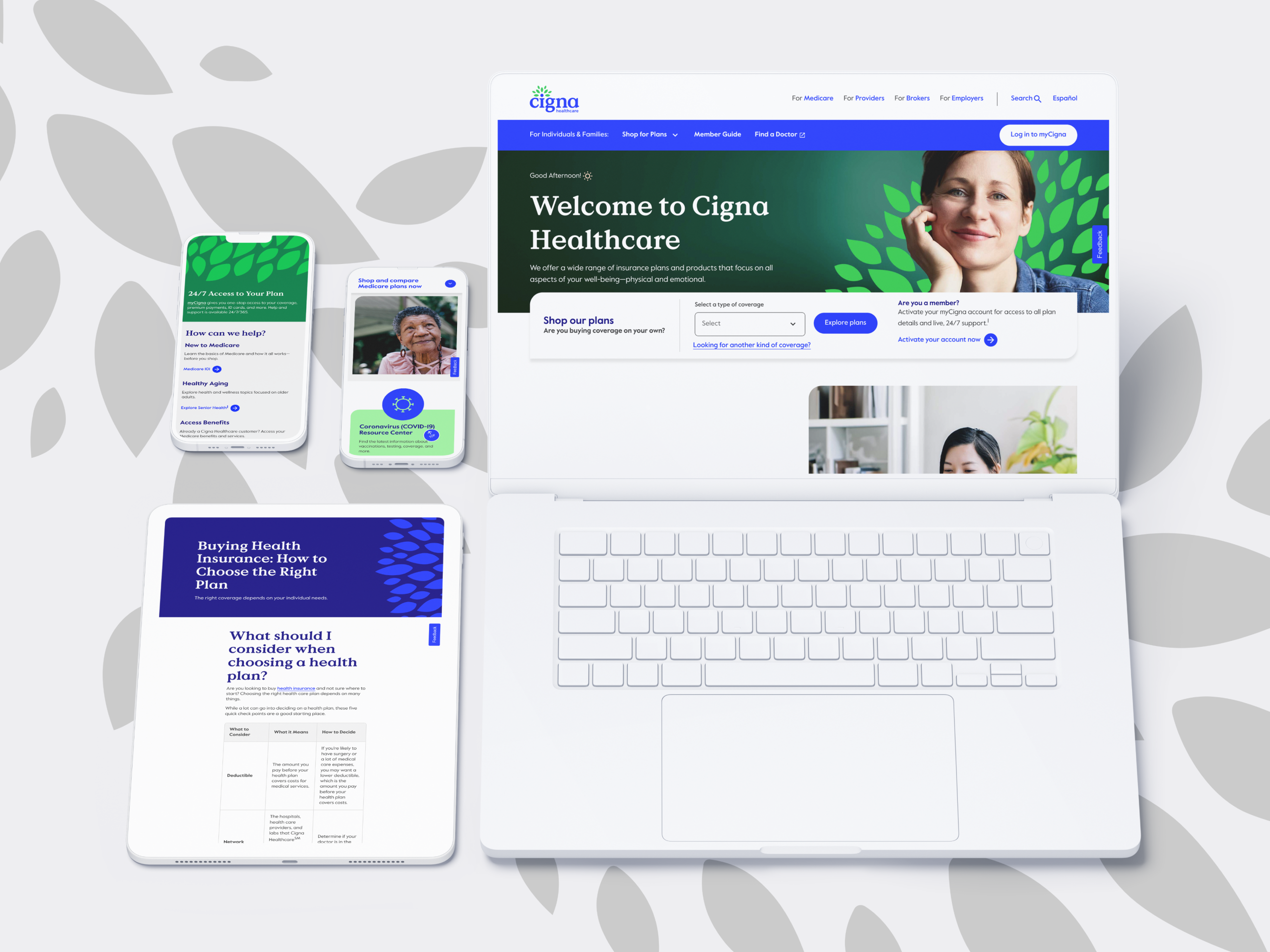
The new, polished look I created for the Cigna Healthcare brand


Challenge
Outcome:Over 500+ creative assets designed by the team
Symbolism of the new logo
Image leaves & motifs
Supporting leaves
Supporting leaves with color Solid leaf in UI
The new, polished look I created for the Cigna Healthcare brand
Creative Team Project
Challenge
Outcome:
Over 500+ creative assets designed by the team
Symbolism of the new logo
Image leaves & motifs
Supporting leaves
Supporting leaves with color Solid leaf in UI