
Gotta have the password 😉
Incorrect password. Please try again.
⬆︎Increasing Conversion Rates (CRO) for Wayfair Verified Page
Team
Design:
Lead UX E-Commerce Strategist (Me)
Marketing:
Head of Creative Operations
Head of Creative Studios
Design Process
- Conduct a competitive analysis of Walmart, Amazon, and Target
- Complete audit of current Verified page based on Baymard Research Institute
- Create wireframes to determine content hiearchy
- Design an elevated, higher-converting design of the new Verified page
Current Verified Page

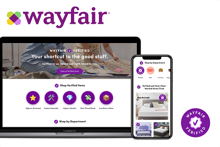
Trusted Seal of Approval Highlight's Wayfair's Most-Trusted Products
Wayfair Verified is a program that is designed to give customers a short cut to the best items in the Wayfair catalogue across every style and price-point.
However, the Verified category page was not adequately converting sales with a high bounce rate of 55%
Desktop
Mobile

Discovery – Competitive Analysis
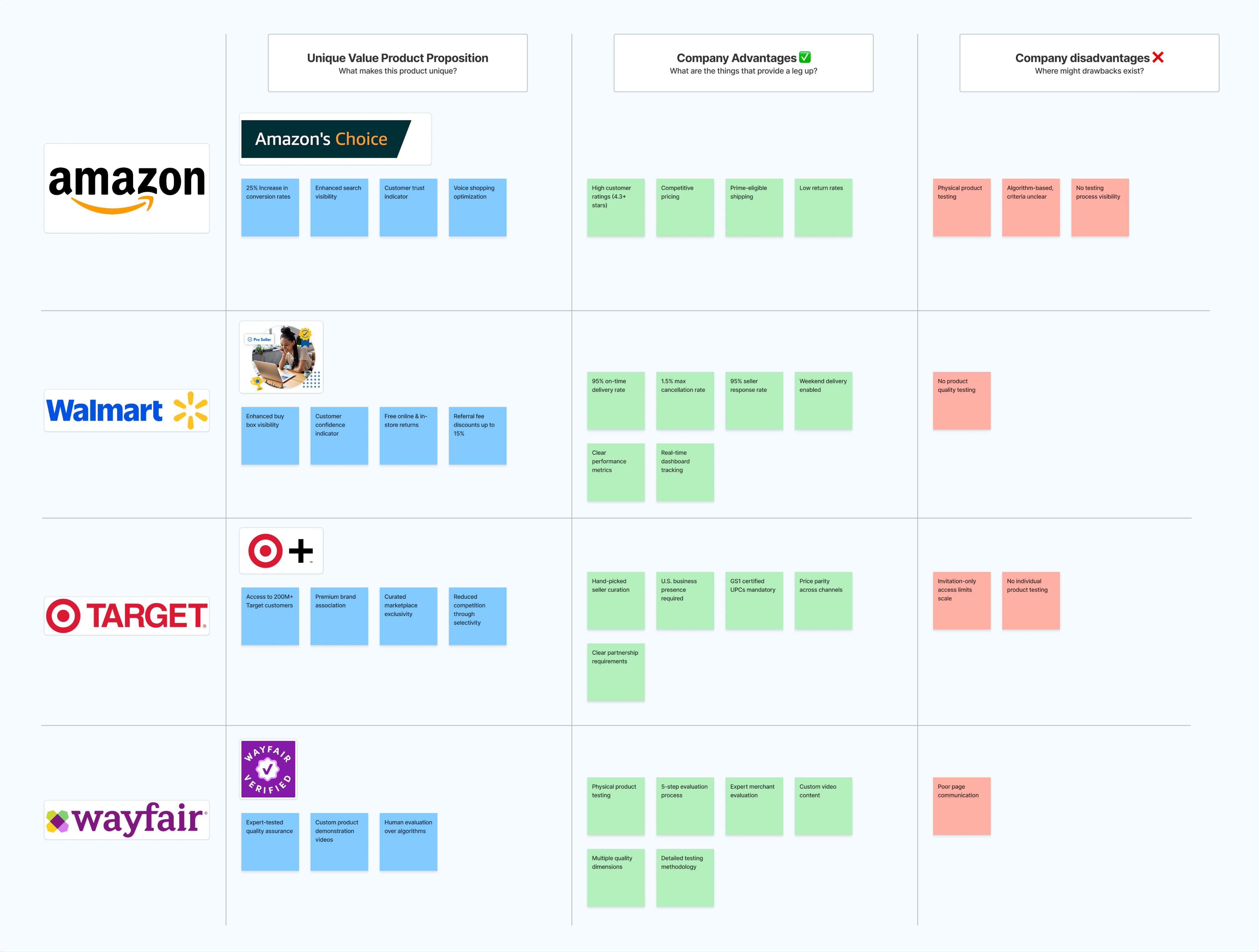
What are the competitive gaps in quality assurance communication for Amazon, Target, and Walmart?
Wayfair Verified is a program that is designed to give customers a short cut to the best items in the Wayfair catalogue across every style and price-point.
- Amazon’s Choice lacks transparency – users don’t understand the selection criteria behind badges, creating skepticism about items
- Target’s “a new day” private label strategy – confuses customers who can’t distinguish between verified quality vs. house brand marketing
- Walmart’s “Great Value” positioning – focuses purely on price over quality assurance missing the premium confidence-building opportunity
Discovery – Audit
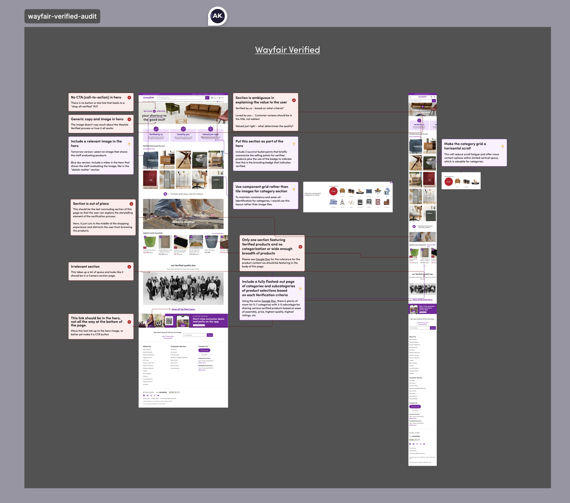
What are the critical UX failures preventing Verified page conversions?
The current Verified page treats premium curated products like standard inventory, missing critical conversion opportunities through poor information architecture and weak calls-to-action that fail to leverage Wayfair's unique quality assurance differentiator.
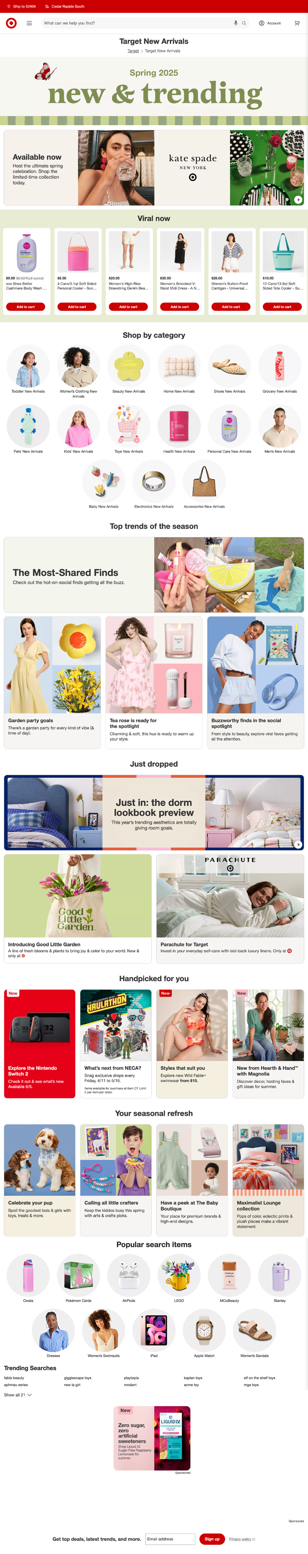
Discovery – Target Analysis
How do premium landing pages achieve above-average conversion rates?
During the discovery phase we analyzed Target’s premium landing page performance against industry conversion benchmarks. The key takeaways were:
- Target exceeds ecommerce averages – While general landing pages convert at 6.6% across industries, ecommerce specifically averages 2-5%, yet Target achieves 2.5-3% conversion rates
- Premium positioning drives performance – Target treats curated collections as premium experiences with dedicated information architecture, not standard product listings
- Clear differentiation messaging missing – Wayfair Verified lacks the streamlined conversion paths that Target uses to justify quality assurance positioning
- Information architecture underutilized – Current Verified page structure doesn’t leverage the premium experience model that drives Target’s above-average performance
Design – Wireframes
Rewiring the information architecture and content hierarchy to provide clear messaging
During the discovery phase we analyzed Target’s premium landing page performance against industry conversion benchmarks. The key takeaways were:
- Target exceeds ecommerce averages – While general landing pages convert at 6.6% across industries, ecommerce specifically averages 2-5%, yet Target achieves 2.5-3% conversion rates
- Premium positioning drives performance – Target treats curated collections as premium experiences with dedicated information architecture, not standard product listings
- Clear differentiation messaging missing – Wayfair Verified lacks the streamlined conversion paths that Target uses to justify quality assurance positioning
- Information architecture underutilized – Current Verified page structure doesn’t leverage the premium experience model that drives Target’s above-average performance
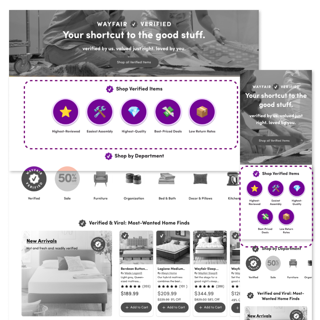
The top five categories that are the most important to customers are as follows:
- ⭐ Highest Reviewed
- ⚒️ Easiest Assembly
- 💎 Highest Quality
- 💸 Best-Priced Deals
- 📦 Lowest Return Rates
Design – New Verified Page
Defining new category structure: elevating products through premium page navigation and browsing experience
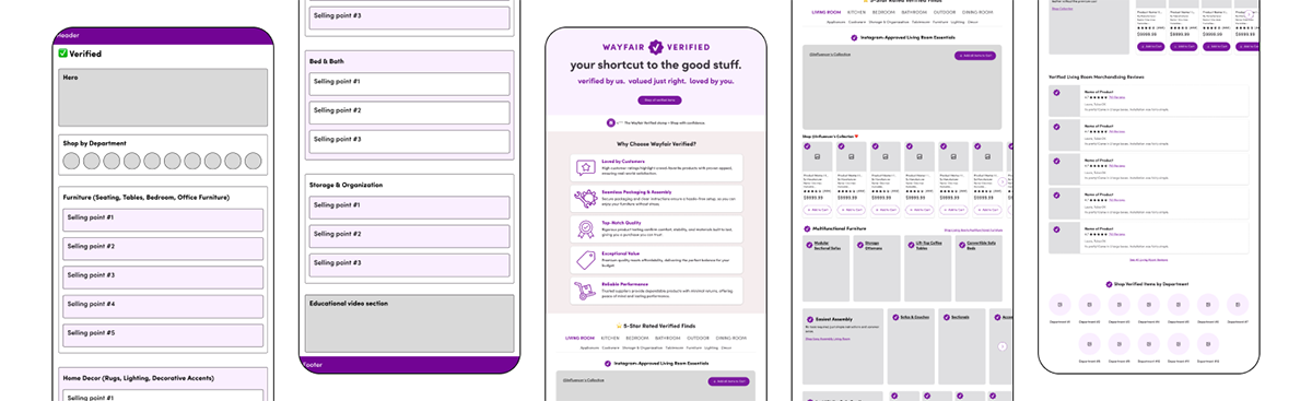
The previous layout of the Verified page buried verification benefits in generic product grids with no visual distinction. Users felt overwhelmed by standard product listings without understanding the premium positioning.
So, I restructured the five categories - highest reviewed, easiest assembly, highest quality, best-priced deals, and lowest return rates - with dedicated sections communicating the verification process.
Then, I elevated the navigation visuals by replacing generic tiles with iconographic story-telling elements.
New Verified Page

Replaced hero image of generic furniture to staff evaluation process
The shopping carousels were sorted by either category card or item carousel format based on the categories most important to the shopping experience in hierarchical order.
Each section is curated by trending statistics such as: new arrivals, top most-reviewed and staff picks of the week.
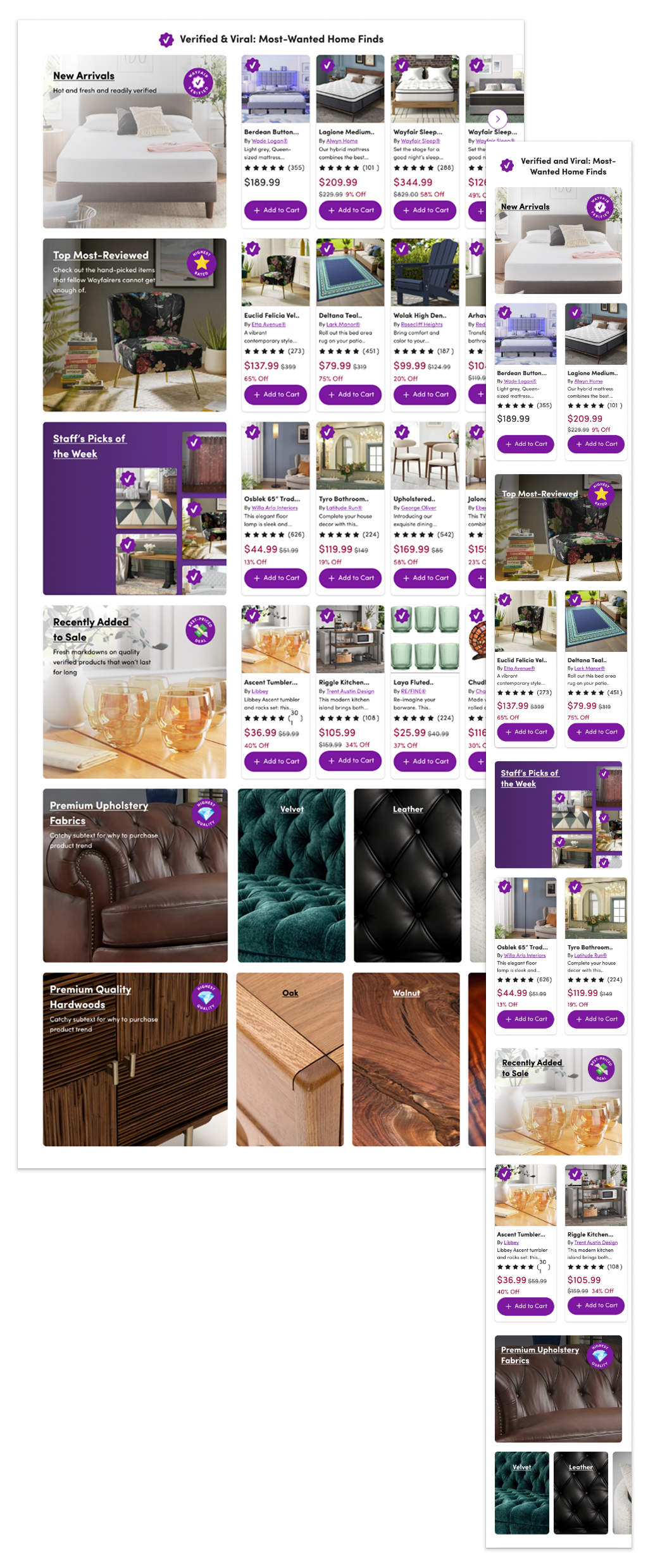
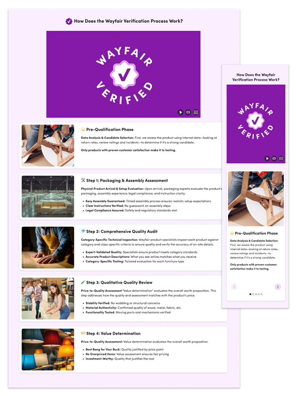
Lastly, the educational section has a promotional video and divided, modular sections explaining each part of the process for the verification process.
This is optimized for scan-ability and summarizes why customers should choose Wayfair products.
Verified Page 2.0
Desktop
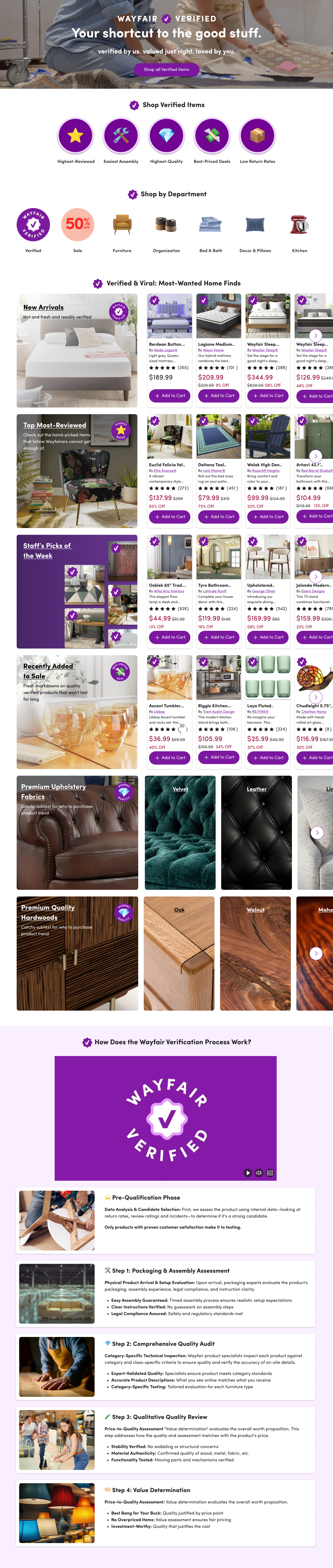
Mobile

Success Metrics & Next Steps
While there was significant organizational restructuring occurring during the design phase of the Verified page, the goal outcome for implementation is targeted to achieve:
↓ 25% Decrease in bounce rate
↑ 18% Increase in conversion rate
Additions to Wayfair's Design System
Throughout the Verified page redesign, we identified opportunities to expand Wayfair's component library with reusable elements that support premium positioning across the platform.
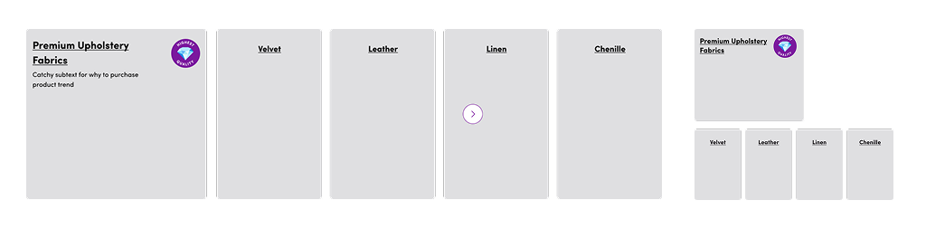
Category Grids

Badges for Product Photos
Badges for Verified products are labels for product photos on category tiles to indicate that a product is verified but also what specific benefit it has.

Verified Headline (H1) Title

Category-Item Carousels
These modular components were for grouped-together products within a similar category with an “+ Add to Cart” CTA for direct placement into the checkout. For mobile, there is a side-swipe feature and a left-arrow for horizontal scrolling on desktop.
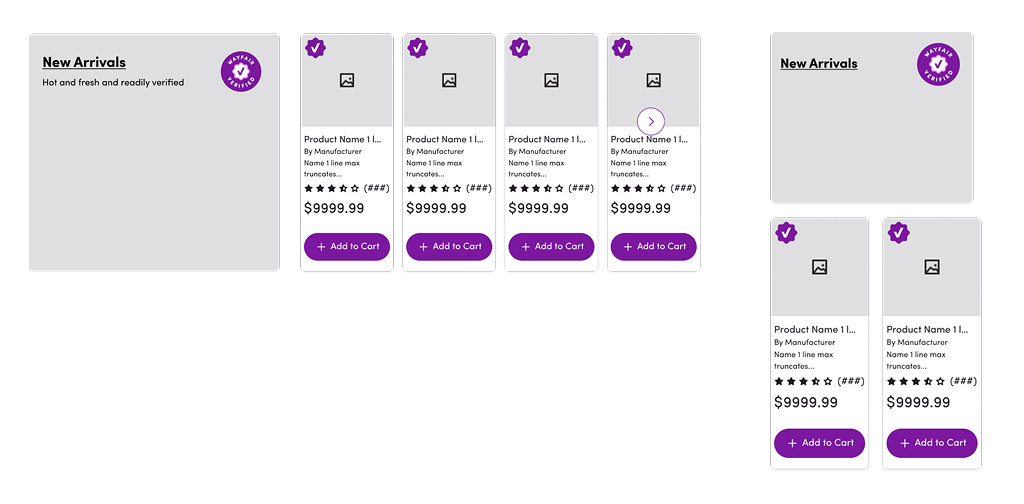
Category Carousels
These modular components were for categories subcategories linking to their own PLP (product listing pages). For mobile, there is a side-swipe feature and a left-arrow for horizontal scrolling on desktop.
⬆︎Increasing Conversion Rates (CRO) for Wayfair Verified Page
Team
Design:
Lead UX E-Commerce Strategist (Me)
Marketing:
Head of Creative Operations
Head of Creative Studios
Design Process
- Conduct a competitive analysis of Walmart, Amazon, and Target
- Complete audit of current Verified page based on Baymard Research Institute
- Create wireframes to determine content hiearchy
- Design an elevated, higher-converting design of the new Verified page
Current Verified Page
Trusted Seal of Approval Highlight's Wayfair's Most-Trusted Products
Wayfair Verified is a program that is designed to give customers a short cut to the best items in the Wayfair catalogue across every style and price-point.
However, the category page was not adequately converting sales with a high bounce rate of 55%
Desktop
Mobile
Discovery – Competitive Analysis
What are the competitive gaps in quality assurance communication for Amazon, Target, and Walmart?
Wayfair Verified is a program that is designed to give customers a short cut to the best items in the Wayfair catalogue across every style and price-point.
- Amazon’s Choice lacks transparency – users don’t understand the selection criteria behind badges, creating skepticism about items
- Target’s “a new day” private label strategy – confuses customers who can’t distinguish between verified quality vs. house brand marketing
- Walmart’s “Great Value” positioning – focuses purely on price over quality assurance missing the premium confidence-building opportunity
Discovery – Audit
What are the critical UX failures preventing Verified page conversions?
The current Verified page treats premium curated products like standard inventory, missing critical conversion opportunities through poor information architecture and weak calls-to-action that fail to leverage Wayfair's unique quality assurance differentiator.
Discovery – Target Analysis
How do premium landing pages achieve above-average conversion rates?
- Target exceeds ecommerce averages – While general landing pages convert at 6.6% across industries, ecommerce specifically averages 2-5%, yet Target achieves 2.5-3% conversion rates
- Premium positioning drives performance – Target treats curated collections as premium experiences with dedicated information architecture, not standard product listings
- Clear differentiation messaging missing – Wayfair Verified lacks the streamlined conversion paths that Target uses to justify quality assurance positioning
- Information architecture underutilized – Current Verified page structure doesn’t leverage the premium experience model that drives Target’s above-average performance
Design – Wireframes
Rewiring the information architecture and content hierarchy to provide clear messaging
During the discovery phase we analyzed Target’s premium landing page performance against industry conversion benchmarks. The key takeaways were:
The top five categories that are the most important to customers are as follows:
- ⭐ Highest Reviewed
- ⚒️ Easiest Assembly
- 💎 Highest Quality
- 💸 Best-Priced Deals
- 📦 Lowest Return Rates
Defining new category structure: elevating products through premium page navigation and browsing experience
New Verified Page
Replaced hero image of generic furniture to staff evaluation process
The shopping carousels were sorted by either category card or item carousel format based on the categories most important to the shopping experience in hierarchical order.
Each section is curated by trending statistics such as: new arrivals, top most-reviewed and staff picks of the week.
Lastly, the educational section has a promotional video and divided, modular sections explaining each part of the process for the verification process.
This is optimized for scan-ability and summarizes why customers should choose Wayfair products.
Verified Page 2.0
Desktop
Mobile
Success Metrics & Next Steps
While there was significant organizational restructuring occurring during the design phase of the Verified page, the goal outcome for implementation is targeted to achieve:
↓ 25% Decrease in bounce rate
↑ 18% Increase in conversion rate
Additions to Wayfair's Design System
Throughout the Verified page redesign, we identified opportunities to expand Wayfair's component library with reusable elements that support premium positioning across the platform.
Category Grids
Simple visuals to sum up the categories that the landing page is selling based on what customers value the most: highest rating, easiest assembly, highest quality, best-priced deal and low-return rate.
Badges for Product Photos
Badges for Verified products are labels for product photos on category tiles to indicate that a product is verified but also what specific benefit it has.
Verified Headline (H1) Title
This was added to the Typography section so that the check-mark icon is included on the Verified page at the start of each section.
Category-Item Carousels
Category Carousels
These modular components were for categories subcategories linking to their own PLP (product listing pages). For mobile, there is a side-swipe feature and a left-arrow for horizontal scrolling on desktop.
⬆︎Increasing Conversion Rates (CRO) for Wayfair Verified Page
Team
Design:
Lead UX E-Commerce Strategist (Me)
Marketing:
Head of Creative Operations
Head of Creative Studios
Design Process
While I started the design process, I focused on the following steps:
- Conduct a competitive analysis of Walmart, Amazon, and Target
- Complete audit of current Verified page based on Baymard Research Institute
- Create wireframes to determine content hiearchy
- Design an elevated, higher-converting design of the new Verified page
Current Verified Page
Wayfair Verified is a program that is designed to give customers a short cut to the best items in the Wayfair catalogue across every style and price-point.
However, the Verified category page was not adequately converting sales with a high bounce rate of 55%
Desktop
Mobile
Discovery - Competitive Analysis
What are the competitive gaps in quality assurance communication for Amazon, Target, and Walmart?
- Amazon’s Choice lacks transparency – users don’t understand the selection criteria behind badges, creating skepticism about items
- Target’s “a new day” private label strategy – confuses customers who can’t distinguish between verified quality vs. house brand marketing
- Walmart’s “Great Value” positioning – focuses purely on price over quality assurance missing the premium confidence-building opportunity
Competitive Analysis
Discovery – Audit
What are the critical UX failures preventing Verified page conversions?
As I conducted a heuristic evaluation of the current Wayfair page experience, the key evaluation finding was:
The current Verified page treats premium curated products like standard inventory, missing critical conversion opportunities through poor information architecture and weak calls-to-action that fail to leverage Wayfair's unique quality assurance differentiator.
Audit of Current Verified Page
Discovery – Target Analysis
How do premium landing pages achieve above-average conversion rates?
During the discovery phase we analyzed Target’s premium landing page performance against industry conversion benchmarks. The key takeaways were:
- Target exceeds ecommerce averages – While general landing pages convert at 6.6% across industries, ecommerce specifically averages 2-5%, yet Target achieves 2.5-3% conversion rates
- Premium positioning drives performance – Target treats curated collections as premium experiences with dedicated information architecture, not standard product listings
- Clear differentiation messaging missing – Wayfair Verified lacks the streamlined conversion paths that Target uses to justify quality assurance positioning
- Information architecture underutilized – Current Verified page structure doesn’t leverage the premium experience model that drives Target’s above-average performance
🎯 Target's Premium Landing Pages
Design – Wireframes
Rewiring the information architecture and content hierarchy to provide clear messaging
The top five categories that are the most important to customers are as follows:
- ⭐ Highest Reviewed
- ⚒️ Easiest Assembly
- 💎 Highest Quality
- 💸 Best-Priced Deals
- 📦 Lowest Return Rates
Design – New Verified Page
Defining new category structure: elevating products through premium page navigation and browsing experience
New Verified Page
Replaced hero image of generic furniture to staff evaluation process
The shopping carousels were sorted by either category card or item carousel format based on the categories most important to the shopping experience in hierarchical order.
Each section is curated by trending statistics such as: new arrivals, top most-reviewed and staff picks of the week.
Lastly, the educational section has a promotional video and divided, modular sections explaining each part of the process for the verification process.
This is optimized for scan-ability and summarizes why customers should choose Wayfair products.
Verified Page 2.0
This new version transforms shopping from browsing inventory to participating in the quality assurance journey, positioning Wayfair as the trusted advisor who literally opens their doors to show customers exactly how products earn verification.
Desktop
Mobile
Gotta have the password 😉
Incorrect password. Please try again.
⬆︎Increasing Conversion Rates (CRO) for Wayfair Verified Page
Team
Design:
Lead UX E-Commerce Strategist (Me)
Marketing:
Head of Creative Operations
Head of Creative Studios
Design Process
- Conduct a competitive analysis of Walmart, Amazon, and Target
- Complete audit of current Verified page based on Baymard Research Institute
- Create wireframes to determine content hiearchy
- Design an elevated, higher-converting design of the new Verified page
Current Verified Page
Trusted Seal of Approval Highlight's Wayfair's Most-Trusted Products
Wayfair Verified is a program that is designed to give customers a short cut to the best items in the Wayfair catalogue across every style and price-point.
However, the Verified category page was not adequately converting sales with a high bounce rate of 55%
Desktop
Mobile
Discovery – Competitive Analysis
What are the competitive gaps in quality assurance communication for Amazon, Target, and Walmart?
Wayfair Verified is a program that is designed to give customers a short cut to the best items in the Wayfair catalogue across every style and price-point.
- Amazon’s Choice lacks transparency – users don’t understand the selection criteria behind badges, creating skepticism about items
- Target’s “a new day” private label strategy – confuses customers who can’t distinguish between verified quality vs. house brand marketing
- Walmart’s “Great Value” positioning – focuses purely on price over quality assurance missing the premium confidence-building opportunity
Discovery – Audit
What are the critical UX failures preventing Verified page conversions?
The current Verified page treats premium curated products like standard inventory, missing critical conversion opportunities through poor information architecture and weak calls-to-action that fail to leverage Wayfair's unique quality assurance differentiator.
Discovery – Target Analysis
How do premium landing pages achieve above-average conversion rates?
During the discovery phase we analyzed Target’s premium landing page performance against industry conversion benchmarks. The key takeaways were:
- Target exceeds ecommerce averages – While general landing pages convert at 6.6% across industries, ecommerce specifically averages 2-5%, yet Target achieves 2.5-3% conversion rates
- Premium positioning drives performance – Target treats curated collections as premium experiences with dedicated information architecture, not standard product listings
- Clear differentiation messaging missing – Wayfair Verified lacks the streamlined conversion paths that Target uses to justify quality assurance positioning
- Information architecture underutilized – Current Verified page structure doesn’t leverage the premium experience model that drives Target’s above-average performance
Design – Wireframes
Rewiring the information architecture and content hierarchy to provide clear messaging
During the discovery phase we analyzed Target’s premium landing page performance against industry conversion benchmarks. The key takeaways were:
- Target exceeds ecommerce averages – While general landing pages convert at 6.6% across industries, ecommerce specifically averages 2-5%, yet Target achieves 2.5-3% conversion rates
- Premium positioning drives performance – Target treats curated collections as premium experiences with dedicated information architecture, not standard product listings
- Clear differentiation messaging missing – Wayfair Verified lacks the streamlined conversion paths that Target uses to justify quality assurance positioning
- Information architecture underutilized – Current Verified page structure doesn’t leverage the premium experience model that drives Target’s above-average performance
The top five categories that are the most important to customers are as follows:
- ⭐ Highest Reviewed
- ⚒️ Easiest Assembly
- 💎 Highest Quality
- 💸 Best-Priced Deals
- 📦 Lowest Return Rates
Design – New Verified Page
Defining new category structure: elevating products through premium page navigation and browsing experience
The previous layout of the Verified page buried verification benefits in generic product grids with no visual distinction. Users felt overwhelmed by standard product listings without understanding the premium positioning.
So, I restructured the five categories - highest reviewed, easiest assembly, highest quality, best-priced deals, and lowest return rates - with dedicated sections communicating the verification process.
Then, I elevated the navigation visuals by replacing generic tiles with iconographic story-telling elements.
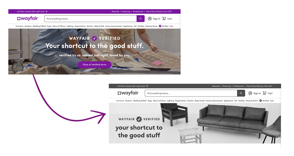
New Verified Page
Replaced hero image of generic furniture to staff evaluation process
The shopping carousels were sorted by either category card or item carousel format based on the categories most important to the shopping experience in hierarchical order.
Each section is curated by trending statistics such as: new arrivals, top most-reviewed and staff picks of the week.
Lastly, the educational section has a promotional video and divided, modular sections explaining each part of the process for the verification process.
This is optimized for scan-ability and summarizes why customers should choose Wayfair products.
Verified Page 2.0
Desktop
Mobile
Success Metrics & Next Steps
While there was significant organizational restructuring occurring during the design phase of the Verified page, the goal outcome for implementation is targeted to achieve:
↓ 25% Decrease in bounce rate
↑ 18% Increase in conversion rate
Additions to Wayfair's Design System
Throughout the Verified page redesign, we identified opportunities to expand Wayfair's component library with reusable elements that support premium positioning across the platform.
Category Grids
Badges for Product Photos
Badges for Verified products are labels for product photos on category tiles to indicate that a product is verified but also what specific benefit it has.
Verified Headline (H1) Title
Category-Item Carousels
These modular components were for grouped-together products within a similar category with an “+ Add to Cart” CTA for direct placement into the checkout. For mobile, there is a side-swipe feature and a left-arrow for horizontal scrolling on desktop.
Category Carousels
These modular components were for categories subcategories linking to their own PLP (product listing pages). For mobile, there is a side-swipe feature and a left-arrow for horizontal scrolling on desktop.
⬆︎Increasing Conversion Rates (CRO) for Wayfair Verified Page
Team
Design:
Lead UX E-Commerce Strategist (Me)
Marketing:
Head of Creative Operations
Head of Creative Studios
Design Process
- Conduct a competitive analysis of Walmart, Amazon, and Target
- Complete audit of current Verified page based on Baymard Research Institute
- Create wireframes to determine content hiearchy
- Design an elevated, higher-converting design of the new Verified page
Current Verified Page
Trusted Seal of Approval Highlight's Wayfair's Most-Trusted Products
Wayfair Verified is a program that is designed to give customers a short cut to the best items in the Wayfair catalogue across every style and price-point.
However, the category page was not adequately converting sales with a high bounce rate of 55%
Desktop
Mobile
Discovery – Competitive Analysis
What are the competitive gaps in quality assurance communication for Amazon, Target, and Walmart?
Wayfair Verified is a program that is designed to give customers a short cut to the best items in the Wayfair catalogue across every style and price-point.
- Amazon’s Choice lacks transparency – users don’t understand the selection criteria behind badges, creating skepticism about items
- Target’s “a new day” private label strategy – confuses customers who can’t distinguish between verified quality vs. house brand marketing
- Walmart’s “Great Value” positioning – focuses purely on price over quality assurance missing the premium confidence-building opportunity
Discovery – Audit
What are the critical UX failures preventing Verified page conversions?
The current Verified page treats premium curated products like standard inventory, missing critical conversion opportunities through poor information architecture and weak calls-to-action that fail to leverage Wayfair's unique quality assurance differentiator.
Discovery – Target Analysis
How do premium landing pages achieve above-average conversion rates?
- Target exceeds ecommerce averages – While general landing pages convert at 6.6% across industries, ecommerce specifically averages 2-5%, yet Target achieves 2.5-3% conversion rates
- Premium positioning drives performance – Target treats curated collections as premium experiences with dedicated information architecture, not standard product listings
- Clear differentiation messaging missing – Wayfair Verified lacks the streamlined conversion paths that Target uses to justify quality assurance positioning
- Information architecture underutilized – Current Verified page structure doesn’t leverage the premium experience model that drives Target’s above-average performance
Design – Wireframes
Rewiring the information architecture and content hierarchy to provide clear messaging
During the discovery phase we analyzed Target’s premium landing page performance against industry conversion benchmarks. The key takeaways were:
The top five categories that are the most important to customers are as follows:
- ⭐ Highest Reviewed
- ⚒️ Easiest Assembly
- 💎 Highest Quality
- 💸 Best-Priced Deals
- 📦 Lowest Return Rates
Defining new category structure: elevating products through premium page navigation and browsing experience
New Verified Page
Replaced hero image of generic furniture to staff evaluation process
The shopping carousels were sorted by either category card or item carousel format based on the categories most important to the shopping experience in hierarchical order.
Each section is curated by trending statistics such as: new arrivals, top most-reviewed and staff picks of the week.
Lastly, the educational section has a promotional video and divided, modular sections explaining each part of the process for the verification process.
This is optimized for scan-ability and summarizes why customers should choose Wayfair products.
Verified Page 2.0
Desktop
Mobile
Success Metrics & Next Steps
While there was significant organizational restructuring occurring during the design phase of the Verified page, the goal outcome for implementation is targeted to achieve:
↓ 25% Decrease in bounce rate
↑ 18% Increase in conversion rate
Additions to Wayfair's Design System
Throughout the Verified page redesign, we identified opportunities to expand Wayfair's component library with reusable elements that support premium positioning across the platform.
Category Grids
Simple visuals to sum up the categories that the landing page is selling based on what customers value the most: highest rating, easiest assembly, highest quality, best-priced deal and low-return rate.
Badges for Product Photos
Badges for Verified products are labels for product photos on category tiles to indicate that a product is verified but also what specific benefit it has.
Verified Headline (H1) Title
This was added to the Typography section so that the check-mark icon is included on the Verified page at the start of each section.
Category-Item Carousels
Category Carousels
These modular components were for categories subcategories linking to their own PLP (product listing pages). For mobile, there is a side-swipe feature and a left-arrow for horizontal scrolling on desktop.
⬆︎Increasing Conversion Rates (CRO) for Wayfair Verified Page
Team
Design:
Lead UX E-Commerce Strategist (Me)
Marketing:
Head of Creative Operations
Head of Creative Studios
Design Process
While I started the design process, I focused on the following steps:
- Conduct a competitive analysis of Walmart, Amazon, and Target
- Complete audit of current Verified page based on Baymard Research Institute
- Create wireframes to determine content hiearchy
- Design an elevated, higher-converting design of the new Verified page
Current Verified Page
Wayfair Verified is a program that is designed to give customers a short cut to the best items in the Wayfair catalogue across every style and price-point.
However, the Verified category page was not adequately converting sales with a high bounce rate of 55%
Desktop
Mobile
Discovery - Competitive Analysis
What are the competitive gaps in quality assurance communication for Amazon, Target, and Walmart?
- Amazon’s Choice lacks transparency – users don’t understand the selection criteria behind badges, creating skepticism about items
- Target’s “a new day” private label strategy – confuses customers who can’t distinguish between verified quality vs. house brand marketing
- Walmart’s “Great Value” positioning – focuses purely on price over quality assurance missing the premium confidence-building opportunity
Competitive Analysis
Discovery – Audit
What are the critical UX failures preventing Verified page conversions?
As I conducted a heuristic evaluation of the current Wayfair page experience, the key evaluation finding was:
The current Verified page treats premium curated products like standard inventory, missing critical conversion opportunities through poor information architecture and weak calls-to-action that fail to leverage Wayfair's unique quality assurance differentiator.
Audit of Current Verified Page
Discovery – Target Analysis
How do premium landing pages achieve above-average conversion rates?
During the discovery phase we analyzed Target’s premium landing page performance against industry conversion benchmarks. The key takeaways were:
- Target exceeds ecommerce averages – While general landing pages convert at 6.6% across industries, ecommerce specifically averages 2-5%, yet Target achieves 2.5-3% conversion rates
- Premium positioning drives performance – Target treats curated collections as premium experiences with dedicated information architecture, not standard product listings
- Clear differentiation messaging missing – Wayfair Verified lacks the streamlined conversion paths that Target uses to justify quality assurance positioning
- Information architecture underutilized – Current Verified page structure doesn’t leverage the premium experience model that drives Target’s above-average performance
🎯 Target's Premium Landing Pages
Design – Wireframes
Rewiring the information architecture and content hierarchy to provide clear messaging
The top five categories that are the most important to customers are as follows:
- ⭐ Highest Reviewed
- ⚒️ Easiest Assembly
- 💎 Highest Quality
- 💸 Best-Priced Deals
- 📦 Lowest Return Rates
Design – New Verified Page
Defining new category structure: elevating products through premium page navigation and browsing experience
New Verified Page
Replaced hero image of generic furniture to staff evaluation process
The shopping carousels were sorted by either category card or item carousel format based on the categories most important to the shopping experience in hierarchical order.
Each section is curated by trending statistics such as: new arrivals, top most-reviewed and staff picks of the week.
Lastly, the educational section has a promotional video and divided, modular sections explaining each part of the process for the verification process.
This is optimized for scan-ability and summarizes why customers should choose Wayfair products.
Verified Page 2.0
This new version transforms shopping from browsing inventory to participating in the quality assurance journey, positioning Wayfair as the trusted advisor who literally opens their doors to show customers exactly how products earn verification.
Desktop
Mobile
Gotta have the password 😉
Incorrect password. Please try again.
⬆︎Increasing Conversion Rates (CRO) for Wayfair Verified Page
Team
Design:
Lead UX E-Commerce Strategist (Me)
Marketing:
Head of Creative Operations
Head of Creative Studios
Design Process
- Conduct a competitive analysis of Walmart, Amazon, and Target
- Complete audit of current Verified page based on Baymard Research Institute
- Create wireframes to determine content hiearchy
- Design an elevated, higher-converting design of the new Verified page
Current Verified Page
Trusted Seal of Approval Highlight's Wayfair's Most-Trusted Products
Wayfair Verified is a program that is designed to give customers a short cut to the best items in the Wayfair catalogue across every style and price-point.
However, the Verified category page was not adequately converting sales with a high bounce rate of 55%
Desktop
Mobile
Discovery – Competitive Analysis
What are the competitive gaps in quality assurance communication for Amazon, Target, and Walmart?
Wayfair Verified is a program that is designed to give customers a short cut to the best items in the Wayfair catalogue across every style and price-point.
- Amazon’s Choice lacks transparency – users don’t understand the selection criteria behind badges, creating skepticism about items
- Target’s “a new day” private label strategy – confuses customers who can’t distinguish between verified quality vs. house brand marketing
- Walmart’s “Great Value” positioning – focuses purely on price over quality assurance missing the premium confidence-building opportunity
Discovery – Audit
What are the critical UX failures preventing Verified page conversions?
The current Verified page treats premium curated products like standard inventory, missing critical conversion opportunities through poor information architecture and weak calls-to-action that fail to leverage Wayfair's unique quality assurance differentiator.
Discovery – Target Analysis
How do premium landing pages achieve above-average conversion rates?
During the discovery phase we analyzed Target’s premium landing page performance against industry conversion benchmarks. The key takeaways were:
- Target exceeds ecommerce averages – While general landing pages convert at 6.6% across industries, ecommerce specifically averages 2-5%, yet Target achieves 2.5-3% conversion rates
- Premium positioning drives performance – Target treats curated collections as premium experiences with dedicated information architecture, not standard product listings
- Clear differentiation messaging missing – Wayfair Verified lacks the streamlined conversion paths that Target uses to justify quality assurance positioning
- Information architecture underutilized – Current Verified page structure doesn’t leverage the premium experience model that drives Target’s above-average performance
Design – Wireframes
Rewiring the information architecture and content hierarchy to provide clear messaging
During the discovery phase we analyzed Target’s premium landing page performance against industry conversion benchmarks. The key takeaways were:
- Target exceeds ecommerce averages – While general landing pages convert at 6.6% across industries, ecommerce specifically averages 2-5%, yet Target achieves 2.5-3% conversion rates
- Premium positioning drives performance – Target treats curated collections as premium experiences with dedicated information architecture, not standard product listings
- Clear differentiation messaging missing – Wayfair Verified lacks the streamlined conversion paths that Target uses to justify quality assurance positioning
- Information architecture underutilized – Current Verified page structure doesn’t leverage the premium experience model that drives Target’s above-average performance
The top five categories that are the most important to customers are as follows:
- ⭐ Highest Reviewed
- ⚒️ Easiest Assembly
- 💎 Highest Quality
- 💸 Best-Priced Deals
- 📦 Lowest Return Rates
Design – New Verified Page
Defining new category structure: elevating products through premium page navigation and browsing experience
The previous layout of the Verified page buried verification benefits in generic product grids with no visual distinction. Users felt overwhelmed by standard product listings without understanding the premium positioning.
So, I restructured the five categories - highest reviewed, easiest assembly, highest quality, best-priced deals, and lowest return rates - with dedicated sections communicating the verification process.
Then, I elevated the navigation visuals by replacing generic tiles with iconographic story-telling elements.
New Verified Page
Replaced hero image of generic furniture to staff evaluation process
The shopping carousels were sorted by either category card or item carousel format based on the categories most important to the shopping experience in hierarchical order.
Each section is curated by trending statistics such as: new arrivals, top most-reviewed and staff picks of the week.
Lastly, the educational section has a promotional video and divided, modular sections explaining each part of the process for the verification process.
This is optimized for scan-ability and summarizes why customers should choose Wayfair products.
Verified Page 2.0
Desktop
Mobile
Success Metrics & Next Steps
While there was significant organizational restructuring occurring during the design phase of the Verified page, the goal outcome for implementation is targeted to achieve:
↓ 25% Decrease in bounce rate
↑ 18% Increase in conversion rate
Additions to Wayfair's Design System
Throughout the Verified page redesign, we identified opportunities to expand Wayfair's component library with reusable elements that support premium positioning across the platform.
Category Grids
Badges for Product Photos
Badges for Verified products are labels for product photos on category tiles to indicate that a product is verified but also what specific benefit it has.
Verified Headline (H1) Title
Category-Item Carousels
These modular components were for grouped-together products within a similar category with an “+ Add to Cart” CTA for direct placement into the checkout. For mobile, there is a side-swipe feature and a left-arrow for horizontal scrolling on desktop.
Category Carousels
These modular components were for categories subcategories linking to their own PLP (product listing pages). For mobile, there is a side-swipe feature and a left-arrow for horizontal scrolling on desktop.
⬆︎Increasing Conversion Rates (CRO) for Wayfair Verified Page
Team
Design:
Lead UX E-Commerce Strategist (Me)
Marketing:
Head of Creative Operations
Head of Creative Studios
Design Process
- Conduct a competitive analysis of Walmart, Amazon, and Target
- Complete audit of current Verified page based on Baymard Research Institute
- Create wireframes to determine content hiearchy
- Design an elevated, higher-converting design of the new Verified page
Current Verified Page
Trusted Seal of Approval Highlight's Wayfair's Most-Trusted Products
Wayfair Verified is a program that is designed to give customers a short cut to the best items in the Wayfair catalogue across every style and price-point.
However, the category page was not adequately converting sales with a high bounce rate of 55%
Desktop
Mobile
Discovery – Competitive Analysis
What are the competitive gaps in quality assurance communication for Amazon, Target, and Walmart?
Wayfair Verified is a program that is designed to give customers a short cut to the best items in the Wayfair catalogue across every style and price-point.
- Amazon’s Choice lacks transparency – users don’t understand the selection criteria behind badges, creating skepticism about items
- Target’s “a new day” private label strategy – confuses customers who can’t distinguish between verified quality vs. house brand marketing
- Walmart’s “Great Value” positioning – focuses purely on price over quality assurance missing the premium confidence-building opportunity
Discovery – Audit
What are the critical UX failures preventing Verified page conversions?
The current Verified page treats premium curated products like standard inventory, missing critical conversion opportunities through poor information architecture and weak calls-to-action that fail to leverage Wayfair's unique quality assurance differentiator.
Discovery – Target Analysis
How do premium landing pages achieve above-average conversion rates?
- Target exceeds ecommerce averages – While general landing pages convert at 6.6% across industries, ecommerce specifically averages 2-5%, yet Target achieves 2.5-3% conversion rates
- Premium positioning drives performance – Target treats curated collections as premium experiences with dedicated information architecture, not standard product listings
- Clear differentiation messaging missing – Wayfair Verified lacks the streamlined conversion paths that Target uses to justify quality assurance positioning
- Information architecture underutilized – Current Verified page structure doesn’t leverage the premium experience model that drives Target’s above-average performance
Design – Wireframes
Rewiring the information architecture and content hierarchy to provide clear messaging
During the discovery phase we analyzed Target’s premium landing page performance against industry conversion benchmarks. The key takeaways were:
The top five categories that are the most important to customers are as follows:
- ⭐ Highest Reviewed
- ⚒️ Easiest Assembly
- 💎 Highest Quality
- 💸 Best-Priced Deals
- 📦 Lowest Return Rates
Defining new category structure: elevating products through premium page navigation and browsing experience
New Verified Page
Replaced hero image of generic furniture to staff evaluation process
The shopping carousels were sorted by either category card or item carousel format based on the categories most important to the shopping experience in hierarchical order.
Each section is curated by trending statistics such as: new arrivals, top most-reviewed and staff picks of the week.
Lastly, the educational section has a promotional video and divided, modular sections explaining each part of the process for the verification process.
This is optimized for scan-ability and summarizes why customers should choose Wayfair products.
Verified Page 2.0
Desktop
Mobile
Success Metrics & Next Steps
While there was significant organizational restructuring occurring during the design phase of the Verified page, the goal outcome for implementation is targeted to achieve:
↓ 25% Decrease in bounce rate
↑ 18% Increase in conversion rate
Additions to Wayfair's Design System
Throughout the Verified page redesign, we identified opportunities to expand Wayfair's component library with reusable elements that support premium positioning across the platform.
Category Grids
Simple visuals to sum up the categories that the landing page is selling based on what customers value the most: highest rating, easiest assembly, highest quality, best-priced deal and low-return rate.
Badges for Product Photos
Badges for Verified products are labels for product photos on category tiles to indicate that a product is verified but also what specific benefit it has.
Verified Headline (H1) Title
This was added to the Typography section so that the check-mark icon is included on the Verified page at the start of each section.
Category-Item Carousels
Category Carousels
These modular components were for categories subcategories linking to their own PLP (product listing pages). For mobile, there is a side-swipe feature and a left-arrow for horizontal scrolling on desktop.
⬆︎Increasing Conversion Rates (CRO) for Wayfair Verified Page
Team
Design:
Lead UX E-Commerce Strategist (Me)
Marketing:
Head of Creative Operations
Head of Creative Studios
Design Process
While I started the design process, I focused on the following steps:
- Conduct a competitive analysis of Walmart, Amazon, and Target
- Complete audit of current Verified page based on Baymard Research Institute
- Create wireframes to determine content hiearchy
- Design an elevated, higher-converting design of the new Verified page
Current Verified Page
Wayfair Verified is a program that is designed to give customers a short cut to the best items in the Wayfair catalogue across every style and price-point.
However, the Verified category page was not adequately converting sales with a high bounce rate of 55%
Desktop
Mobile
Discovery - Competitive Analysis
What are the competitive gaps in quality assurance communication for Amazon, Target, and Walmart?
- Amazon’s Choice lacks transparency – users don’t understand the selection criteria behind badges, creating skepticism about items
- Target’s “a new day” private label strategy – confuses customers who can’t distinguish between verified quality vs. house brand marketing
- Walmart’s “Great Value” positioning – focuses purely on price over quality assurance missing the premium confidence-building opportunity
Competitive Analysis
Discovery – Audit
What are the critical UX failures preventing Verified page conversions?
As I conducted a heuristic evaluation of the current Wayfair page experience, the key evaluation finding was:
The current Verified page treats premium curated products like standard inventory, missing critical conversion opportunities through poor information architecture and weak calls-to-action that fail to leverage Wayfair's unique quality assurance differentiator.
Audit of Current Verified Page
Discovery – Target Analysis
How do premium landing pages achieve above-average conversion rates?
During the discovery phase we analyzed Target’s premium landing page performance against industry conversion benchmarks. The key takeaways were:
- Target exceeds ecommerce averages – While general landing pages convert at 6.6% across industries, ecommerce specifically averages 2-5%, yet Target achieves 2.5-3% conversion rates
- Premium positioning drives performance – Target treats curated collections as premium experiences with dedicated information architecture, not standard product listings
- Clear differentiation messaging missing – Wayfair Verified lacks the streamlined conversion paths that Target uses to justify quality assurance positioning
- Information architecture underutilized – Current Verified page structure doesn’t leverage the premium experience model that drives Target’s above-average performance
🎯 Target's Premium Landing Pages
Design – Wireframes
Rewiring the information architecture and content hierarchy to provide clear messaging
The top five categories that are the most important to customers are as follows:
- ⭐ Highest Reviewed
- ⚒️ Easiest Assembly
- 💎 Highest Quality
- 💸 Best-Priced Deals
- 📦 Lowest Return Rates
Design – New Verified Page
Defining new category structure: elevating products through premium page navigation and browsing experience
New Verified Page
Replaced hero image of generic furniture to staff evaluation process
The shopping carousels were sorted by either category card or item carousel format based on the categories most important to the shopping experience in hierarchical order.
Each section is curated by trending statistics such as: new arrivals, top most-reviewed and staff picks of the week.
Lastly, the educational section has a promotional video and divided, modular sections explaining each part of the process for the verification process.
This is optimized for scan-ability and summarizes why customers should choose Wayfair products.
Verified Page 2.0
This new version transforms shopping from browsing inventory to participating in the quality assurance journey, positioning Wayfair as the trusted advisor who literally opens their doors to show customers exactly how products earn verification.
Desktop
Mobile